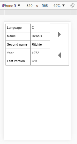
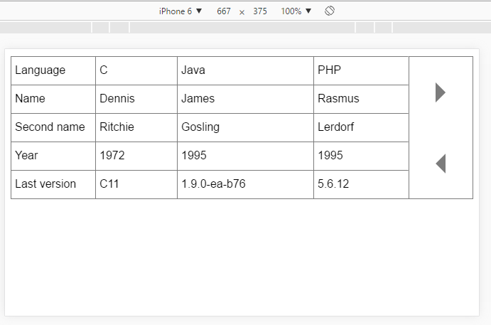
Invert table heads direction on small screens
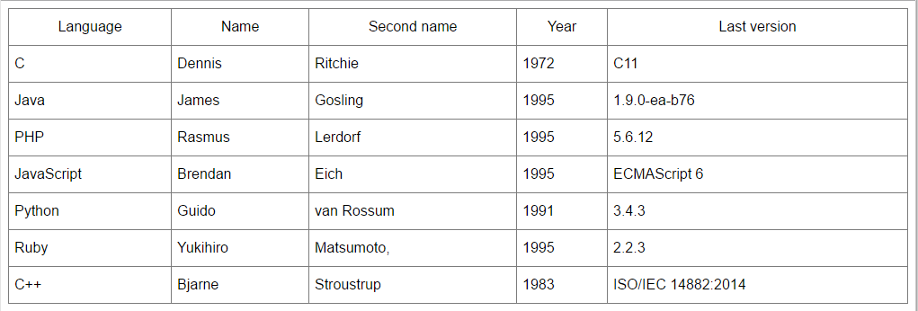
Big screen
Small screen
##Demo Here is a demo
Responsive-table will be showed at small screens (default 768px, but you may change it), but normal table will be hidden. When screen width is more then(768px) tables will switched;
Add scripts and styles to you page
<link rel="stylesheet" href="dist/styles.min.css"/>
<script type="text/javascript" src="dist/bundle.min.js"></script>
In you script use params like this
    var params = { // this is default params
        query: 'table',
        amount: [
            [0,   480],   // 1
            [481, 568],   // 2
            [569, 768]    // 3
        ],
        maxWidth: 768
    };
    responsiveTable.init(params);
or you may use default params
responsiveTable.init()
query- query of you table (.class,attribute,#id)(useddocument.querySelectorAll(query)it means, that you may use everything)amount- determine amount of content column depends on screen width.maxWidth- max screen width when response table is showed.
Library distributed AS IS and you may do it with it what do you want.
MIT