Twilio Flex + builder.io = ❤️
What if building in Flex was as easy as drag-and-drop? Now it can be with builder.io!
builder.io is a highly performant Visual CMS that lets you edit web content using a highly customizable drag-and-drop editor.

There's a whole write-up on the technical details of how this solution works here.
builder.io allows you to rapidly build, layout, and prototype in the Flex UI. You can assemble Panel2 at warp speed using pre-built components or your own new custom components.
Here's a quick demo of this in action:

builder.io also supports targetting based on attributes of the user logged into Flex, or attributes about the Task that they are working on allows you to build different UX experiences for different groups of users, or based on the type of task which they are currently handling.
- stop thinking about component layout and focus on functionality
- dont have to re-invent the wheel
- display and arrange content from APIs and task attributes in the UX in seconds
- see UX changes in real-time, publish when it's good to go
- compose custom demos without developers in an easy to use drag-and-drop UI
- build high-quality reuable layouts which can be called upon at any time
- pick from a library of components available to you which have pre-built and configurable functionality
Prerequisites
- Create a builder.io account
- Navigate to models and create a new section model with the name
Panel 2and set the Preview URL to http://localhost:3000/agent-desktop - you are running node v16 or above
- twilio cli 5.2.0 or above is installed (
twilio --version) - twilio flex plugins 6.0.2 or above is installed (
twilio plugins,twilio plugins:install @twilio-labs/plugin-flex@latest) - twilio serverless plugin 3.0.4 or above is installed (
twilio plugins,twilio plugins:install @twilio-labs/plugin-serverless@latest) twilio profiles:listhas an active account set.- have the twilio auth token for your account ready
Setup
- clone the repo
- open terminal and cd to the directory you put your plugin in
- execute the following commands
cp public/appConfig.example.js public/appConfig.jscp .env.sample .env- add your API key to builder.io in your .env file which can be found on the Get started page or your Account Settings
npm installnpm install @twilio-paste/core@17.7.0 @twilio-paste/icons@9.4.3 --legacy-peer-depstwilio flex:plugins:start- Navigate to the builder.io content page
- Click the
Create Your First Entrybutton, and select that you want to build a new Panel 2 content item - If everything worked correctly you should see an
+ Add Blockbutton on the right that you can use to add page content. You can use components from builder.io, but also check out theCustom Componentssection which allows you to insert a subset of components from the Paste Library which will match in theme and style with the rest of the Flex UI. - For any additional details on how to build with builder.io, check out the getting started guide on the builder.io docs
In your main plugin file, there are few key things that happen.
- We init the builder.io SDK with an API key that you can find in their console.
- We optionally set attributes which can be used to alter content seen by the agent. You would use this method for metadata that is not task specific such as looking at properties of the logged in worker to enable or disable part of the UI.
- We call a helper utility which loads a number of components from the Paste Library so that you can get started very quickly.
- We replace the default content in Panel2 with the builder.io component
abbreviated for clarity
import React from "react";
import * as Flex from "@twilio/flex-ui";
import Section from "./components/builderio/Section";
import builder from "@builder.io/react";
import registerPasteComponents from "./utils/registerPasteComponents";

const PLUGIN_NAME = "BuilderIoPlugin";

export default class BuilderIoPlugin extends FlexPlugin {
	constructor() {
		super(PLUGIN_NAME);
	}

	async init(flex: typeof Flex, manager: Flex.Manager): Promise<void> {
		// set to the API key of your builder io environment.
		builder.init(process.env.FLEX_BUILDERIO_API_KEY!);

		// optionally pass worker data.  can  be used in targetting
		builder.setUserAttributes({
			worker: manager.workerClient,
		});

		// loads useful paste components to be used in Panel2
		registerPasteComponents();

		// replace Panel2 with a new component for builder.io
		flex.AgentDesktopView.Panel2.Content.replace(<Section key="myComp" />);
	}
}
Much of the magic will now happen in the component that we now use for Panel2.
abbreviated for clarify
// imports
// ...

const SECTION_MODEL_NAME = "panel-2";

// populated by withTaskContext and withTheme helpers respectively
// https://www.twilio.com/docs/flex/developer/ui/add-component-context
export interface ContextProps {
	tasks?: Map<string, ITask>;
	task?: ITask;
	theme?: Theme;
	selectedTaskSid?: string;
}

const Section = (props: ContextProps) => {
	const [builderContentJson, setBuilderContentJson] = useState<any>();
	const [task, setTask] = useState<Partial<ITask>>();
	const [tasks, setTasks] = useState<string[] | undefined>();
	const [worker, setWorker] = useState<Partial<CleanWorker> | undefined>();

	const manager = Manager.getInstance();
	let workerClient = manager.workerClient;

	useEffect(() => {
		try {
			builder
				.get(SECTION_MODEL_NAME, {
					url: location.pathname,
					cachebust: true,
					cacheSeconds: 60,
					userAttributes: {
						// set attributes used for targetting here
						worker: workerClient?.name,
					},
				})
				.promise()
				.then(setBuilderContentJson);
		} catch (error) {
			console.log(error);
		}
	}, []);

  // some useEffect hooks removed for brevity

	if (!builderContentJson) {
		return <React.Fragment />;
	} else {
		let dataPayload = {
			// pass theme data (using withTheme helper) minus cyclical references:
			// https://www.twilio.com/docs/flex/developer/ui/add-component-context#add-theme-data-to-a-custom-component
			theme: props.theme,

			// a string[] of all assigned tasks.
			// useful for understanding if the user has active tasks or not.
			tasks: tasks,

			// pass a cleaned up copy of task data (using withTaskContext helper) minus cyclical references:
			// https://www.twilio.com/docs/flex/developer/ui/add-component-context#add-task-data-to-a-custom-component
			task: task,

			// this gets set by the withTaskContext helper,
			// and tells you which task the user has selected.
			selectedTaskSid: props.selectedTaskSid,

			// pass worker info so that pages can render
			// different content based on worker attributes.
			worker: worker,
		};

		return (
			<BuilderComponent
				model={SECTION_MODEL_NAME}
				content={builderContentJson}
				// use context to pass callbacks
				context={{
					invokeAction: async (action: string, payload: object) => {
						console.log(
							`${action} Action invoked from builder.io with payload:`,
							payload
						);
						await Actions.invokeAction(action, payload);
					},
				}}
				// pass any data that builder.io may need.
				// will be placed in builder.io's state object
				data={dataPayload}
			/>
		);
	}
};

export default withTheme(withTaskContext(Section));
In the BuilderComponent props, some really important things happen.
- model: we specify the name of the section model which should be rendered in panel2 when flex loads
- content: builder uses the JSON representation of your content for that model that it fetches in the useEffect hook
- context: we tell builder about any data or callbacks we want to make available. this allows us to invoke code in flex through events generated in the builder.io UI.
- data: we pass all of the theme and task context to builder (set in props by withTheme and withTaskContext respectively)
This allows us to build bi-directional data flow.
builder.io will now have access to all task, theme, and more saved in the state object. You can now create text in panel2 and bind the text to state.task.attributes.someproperty, or simply use the binding drop down to select any attribute available from the task or theme.
builder.io can create events that call functions passed in the context parameter. For more details on how this works, see here.
For a practical example, lets assume we wanted to create a button in builder.io that allowed us to click to call. We know that we need to use the StartOutboundCall Action from Flex to initiate the call. In builder.io we can add an event listener for a click event on our button and execute the following custom code:
context.invokeAction("StartOutboundCall", {
	destination: state.task.attributes.customers.phone,
});
please note: flex does not allow you to have multiple open windows when making an outbound call. you'll need to publish your changes and then navigate away from the builder content entry preview page before you test this functionality.
If you have already built a component...
components/Greeting.jsx
import React from "react";
import { Builder } from "@builder.io/react";

export const Greeting = () => (
	const greeting = 'Hello Function Component!';
	return <h1>{greeting}</h1>;
);
then you can register it with builder.io using a single line of code.
utils/builderio-component-factory.js
import React from "react";
import { Builder } from "@builder.io/react";
import { Greeting } from "../components/Greeting";

export default function createBuilderIOComponents() {
	Builder.registerComponent(Greeting, { name: "My Greeting Component" });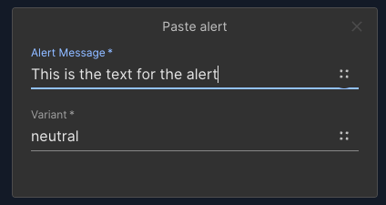
}When you create custom components, you can also specify configurable inputs that can be set using the builder.io UI. The list of input types can be found here. You can specify any number of inputs, as well as the type of input (text, boolean, color, date, etc...). For instance, let's assume you wanted register the paste alert as a custom component, but you wanted to be able to set the alert text, and the variant in the builder.io UI, you could register the component like this:
import { CustomBuilderIOComponent } from "types/CustomBuilderIOComponent";
import { Alert } from "@twilio-paste/core";

export const AlertComponent: CustomBuilderIOComponent = {
	component: Alert,
	componentOptions: {
		name: "Paste Alert",
		image:
			"https://tabler-icons.io/static/tabler-icons/icons-png/exclamation-mark.png",
		docsLink: "https://paste.twilio.design/components/alert",
		inputs: [
			{
				friendlyName: "Alert Message",
				name: "children",
				type: "text",
				defaultValue: "this is default alert text",
				required: true,
			},
			{
				friendlyName: "Variant",
				name: "variant",
				type: "text",
				enum: ["neutral", "warning", "error"],
				defaultValue: "neutral",
				required: true,
			},
		],
	},
};
Now when you wanted to use this alert in the builder.io UI, you will have configurable options to set the text string for the alert text, and a drop down menu of the various variants available.
Setting configuration in the UI is nice, but you may want some options to be set by default and not through the UI. You can programmatically set bindings on custom components so you can apply multiple bindings simultaneously. This is helpful when, for example, applying styles from an existing design system.
import {Card} from "@twilio-paste/core";
...
	const PasteCard = (props) => <Card>{props.children}</Card>;

	Builder.registerComponent(withChildren(PasteCard), {
		name: "Card",
		image:
			"https://tabler-icons.io/static/tabler-icons/icons-png/layout-cards.png",
		docsLink: "https://paste.twilio.design/components/card",
		canHaveChildren: true,
		defaults: {
			bindings: {
				"style.background": "state.theme.tokens.backgroundColors.colorBackground",
				"style.borderColor": "state.theme.tokens.borderColors.colorBorder",
				"style.color": "state.theme.tokens.textColors.colorText",
			},
		},
});We hope that you find this repo as valuable as we did. This tool has made us even more efficient at building high quality UX in the Flex UI!