New intro screen #15127
New intro screen #15127
Conversation
Jenkins BuildsClick to see older builds (32)
|
 J-Son89
force-pushed
the
jc/migrate-resources
branch
from
J-Son89
force-pushed
the
jc/migrate-resources
branch
from
c76837d to
871288a
Compare
J-Son89
force-pushed
the
jc/migrate-resources
branch
from
457c10f to
dc4ad63
Compare
|
This pr, is ready for dev review, pretty sure tests etc are failing because its base branch is pointing to my migrate resources branch. |
J-Son89
requested review from
Parveshdhull,
ulisesmac,
briansztamfater,
caybro and
flexsurfer
J-Son89
force-pushed
the
jc/migrate-resources
branch
3 times, most recently
from
6647ff9 to
f387d59
Compare
| 1500)] | ||
| #(js/clearInterval interval)))) | ||
| [rn/view {:style style/page-container} | ||
|
|
There was a problem hiding this comment.
We have various extra empty lines, could you please remove them? :)
| (defn view | ||
| [] | ||
| [:f> | ||
| (fn [] |
There was a problem hiding this comment.
I'm not sure if it's a good practice to delcare the component in this way in terms of performance 🤔
I'd say it's better to create the component using defn so it's not redefined each time view is called.
What do other devs think about it?
There was a problem hiding this comment.
it's so I could a hook, but is it possible to use hooks with the [:f> ?
There was a problem hiding this comment.
Yes, if you use defn you can always call to that component using [:f> ,,, ] and it will support hooks
| [] | ||
| [:f> | ||
| (fn [] | ||
| (rn/use-effect (fn [] |
There was a problem hiding this comment.
What do you think about using the following pattern in this case instead of using a functional component and the use-effect hook:
(defn view
  []
  (reagent/with-let [carousel-index (reagent/atom 0)
                     interval-id    (js/setInterval
                                     #(swap! carousel-index set-index)
                                     1500)]
    [rn/view {:style style/page-container}
     ;; your view code
     ]
    (finally
     (js/clearInterval interval-id))))
I've tested it and it works as expected, plus is easier to read IMO.
There was a problem hiding this comment.
sure thing, I can adjust 👍
src/status_im2/navigation/roots.cljs
Outdated
| {:root {:stack {:id :intro | ||
| :children [{:component {:name :intro | ||
| :id :intro | ||
| :options (merge |
There was a problem hiding this comment.
We could use a map with two keys instead merging two maps
src/status_im2/navigation/roots.cljs
Outdated
| :drawBehind true}} | ||
| {:statusBar {:style (if dark-mode? :light :dark)}}))) | ||
| ([dark-root?] | ||
| (let [dark-mode? (if dark-root? (colors/dark?) (utils.theme/dark-mode?))] |
There was a problem hiding this comment.
I'm curious about what was that :shell-stack.
I understand we'll pass true to this function for the onborading screens we'll create, is it correct?
There was a problem hiding this comment.
I might need to revert this code. That said, the navigation code was a bit complicated and I did not like coupling the shell-stack to that function when it could be passed as a param.
I think ideally it could be done that way @ulisesmac but would appreciate if @Parveshdhull can check it as well.
There was a problem hiding this comment.
(colors/dark?) depends on the user's choice (can only be accessed after login, that's why shell-stack) and (utils.theme/dark-mode?) depends on the system theme setting.
So after login we should use the user's choice. And as we didn't had access to that before login, we were using the system theme upto now.
But for new designs, onboarding is always the dark theme, so we can use
dark-mode? (if (= @state/root-id :shell-stack) (colors/dark?) true)
There was a problem hiding this comment.
I reverted this change for now as it's not necessary. I think it would be nice to make this not coupled with the state and just pass it in as a param.
| @@ -148,10 +139,19 @@ | |||
| [] | |||
| ;;TABS | |||
| (merge (old-roots) | |||
| ;;INTRO (onboarding carousel) | |||
| {:intro-stack | |||
There was a problem hiding this comment.
Could you please explain what's the way to add more screens to this :intro-stack? I guess we should add them into that :children vector, but I'm not sure.
Thanks!
There was a problem hiding this comment.
as far as I understand we should add them to src/status_im2/navigation/screens.cljs and then have a button that navigates to that screen. @Parveshdhull, that's how it should work,right?
There was a problem hiding this comment.
Yes, we should navigate to them with buttons.
Multiple children are used for pushing several screens at once while changing root.
For ex: After login instead of showing the shell screen, directly show chat screen. (where shell screen is also opened below it)
| :lifestyle (js/require "../resources/images/ui2/lifestyle.png") | ||
| :music (js/require "../resources/images/ui2/music.png") | ||
| :podcasts (js/require "../resources/images/ui2/podcasts.png") | ||
| :intro-1 (js/require "../resources/images/ui2/intro-1.png") |
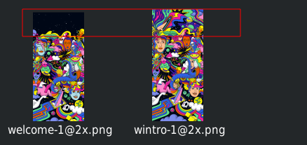
There was a problem hiding this comment.
The images added contain a transparent padding top (i.e. some transparent pixels), is it correct?
I've seen this sometimes in the designs, but I'm not sure whether that's due to the way figma exports the files or it's intended by the design team.
There was a problem hiding this comment.
yes, let's check with design team about this 👍 I exported using Figma which is the method we normally use afaik
There was a problem hiding this comment.
images look good in the app btw 👍
There was a problem hiding this comment.
yes they looks different images
Fresh Install flow uses different image then app locked etc.
(probably they are just placeholder and going to be replaced, not sure)
There was a problem hiding this comment.
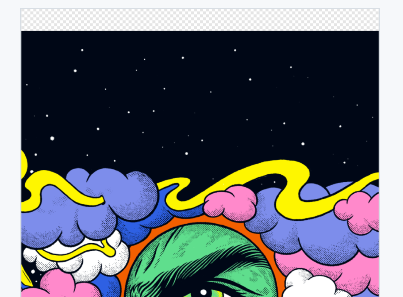
@J-Son89 @Parveshdhull I'm talking about these transparent pixels:
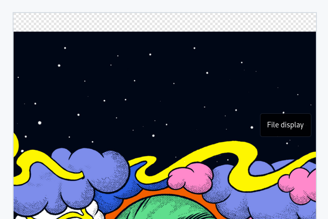
Is it ok to keep that "padding-like"?
There was a problem hiding this comment.
I think we should use this kind of images without transparent pixels, and add paddings programatically if necessary
There was a problem hiding this comment.
I'll discuss with design team!
J-Son89
force-pushed
the
jc/migrate-resources
branch
8 times, most recently
from
2287309 to
c3c50e9
Compare
J-Son89
force-pushed
the
jc/new-onboarding
branch
from
306c8ea to
6322db4
Compare
 J-Son89
force-pushed
the
jc/new-onboarding
branch
2 times, most recently
from
J-Son89
force-pushed
the
jc/new-onboarding
branch
2 times, most recently
from
84d7be9 to
e6a96e8
Compare
|
checked with design team and fixed the borders issue on Android phones |
ios/Podfile.lock
Outdated
| @@ -228,6 +228,8 @@ PODS: | |||
| - React-Core | |||
| - react-native-netinfo (4.7.0): | |||
| - React | |||
| - react-native-orientation-locker (1.5.0): | |||
There was a problem hiding this comment.
how this related to this PR?
There was a problem hiding this comment.
it's not, will remove. thanks for spotting 👍
| :bottom 0 | ||
| :left 0 | ||
| :right 0 | ||
| :width "100%" |
There was a problem hiding this comment.
redundant width and height
There was a problem hiding this comment.
will double check this 👍
| (def carousel | ||
| {:height 92 | ||
| ;; (padding-top) This insets issue needs a consistent implementation across all screens. | ||
| :padding-top (if platform/android? 0 44) |
There was a problem hiding this comment.
why is it different on android ?
There was a problem hiding this comment.
This is a common occurrence across the application. Imo it's another thing that need to be revisited in the navigation code
There was a problem hiding this comment.
or should I make use of the insets here? I believe for the redesign it is consistently like this however since we are hiding the top bar. Perhaps we can just put this in as the default inset for navigation screens and then clean up all the screens in a refactor? @Parveshdhull @flexsurfer wdyt?
There was a problem hiding this comment.
yes i see a lot of this in the new code, and it looks like a misconception, we shouldn't do it in every place
There was a problem hiding this comment.
okay, how would you feel if I leave it as is in this pr and do a follow up to configure all the screens setting this value in one place, i.e navigation screens?
There was a problem hiding this comment.
yes sure it should be done in separate PR
| :style style/highlighted-text | ||
| :weight :semi-bold} | ||
| (i18n/label :t/terms-of-service)]]]] | ||
| (finally (js/clearInterval interval-id)))) |
There was a problem hiding this comment.
credit to @ulisesmac :)
89% of end-end tests have passedFailed tests (3)Click to expandClass TestOneToOneChatMultipleSharedDevicesNewUi:
Class TestCommunityMultipleDeviceMerged:
Passed tests (24)Click to expandClass TestGroupChatMultipleDeviceMergedNewUI:
Class TestCommunityMultipleDeviceMerged:
Class TestActivityCenterMultipleDevicePR:
Class TestDeeplinkOneDeviceNewUI:
Class TestCommunityOneDeviceMerged:
Class TestOneToOneChatMultipleSharedDevicesNewUi:
|
|
Hi @J-Son89 thank you for the fixes. Issues 1,2,3 are fixed. Will you push some extra commits? If yes, let me know and I will retest it. Otherwise, no issues from my side for the last build and PR is ready to be merged |
|
Thanks @churik, will do! :) |
 J-Son89
force-pushed
the
jc/new-onboarding
branch
from
J-Son89
force-pushed
the
jc/new-onboarding
branch
from
e6a96e8 to
5034b4c
Compare
|
@VladimrLitvinenko, I pushed new changes. It's only removing one line where I had redundant |
|
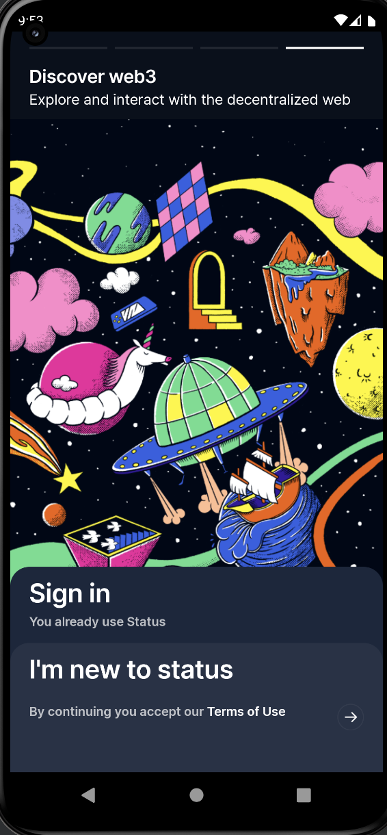
hey @J-Son89 why is there an empty space on the top of the images ? |
Yes @briansztamfater was asking about this too. Talked to design team and they added this so there is more space for the text. |
what do you mean? why can't it be done in react layout ? |
|
Sorry if unclear. Yes, that's what I am saying. I will ask designers to remove the padding from the images and we can adjust it with code if it's required. |
|
@J-Son89 I sent the image to @Parveshdhull last week. regardless, it should be in Figma next to those screens if you want to export it again |
|
Thanks @pedro-et, will get the updated images in the app 😀 |
fixes: #15014
This pr implements the basic structure of the new "intro" page.
The carousel implemented is only a quick solution with no animation, I will create a separate issue to address this and also add blur effect to the buttons. Currently we want to get this flow started so other devs work can begin as well.
Currently both buttons will just direct the user to the next page that would have been on the flow anyway.
i.e
no matter what they select they will be brought to:
To test:
Open up the application without any saved data, you should see the new opening screen