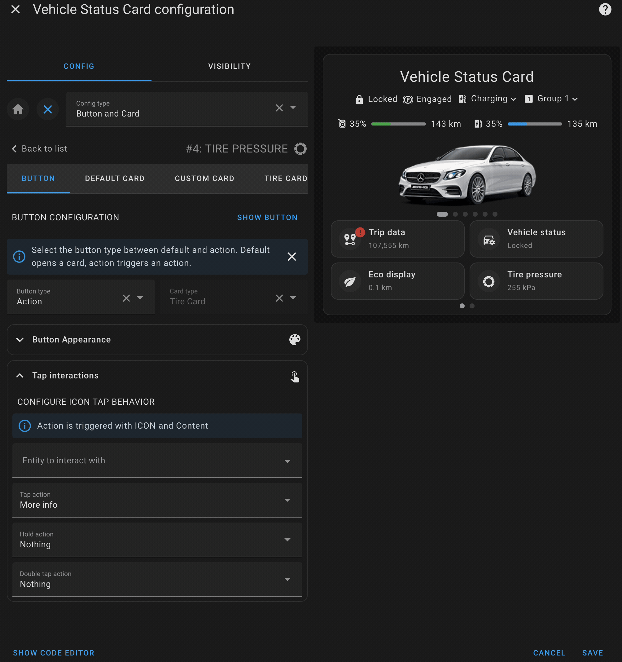
Button card
The button card is a core feature that provides interactive buttons to control or monitor specific entities in your vehicle. Each button can be customized with a primary label, secondary information, icons, and notifications.
A single button allows you to represent an entity or action related to your vehicle. You can set up the button’s appearance, behavior, and actions to suit your needs.
- Primary Label: The main label on the button, usually indicating the action or entity (e.g., "Lock Doors").
- Secondary Info: Additional details below the primary label, such as the state of an entity (e.g., "Locked" or "Unlocked").
- Icon: Customize the icon displayed on the button to visually represent the entity or action (e.g., a lock or fuel pump).
- Notifications: Set up conditional notifications to alert you when certain states occur (e.g., when the fuel level is low).
-
Action Types: New feature that allows you to configure different types of actions for the button, such as
tap,hold, ordouble_tapactions.
The Action Type feature allows you to define what action should be triggered when interacting with a button. Each button can have multiple action types configured, giving you more control over how the button behaves. You can specify different actions for tapping, holding, or double tapping the button.
- tap_action: The action triggered when the button is tapped.
- hold_action: The action triggered when the button is held down.
- double_tap_action: The action triggered when the button is double tapped.
-
more-info: Opens the more-info dialog of the entity. -
toggle: Toggles the state of the entity (e.g., fromontooff). -
call-service: Calls a Home Assistant service (e.g.,lock.lock). -
navigate: Navigates to a specified path or view in the interface. -
url: Opens a specific URL.
The default card configuration allows you to display a set of related entities with their states in a structured way. This card can display multiple pieces of information, such as sensor readings or status indicators, in a compact and organized format.
- Title: Each default card can have a title to define the category of items being displayed (e.g., "Fuel Status" or "Vehicle Locks").
- Collapsible Sections: You can optionally make sections of the card collapsible, allowing users to hide or show the details as needed.
- Items: Display a list of entities with their states, icons, and labels. This provides a clear overview of the current status of various vehicle sensors or controls (e.g., tire pressure, battery status).
The default card is perfect for grouping and displaying related entities in one place, giving users an at-a-glance view of the vehicle’s key metrics or controls.

The custom card configuration allows you to integrate any Home Assistant-supported card into the vehicle status card. This feature gives you full flexibility to display or interact with various entities using custom Lovelace cards.
- Full Lovelace Support: You can embed any Lovelace card configuration, such as entity cards, glance cards, or custom third-party cards.
- Custom Layout: Customize the layout and appearance of the card to suit your preferences, allowing you to display more complex data or control options.
- Entity Control: Use custom cards to control specific entities or display detailed information, such as real-time vehicle metrics or custom sensor data.
This powerful feature allows you to extend the functionality of the vehicle status card by adding any custom elements or controls that fit your needs.

The Tire Pressures Card allows users to monitor and display the tire pressures of their vehicle in a highly customizable manner. This card provides a visual representation of the vehicle’s tires, allowing users to assign specific entities to each tire and customize the background image, layout, and size.
This card is designed to give users a clear, at-a-glance view of their tire pressure status, ensuring they can easily monitor and respond to any issues that may arise.
- Custom Background: Upload or link to a custom image of your vehicle, allowing for a personalized layout.
- Tire Pressure Monitoring: Assign specific Home Assistant entities to each tire to display real-time pressure readings.
- Customizable Layout: You can adjust the size, position, and orientation of the vehicle image and tire indicators.
- Responsive Design: Ensure the card fits neatly within your dashboard, adapting to different screen sizes and layouts.
The card supports complete customization, from setting the vehicle's background image to adjusting the size and positioning of tire pressure indicators.
-
Background Image: Set a custom image of your vehicle (or any image of your choice) as the background to enhance the visual appeal of the tire pressures display.
-
Tire Entities: Define which Home Assistant entities should be used for each tire (front left, front right, rear left, rear right).s
-
Image Size & Position: Customize the size and position of the background image, ensuring that the tire pressure indicators fit well within the image.
-
Orientation: Choose whether the layout should be horizontal or vertical, allowing you to display the tires in the correct orientation based on the background image.
