


A rehype plugin for processing and rendering blockquote-based callouts.
This plugin adds support for callouts (admonitions/alerts), allowing you to use Obsidian's callout syntax to achieve the following features:
- Includes default callout types for various themes.
- Supports collapsible callouts with
-/+and nestable callouts. - Optionally import stylesheets for corresponding themes.
- Allows custom titles with markdown syntax.
- Customizable default callout types.
- Configurable new callout types.
- Configurable aliases for callout types.
- Configurable icon display.
- Configurable element attributes.
This plugin helps render markdown callouts, ideal for blogs built with frameworks like Astro or Next.js. It processes HTML directly without needing allowDangerousHtml in remark-rehype and supports collapsible callouts with the details tag, all without JavaScript.
This package is ESM only. In Node.js (version 18+), install with your package manager:
npm install rehype-callouts
yarn add rehype-callouts
pnpm add rehype-callouts
In Deno with esm.sh:
import rehypeCallouts from 'https://esm.sh/rehype-callouts'In browsers with esm.sh:
<script type="module">
  import rehypeCallouts from 'https://esm.sh/rehype-callouts?bundle'
</script>Say example.md contains:
<!-- Callout type names are case-insensitive: 'Note', 'NOTE', and 'note' are equivalent. -->

> [!note] This is a _non-collapsible_ callout
> Some content is displayed directly!

> [!WARNING]- This is a **collapsible** callout
> Some content shown after opening!
For vanilla JS:
// example.js
import { unified } from 'unified'
import remarkParse from 'remark-parse'
import remarkRehype from 'remark-rehype'
import rehypeCallouts from 'rehype-callouts'
import rehypeStringify from 'rehype-stringify'
import { readSync } from 'to-vfile'

const file = unified()
  .use(remarkParse)
  .use(remarkRehype)
  .use(rehypeCallouts)
  .use(rehypeStringify)
  .processSync(readSync('example.md'))

console.log(String(file))
For Astro projects:
// astro.config.ts
import { defineConfig } from 'astro/config'
import rehypeCallouts from 'rehype-callouts'

// https://docs.astro.build/en/reference/configuration-reference/
export default defineConfig({
  markdown: {
    rehypePlugins: [rehypeCallouts],
  },
})
For Next.js projects:
// next.config.ts
import createMDX from '@next/mdx'
import rehypeCallouts from 'rehype-callouts'
import type { NextConfig } from 'next'

// https://nextjs.org/docs/app/api-reference/config/next-config-js
const nextConfig: NextConfig = {
  pageExtensions: ['js', 'jsx', 'md', 'mdx', 'ts', 'tsx'],
}

const withMDX = createMDX({
  options: {
    remarkPlugins: [],
    rehypePlugins: [rehypeCallouts],
    // With Turbopack, specify plugin names as strings
    // rehypePlugins: [['rehype-callouts']],
  },
})

export default withMDX(nextConfig)
Run node example.js (pnpm dev) to get:
<div class="callout" data-callout="note" data-collapsible="false">
  <div class="callout-title">
    <div class="callout-title-icon" aria-hidden="true">
      <!-- svg icon-->
    </div>
    <div class="callout-title-text">
      This is a <em>non-collapsible</em> callout
    </div>
  </div>
  <div class="callout-content">
    <p>Some content is displayed directly!</p>
  </div>
</div>

<details class="callout" data-callout="warning" data-collapsible="true">
  <summary class="callout-title">
    <div class="callout-title-icon" aria-hidden="true">
      <!-- svg icon-->
    </div>
    <div class="callout-title-text">
      This is a <strong>collapsible</strong> callout
    </div>
    <div class="callout-fold-icon" aria-hidden="true">
      <!-- svg icon-->
    </div>
  </summary>
  <div class="callout-content">
    <p>Some content shown after opening!</p>
  </div>
</details>This package exports no identifiers. The default export is rehypeCallouts.
Used to render callouts.
options(UserOptions, optional) — configuration
Transform (Transformer).
Configuration (TypeScript type). All options are optional.
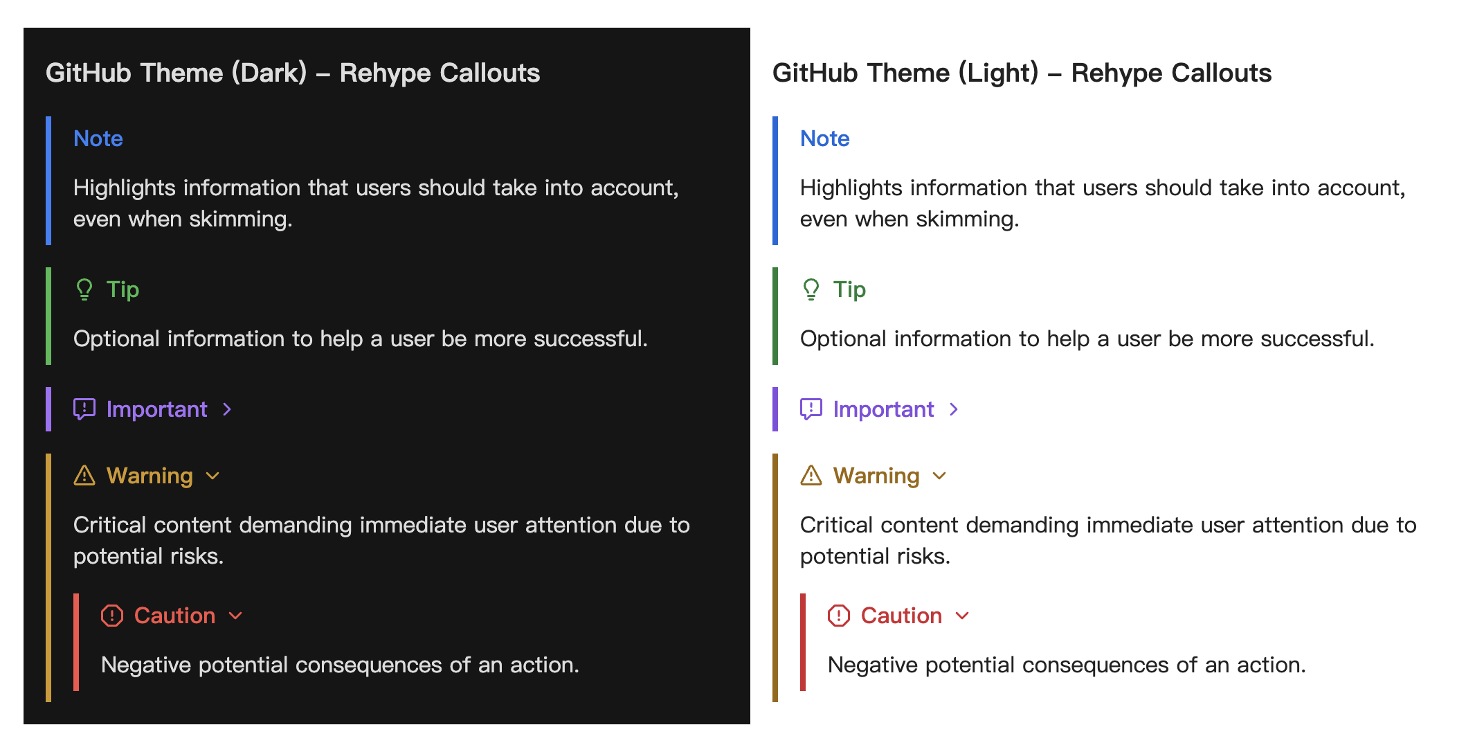
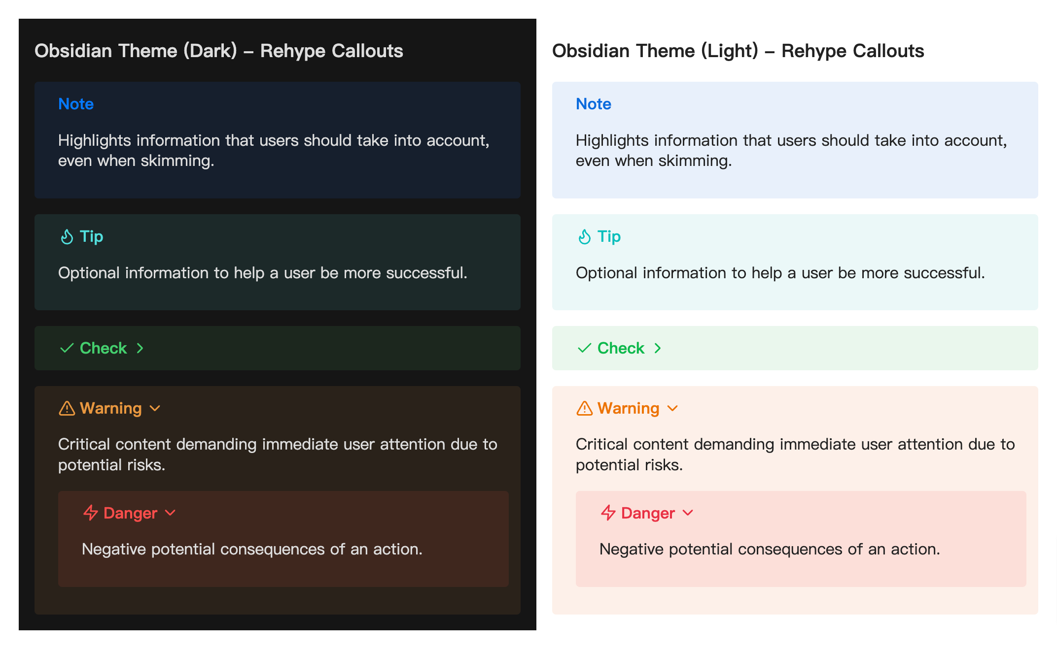
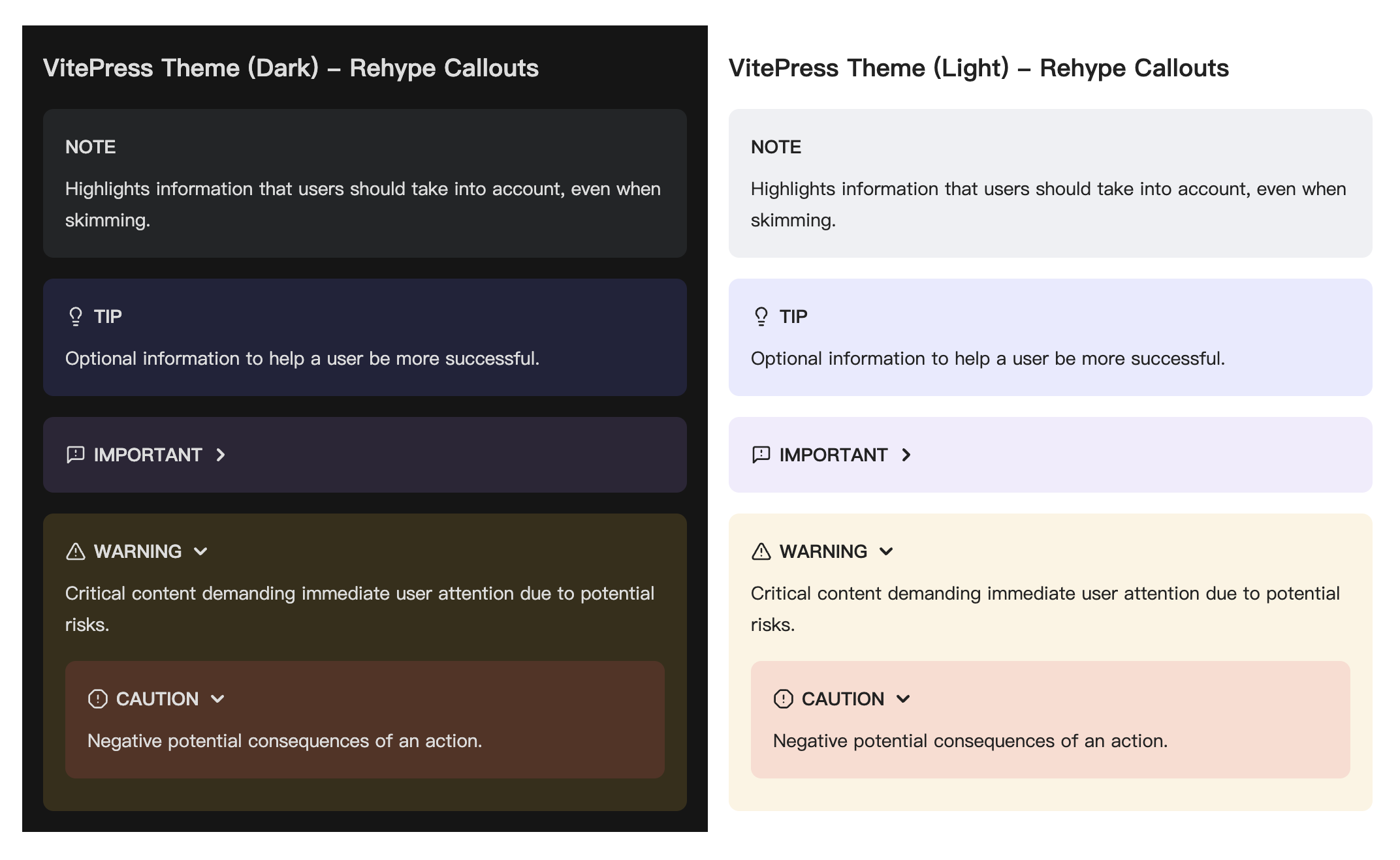
theme('github'|'obsidian'|'vitepress', default:'obsidian') — your desired callout theme to automatically apply its default callout types.callouts(Record<string, CalloutConfig>, default: see source code) — define default or custom callouts as key-value pairs, where each key is a callout type and the value specifies its default text and icon, e.g.,{'note': {title: 'custom title'}, 'custom': {title: 'new callout', indicator: '<svg ...">...</svg>'}}.aliases(Record<string, string[]>, default:{}) — aliases for callout types, e.g.,{'note': ['n'], 'tip': ['t']}.showIndicator(boolean, default:true) — whether to display an type-specific icons before callout title.tags(TagsConfig, default: alldiv) — HTML tag names for callout structure elements.props(PropsConfig, default: allnull) — properties for callout structure elements, whereclassorclassNameoverrides default class names; see examples below.
You can customize callout styles with the class names or by importing the provided theme-specific stylesheets using one of the following methods.
Import in JavaScript/TypeScript:
import 'rehype-callouts/theme/github'
// import 'rehype-callouts/theme/obsidian'
// import 'rehype-callouts/theme/vitepress'
Import in a CSS file:
@import 'rehype-callouts/theme/github';Import in a Sass file:
@use 'rehype-callouts/theme/github';Directly include in HTML via CDN (unpkg.com or jsdelivr.net):
<link
  rel="stylesheet"
  href="https://unpkg.com/rehype-callouts/dist/themes/github/index.css"
/>
<link
  rel="stylesheet"
  href="https://cdn.jsdelivr.net/npm/rehype-callouts/dist/themes/github/index.css"
/>
Once imported, you can set colors for default or custom callouts as follows:
/* Using CSS custom properties (for default callouts only) */
:root {
  --callout-note-color-light: pink;
  --callout-note-color-dark: #ffc0cb;
  --callout-tip-color-light: rgb(255, 192, 203);
  --callout-tip-color-dark: hsl(350, 100%, 88%);
  /* Customize colors for default callout types included in the theme
  using `--callout-{type}-color-{light|dark}: <color>` */
}

/* Using attribute selectors (for both default and custom callouts) */
/* Custom callouts default to `#888` if no color is set */
[data-callout='warning'],
[data-callout='custom'] {
  --rc-color-light: pink;
  --rc-color-dark: #ffc0cb;
}This package provides callout styles for GitHub, Obsidian, and VitePress. It supports dark mode via the .dark class, and also works automatically with prefers-color-scheme for environments without class-based toggling. For more, check the source code.
The props option allows overriding the default class names generated by the plugin. The example from before can be changed like so:
import rehypeCallouts from 'rehype-callouts'
...

const file = unified()
  .use(remarkParse)
  .use(remarkRehype)
- .use(rehypeCallouts)
+ .use(rehypeCallouts, {
+   props: {
+     titleProps: { class: 'custom-class1' },
+     contentProps: { className: ['custom-class2', 'custom-class3'] },
+   },
+ })
  .use(rehypeStringify)
  .processSync(readSync('example.md'))

console.log(String(file))
…that would output:
<div class="callout" data-callout="note" data-collapsible="false">
- <div class="callout-title">
+ <div class="custom-class1">
    <div class="callout-title-icon" aria-hidden="true">
      <!-- svg icon-->
    </div>
    <div class="callout-title-text">
      This is a <em>non-collapsible</em> callout
    </div>
  </div>
- <div class="callout-content">
+ <div class="custom-class2 custom-class3">
    <p>Some content is displayed directly!</p>
  </div>
</div>

<details class="callout" data-callout="warning" data-collapsible="true">
- <summary class="callout-title">
+ <summary class="custom-class1">
    <div class="callout-title-icon" aria-hidden="true">
      <!-- svg icon-->
    </div>
    <div class="callout-title-text">
      This is a <strong>collapsible</strong> callout
    </div>
    <div class="callout-fold-icon" aria-hidden="true">
      <!-- svg icon-->
    </div>
  </summary>
- <div class="callout-content">
+ <div class="custom-class2 custom-class3">
    <p>Some content shown after opening!</p>
  </div>
</details>The props option allows adding custom attributes to elements in generated callouts. The example from before can be changed to add the dir: auto attribute to the outer container of both collapsible and non-collapsible callouts, and to set a custom color for 'note' callouts, like so:
import rehypeCallouts from 'rehype-callouts'
...

const file = unified()
  .use(remarkParse)
  .use(remarkRehype)
- .use(rehypeCallouts)
+ .use(rehypeCallouts, {
+   props: {
+     containerProps(_, type) {
+       const newProps: Record<string, string> = {
+         dir: 'auto',
+       }
+       if (type === 'note') {
+         newProps.style = '--rc-color-light:#fc7777; --rc-color-dark:#fa9292;'
+       }
+       return newProps
+     },
+   },
+ })
  .use(rehypeStringify)
  .processSync(readSync('example.md'))

console.log(String(file))
…that would output:
<div
+ dir="auto"
+ style="--rc-color-light:#fc7777; --rc-color-dark:#fa9292;"
  class="callout"
  data-callout="note"
  data-collapsible="false"
>
  <div class="callout-title">
    <div class="callout-title-icon" aria-hidden="true">
      <!-- svg icon-->
    </div>
    <div class="callout-title-text">
      This is a <em>non-collapsible</em> callout
    </div>
  </div>
  <div class="callout-content">
    <p>Some content is displayed directly!</p>
  </div>
</div>

<details
+ dir="auto"
  class="callout"
  data-callout="warning"
  data-collapsible="true"
>
  <summary class="callout-title">
    <div class="callout-title-icon" aria-hidden="true">
      <!-- svg icon-->
    </div>
    <div class="callout-title-text">
      This is a <strong>collapsible</strong> callout
    </div>
    <div class="callout-fold-icon" aria-hidden="true">
      <!-- svg icon-->
    </div>
  </summary>
  <div class="callout-content">
    <p>Some content shown after opening!</p>
  </div>
</details>
Note: In Svelte, using dir="auto" may trigger a compiler error. See #15126 for details.
This package is fully typed with TypeScript. It exports the additional types UserOptions, CalloutConfig, TagsConfig, PropsConfig and CreateProperties. See jsDocs.io for type details.
- staticnoise/rehype-obsidian-callout - basic functionality.
- Octions - default icons for GitHub callouts.
- Lucide - default icons for Obsidian, VitePress callouts.
If you see any errors or room for improvement on this plugin, feel free to open an issues or pull request . Thank you in advance for contributing!
MIT © 2024-PRESENT Stephanie Lin