Bounceable Flutter Widget Kit
import 'package:bouncing_widgets/bouncing_widgets.dart';
CustomBounceWidget(
    onPressed: () => print("Clicked"),
    child: Container(
    color: Colors.red,
    height: 100,
    width: 100,
    ),
)
| Parameter | Type | Description |
|---|---|---|
onPressed |
VoidCallback |
Required. Click function |
child |
Widget |
Required. Child widget |
isScrollable |
bool |
Important Set it to true if you are going to use it in a list |
scaleFactor |
double |
Scale factor |
duration |
Duration |
Animation duration |
canReverse |
bool |
Whether the animation can revers or not |
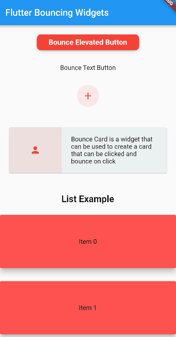
BounceElevatedButton(
    onPressed: () => showSnackBar(context, 'Clicked BounceElevatedButton'),
    color: Colors.red,
    borderRadius: BorderRadius.circular(10),
    child: const Text(
        'Bounce Elevated Button',
        style: TextStyle(
        color: Colors.white,
        fontSize: 16,
        fontWeight: FontWeight.bold,
        ),
    ),
)
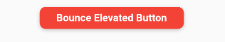
BounceTextButton(
    onPressed: () => showSnackBar(context, 'Clicked BounceTextButton'),
    child: Text('Bounce Text Button'),
)
BounceCircleAvatar(
    onPressed: () => showSnackBar(context, 'Clicked BounceCircleAvatar'),
    backgroundColor: Colors.red.withOpacity(0.1),
    child: const Icon(Icons.add, color: Colors.red),
)
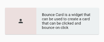
BounceCard(
  onPressed: () => showSnackBar(context, 'Clicked BounceCard'),
  child: Row(
    mainAxisAlignment: MainAxisAlignment.center,
    children: [
      Expanded(
        flex: 1,
        child: Container(
          height: 100,
          color: Colors.red.withOpacity(0.1),
          child: const Icon(
            Icons.person,
            color: Colors.red,
          ),
        ),
      ),
      const Expanded(
        flex: 2,
        child: SizedBox(
          height: 100,
          child: Padding(
            padding: EdgeInsets.symmetric(horizontal: 20),
            child: Center(
              child: Text(
                "Bounce Card is a widget that can be used to create a card that can be clicked and bounce on click",
              ),
            ),
          ),
        ),
      ),
    ],
  ),
)
You can use the .bounce() extension to bounceable your widget
MyAwesomeWidget().bounce(
    onPressed: () {},
)
| Parameter | Type | Description |
|---|---|---|
onPressed |
VoidCallback |
Required. Click function |
isScrollable |
bool |
Important Set it to true if you are going to use it in a list |
scaleFactor |
double |
Scale factor |
duration |
Duration |
Animation duration |
canReverse |
bool |
Whether the animation can revers or not |