


A custom card showing a meteogram with wind barbs, powered by Met.no API or Home Assistant weather entity.
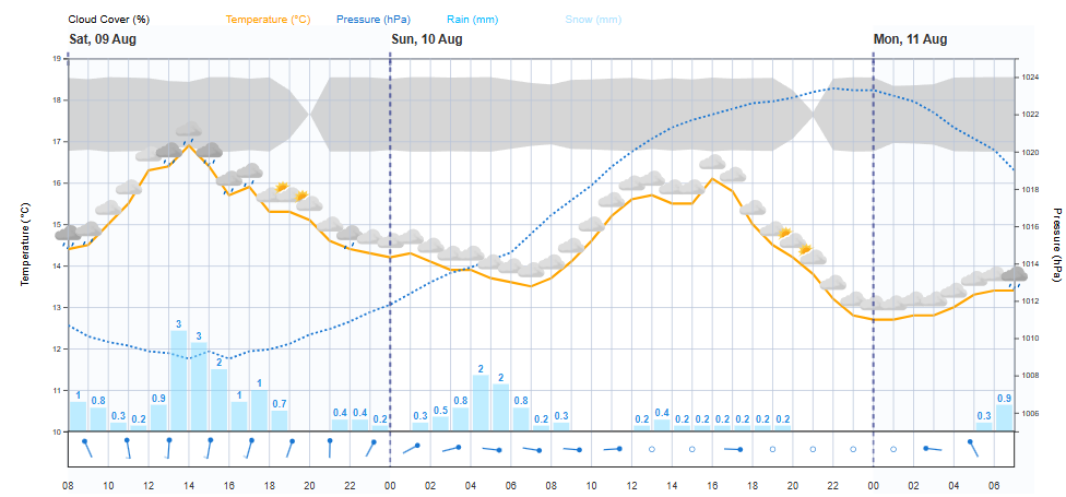
- Full weather forecast visualization
- Temperature curve with weather icons
- Precipitation display (rain/snow) with probability indicators
- Cloud coverage visualization
- Professional-style wind barbs showing wind speed and direction
- Barometric pressure trend
- Automatically uses Home Assistant's configured location or weather entity
- Open Home Assistant and go to HACS > Frontend.
- Click the "+" button to add a new integration.
- Search for Meteogram Card.
- Click Install.
- Restart Home Assistant if prompted.
You no longer need to add a custom repository. The card is available directly in HACS.
Add the card to your dashboard:
type: custom:meteogram-card
title: Weather Forecast
# Optional: specify coordinates, or use Home Assistant's default location
latitude: 51.5074
longitude: -0.1278
# Optional: use a Home Assistant weather entity
entity_id: weather.home
# Optional: toggle display components
show_cloud_cover: true
show_pressure: true
show_weather_icons: true
show_wind: true
show_precipitation: trueIf you set entity_id, the card will use the forecast from that entity.
Supported entities: any Home Assistant weather entity with a forecast attribute.
Important Note:
Most Home Assistant weather integrations do not provide the full set of attributes that meteogram-card can display.
For example, some integrations may lack cloud cover, precipitation_max, or even wind speed and direction.
Additionally, weather integration entities may only provide data for a limited number of hours (often 24 or 48), which may restrict the length of the meteogram.
For example some Weather integrations for Home Assistant only provide 24 hours of forecast data, which gives a 23 hour meteogram.
For best functionality and a complete meteogram, passing latitude and longitude (to use the Met.no API) is recommended.
Caching:
Forecasts are cached in localStorage under meteogram-card-entity-weather-cache, keyed by entity ID.
Multiple entities can be cached and retrieved independently.
If no entity_id is set, the card uses the Met.no API and caches per location.
The meteogram retrieves weather data from the Met.no API or a Home Assistant weather entity and displays it in a visually appealing format.
- Temperature Curve
Displays temperature over the next specified period with weather icons for each hour. - Precipitation Visualization
Shows rain and snow probability with bars indicating expected precipitation. - Cloud Coverage
Visualizes cloud cover as a shaded area on the chart. - Wind Barbs
Displays wind speed and direction using professional-style wind barbs. - Barometric Pressure
Shows the pressure trend over the next 48 hours with an optional right-side axis.
Configure various display options like cloud cover, pressure, weather icons, wind, and rain.
- Meteogram Length
Configurable length of the meteogram (8, 12, 24, 48 hours, or "max" for full available data). - Weather Icons Density
Choose between dense (every hour) or sparse (every 2 hours) weather icons. - Title
Optional title for the card, displayed at the top.
- Dynamic Location
Automatically uses Home Assistant's configured location, specified coordinates, or weather entity. - Responsive Design
Automatically resizes to fit the card/container, ensuring a good layout on both wide and narrow screens. - Error Handling
User-friendly error messages for network issues, API errors, and CORS problems. - Dark Mode Support
Optimized for Home Assistant's dark mode with improved color contrast. - Visual Editor Support
Fully compatible with Home Assistant's visual editor for easy configuration. - Caching
Caches weather data per location or per entity to reduce API calls and improve performance. - Location Handling
Uses configured coordinates, Home Assistant's location, or falls back to a default location (London).
| Name | Type | Default | Description |
|---|---|---|---|
| title | string | "Weather Forecast" | Optional title for the card |
| latitude | number | HA's default | Latitude for weather data |
| longitude | number | HA's default | Longitude for weather data |
| altitude | number | HA's default | Altitude (in meters) for weather data. Optional; improves accuracy for some locations. |
| entity_id | string | none | Weather entity to use as data source |
| show_cloud_cover | boolean | true | Show/hide cloud cover visualization |
| show_pressure | boolean | true | Show/hide pressure curve |
| show_precipitation | boolean | true | Show/hide precipitation visualization (replaces deprecated show_rain) |
| show_weather_icons | boolean | true | Show/hide weather icons |
| show_wind | boolean | true | Show/hide wind barbs section |
| dense_weather_icons | boolean | true | Show weather icons every hour (true) or every 2 hours (false) |
| meteogram_hours | string | "48h" | Number of hours to display in the meteogram (8h, 12h, 24h, 48h, 54h, or max) |
| aspect_ratio | string | "16:9" | Aspect ratio for the chart (e.g., "16:9", "4:3"). Only applies in panel/grid layout modes. |
| layout_mode | string | "sections" | Layout mode for the card: "sections", "panel", or "grid" |
| diagnostics | boolean | false | Show diagnostics/status panel (for troubleshooting) |
| display_mode | string | "full" | Display mode: "full", "core", or "focussed" (use display_mode instead of deprecated focussed) |
| focussed | boolean | false | (Deprecated) Use display_mode: "focussed" instead. |
| styles | object | {{}} | Custom CSS variables for card styling |
show_precipitationreplaces the deprecatedshow_rainoption. For backward compatibility,show_rainis still supported but will be ignored ifshow_precipitationis set.meteogram_hoursreplaces the deprecatedmeteogram_lengthoption. For backward compatibility,meteogram_lengthis still supported but will be ignored ifmeteogram_hoursis set.layout_modecontrols the card's layout. Possible values:sections(default): Standard Home Assistant card layout.panel: Wide, single-panel layout (good for dashboards).grid: Grid layout for advanced dashboarding.
aspect_ratioonly applies inpanelorgridlayout modes.diagnosticsenables a status panel for troubleshooting API/data issues.display_modeis the preferred way to set the card's display style. Use"focussed"for a minimal chart-only view.altitudeis optional and can be set to improve forecast accuracy for locations at significant elevation. If not set, the Home Assistant default altitude is used (if available).
Experimental Option for Advanced/Legacy Views
The layout_mode option controls the overall layout of the meteogram card. The default and recommended value is sections, which is designed to integrate seamlessly with Home Assistant's modern dashboard experience.
- sections (default, recommended):
- The primary and best-supported view for meteogram-card.
- Uses Home Assistant's standard card layout, ensuring maximum compatibility and visual consistency.
- All features and options are tested and optimized for this mode.
- panel (experimental):
- Renders the chart in a wide, single-panel layout.
- Useful for legacy dashboards or custom kiosk views.
- Some features or styling may not be as robust as in
sectionsmode.
- grid (experimental):
- Places the chart in a grid layout for advanced dashboarding.
- Intended for power users and special use cases.
- May not be fully supported in all Home Assistant themes or dashboard types.
Note: The
panelandgridmodes are provided for advanced users and legacy compatibility. Most users should use the defaultsectionsmode for the best experience.
Note: The
layout_modeoption is not available in the visual (interactive) editor. To uselayout_mode, you must open the YAML editor (click "Show code editor" in the card configuration dialog) and add the option manually. This is becauselayout_modeis an advanced/experimental feature and not exposed in the standard UI.
Only applies in
panelorgridlayout modes
The aspect_ratio option allows you to control the width-to-height ratio of the chart area. This is only relevant if you are using layout_mode: panel or layout_mode: grid.
- Examples:
16:9(default),4:3,1:1,21:9,3:2, or a custom value like1.6or5:3. - Has no effect in the default
sectionslayout mode.
Recommended:
- Use the default
sectionslayout for most dashboards. Only usepanelorgrid(and thusaspect_ratio) if you have a specific advanced use case or are maintaining a legacy dashboard.
type: custom:meteogram-card
title: Weather Forecast
latitude: 51.5074
longitude: -0.1278
entity_id: weather.home
show_cloud_cover: true
show_pressure: true
show_precipitation: true
show_weather_icons: true
show_wind: true
dense_weather_icons: true
meteogram_hours: 48h
aspect_ratio: "16:9"
layout_mode: sections
diagnostics: false
display_mode: full
styles:
  --meteogram-label-font-size: "16px"
--meteogram-grid-color: "#1976d2"type: custom:meteogram-card
display_mode: focussedtype: custom:meteogram-card
layout_mode: panel
aspect_ratio: "21:9"type: custom:meteogram-card
diagnostics: trueWhy are some colors named instead of hex codes? To avoid HACS/GitHub auto-linking hex codes like
#333and#444as issue references, these have been replaced with named CSS colors (e.g.,darkgray,dimgray,gray,black) in documentation examples. You can safely copy-paste these values—they will work in Home Assistant and CSS. Other hex codes remain unchanged.
Example: Customize chart colors
type: custom:meteogram-card
styles:
  --meteogram-cloud-color: "#ffb300"
  --meteogram-grid-color: "#1976d2"
  --meteogram-cloud-color-dark: "darkgray"
  --meteogram-grid-color-dark: "dimgray"   # Dark mode grid color
Example: Change font size for labels, legends, and axis ticks
type: custom:meteogram-card
styles:
  --meteogram-label-font-size: "18px"      # Axis labels, date/hour/rain labels
  --meteogram-legend-font-size: "16px"     # Legend text
  --meteogram-tick-font-size: "15px"       # Y axis tick text
Example: Customize rain bar, temperature line, pressure line, wind barb colors, and rain label text
type: custom:meteogram-card
styles:
  --meteogram-rain-bar-color: "#2196f3"
  --meteogram-rain-bar-color-dark: "#1565c0"
  --meteogram-rain-max-bar-color: "#90caf9"
  --meteogram-rain-max-bar-color-dark: "#1976d2"
  --meteogram-temp-line-color: "#ff9800"
  --meteogram-temp-line-color-dark: "#ffd54f"
  --meteogram-pressure-line-color: "#1976d2"
  --meteogram-pressure-line-color-dark: "#90caf9"
  --meteogram-wind-barb-color: "#388e3c"
  --meteogram-wind-barb-color-dark: "#c8e6c9"
  --meteogram-rain-label-color: "#d32f2f"
  --meteogram-rain-label-color-dark: "#ffebee"
  --meteogram-rain-max-label-color: "#1976d2"
  --meteogram-rain-max-label-color-dark: "#90caf9"
  --meteogram-cloud-color: red
  --meteogram-cloud-color-dark: darkgray
  --meteogram-grid-color-dark: dimgray
Usage notes:
- All values must be strings.
- You can override any CSS variable used by the card.
- For dark mode, if a
-darkvariable is not set, the card will use the corresponding non-dark variable as a fallback. - For a full list of variables, see doc/STYLES.md.
You can override the following CSS variables via the styles option:
--card-background-color--primary-text-color--secondary-text-color--error-color--divider-color--meteogram-label-font-size--meteogram-legend-font-size--meteogram-tick-font-size--meteogram-cloud-color--meteogram-grid-color--meteogram-pressure-line-color--meteogram-timescale-color--meteogram-rain-bar-color--meteogram-rain-max-bar-color--meteogram-temp-line-color--meteogram-wind-barb-color--meteogram-rain-label-color--meteogram-rain-max-label-color--meteogram-cloud-color-dark--meteogram-grid-color-dark--meteogram-pressure-line-color-dark--meteogram-rain-bar-color-dark--meteogram-rain-max-bar-color-dark--meteogram-temp-line-color-dark--meteogram-wind-barb-color-dark--meteogram-rain-label-color-dark--meteogram-rain-max-label-color-dark--meteogram-snow-bar-color--meteogram-snow-bar-color-dark
For more details and examples, see doc/STYLES.md.
This card fetches weather data from the Met.no API or from a Home Assistant weather entity.
If no coordinates or entity are specified, it will use your Home Assistant's configured location.
The card uses the "complete" API endpoint to retrieve precipitation probability data, which allows visualization of rain/snow uncertainty.
For developers, the Meteogram Card is built with TypeScript and uses modern web technologies.
- Weather data provided by MET Norway Weather API
- Weather icons from Met.no Weather Icons
The following are the default configuration properties for the Meteogram Card (as of the latest version):
| Property | Default Value |
|---|---|
| title | "" |
| latitude | undefined |
| longitude | undefined |
| showCloudCover | true |
| showPressure | true |
| showRain | true |
| showWeatherIcons | true |
| showWind | true |
| denseWeatherIcons | true |
| meteogramHours | "48h" |
| styles | {{}} |
| diagnostics | DIAGNOSTICS_DEFAULT |
| entityId | undefined |
| focussed | false |
Note: DIAGNOSTICS_DEFAULT is defined in the code and typically defaults to false for production builds.
The following are the default CSS variables for the card. You can override these in your Home Assistant theme or via the styles property:
:host {
    --meteogram-grid-color: #b8c4d9;
    --meteogram-grid-color-dark: #444;
    --meteogram-temp-line-color: orange;
    --meteogram-temp-line-color-dark: orange;
    --meteogram-pressure-line-color: #90caf9;
    --meteogram-pressure-line-color-dark: #90caf9;
    --meteogram-rain-bar-color: deepskyblue;
    --meteogram-rain-bar-color-dark: deepskyblue;
    --meteogram-rain-max-bar-color: #7fdbff;
    --meteogram-rain-max-bar-color-dark: #7fdbff;
    --meteogram-rain-label-color: #0058a3;
    --meteogram-rain-label-color-dark: #a3d8ff;
    --meteogram-rain-max-label-color: #2693e6;
    --meteogram-rain-max-label-color-dark: #2693e6;
    --meteogram-cloud-color: #b0bec5;
    --meteogram-cloud-color-dark: #eceff1;
    --meteogram-wind-barb-color: #1976d2;
    --meteogram-wind-barb-color-dark: #1976d2;
    --meteogram-snow-bar-color: #b3e6ff;
    --meteogram-snow-bar-color-dark: #e0f7fa;
    --meteogram-label-font-size: 13px;
    --meteogram-legend-font-size: 14px;
    --meteogram-tick-font-size: 13px;
    --meteogram-axis-label-color: #000;
    --meteogram-axis-label-color-dark: #fff;
    --meteogram-timescale-color: #ffb300;
    --meteogram-timescale-color-dark: #ffd54f;
}
Note: The default grid color in dark mode is now a dark grey (#444). This improves contrast and visual clarity in dark mode. Override with --meteogram-grid-color-dark if desired.
The meteogram displays wind speed and direction using professional-style wind barbs, a standard meteorological symbol. Each wind barb is plotted at the corresponding forecast hour and visually encodes both the wind speed and the direction:
- Direction:
- The shaft of the wind barb points in the direction from which the wind is blowing.
- North is up on the chart, so a barb pointing straight up means wind is coming from the north (blowing south).
- For example, a barb pointing to the right (east) means wind is coming from the east (blowing west).
- Speed:
- Wind speed is indicated by the number and type of barbs (feathers) and flags on the shaft:
- Short feather: 5 knots
- Long feather: 10 knots
- Triangle (flag): 50 knots (not used in this card; only short and long feathers are shown)
- The total wind speed is the sum of the values of all feathers on the barb.
- For example, a barb with two long feathers and one short feather represents 25 knots (10 + 10 + 5).
- If the wind is very light (less than 2 knots), a small circle is drawn instead of a barb ("calm").
- Wind speed is indicated by the number and type of barbs (feathers) and flags on the shaft:
- Placement:
- Wind barbs are shown in a dedicated band below the main chart area, aligned with the forecast hour.
- The length of the shaft and the size of the feathers are scaled for readability.
- Gusts:
- Wind gusts are currently not shown in the meteogram. Only the sustained wind speed and direction are visualized. If your data source provides gust information, it will not be displayed in the wind barb band at this time.
Reading the wind barbs:
- The orientation of the shaft shows the wind's origin direction (where it's coming from).
- The number and type of feathers show the wind speed in knots.
- Calm winds (less than 2 knots) are shown as a small circle.
Example:
- A wind barb pointing up with one long and one short feather: wind from the north at 15 knots.
- A wind barb pointing left with two long feathers: wind from the west at 20 knots.
This visualization allows you to quickly assess both the strength and direction of the wind at each forecast hour, just as in professional meteorological charts.