Re: Circularity Assessment Protocol(CAP) Reports
To implement data visualizations for comparison & analysis of CAP data in the dashbaord of an online portal to be shared with clients & the scientific community
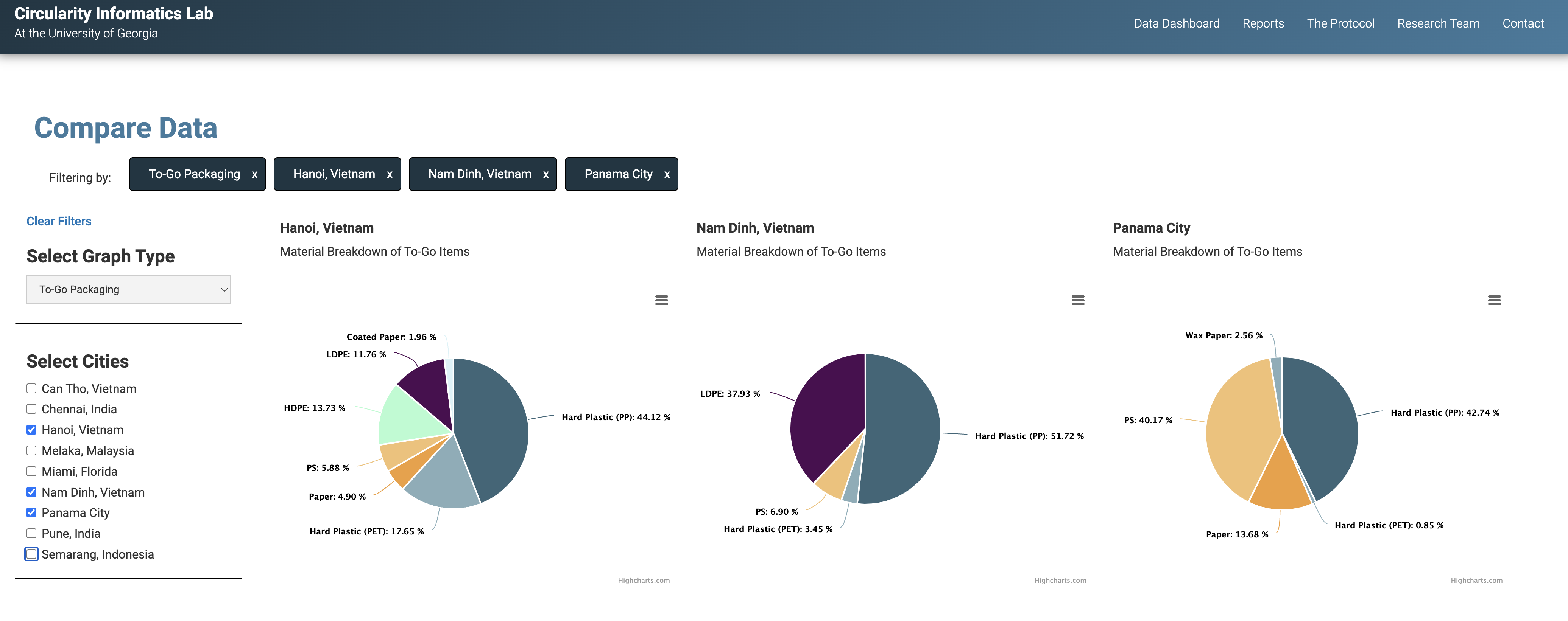
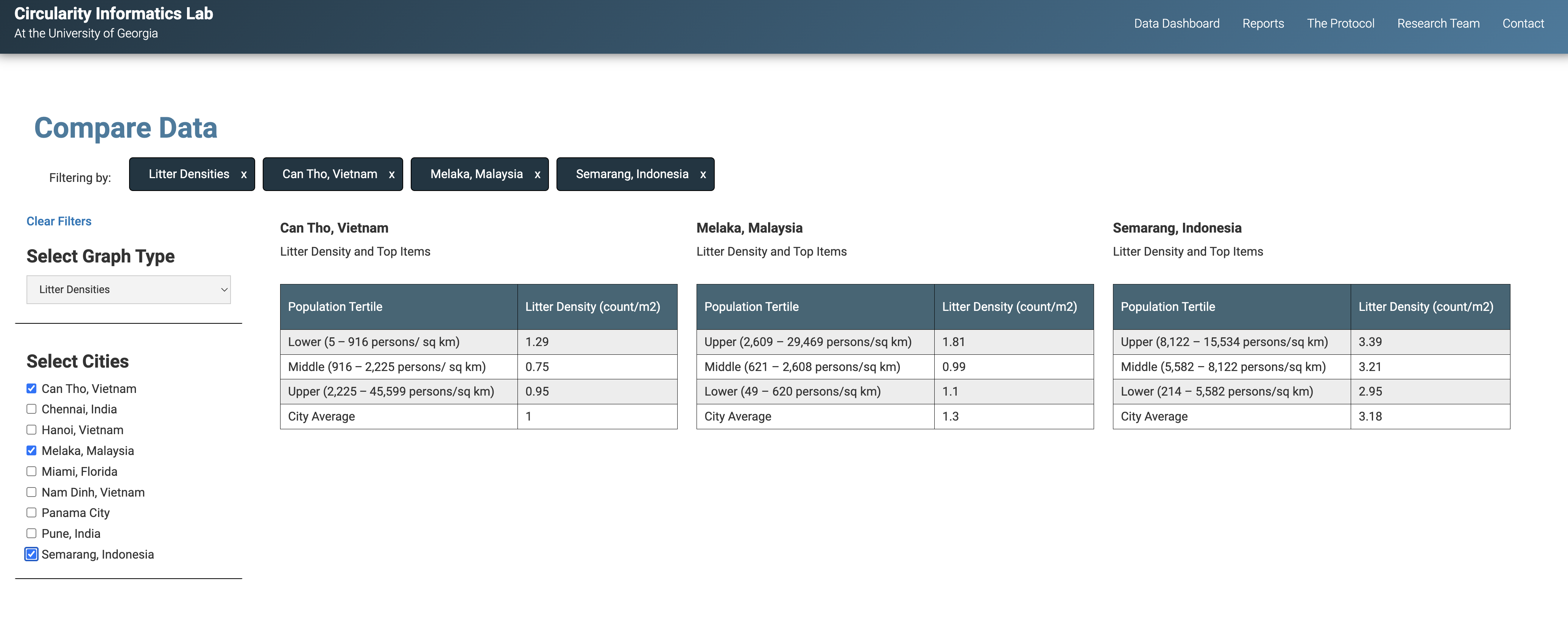
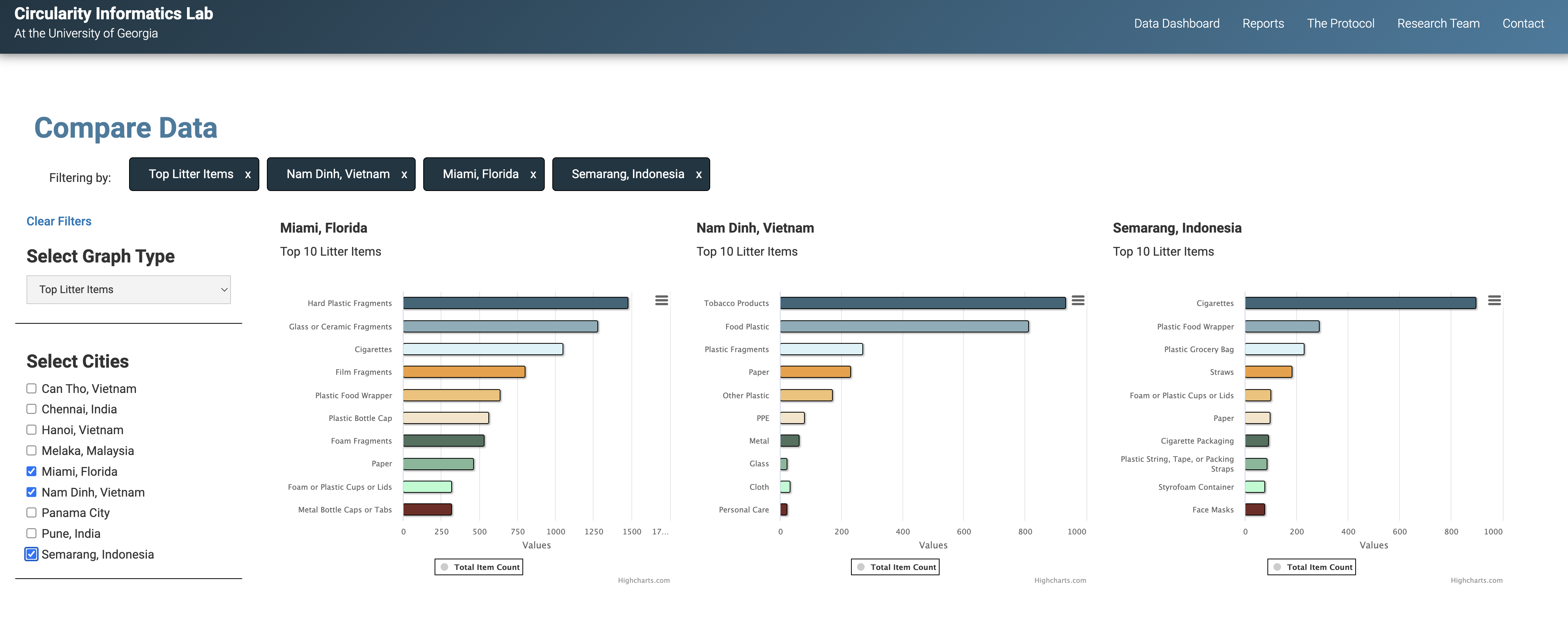
Preview the Data Dashboard here
- Create .csv assets and make accessible via content delivery network (i.e. jsdelivr , github, etc.)
- Import .csv file data via asynchronous fetch request
- Make appropriate use of this data in order to display it in the DOM
- Render .csv text in dynamic data visualizatons via the HighCharts API
- Convert remaining .csv text into HTML tables for static presentation of alternate datasets
- Render results in the DOM dynamically as each of the datasets in question is pulled from the CMS
- Integrate both types of data visulations into a dynamic search & filtering interface with active tagging enabled