
CTkExtendedGraph is a CustomTkinter widget that allows you to display a stacked bar chart in a flexible and customizable manner. It is built on top of the matplotlib library and can be easily integrated into any Tkinter-based GUI application. You can use it to visualize data with two categories (e.g., Solar vs Grid energy consumption) and dynamically add new data entries.
-
Installation via pip: Easy installation using pip.
-
Resizable: The widget automatically adjusts its size to fit within its parent container.
-
Customizable: You can customize the chart's title, categories, colors, and units.
-
Dynamic Updates: Allows adding new data entries to the chart dynamically.
-
Dark Theme: The widget features a dark theme with white text and chart elements.
Caution
Limitation: The add_new_entry() method will overwrite existing data if the key already exists in the dictionary. This functionality is not fixable and should be kept in mind when using this feature. This will also happen if you provide duplicate keys in the constructor - CTkExtendedGraph can't handle this.
To install the package via pip, use the following command:
pip install CTkExtendedGraph
import customtkinter as ctk
from CTkExtendedGraph import CTkExtendedGraph

# Sample Data
data = {
    "Jan": (200, 0), "Feb": (180, 40), "Mar": (220, 30),
    "Apr": (250, 20), "May": (300, 15), "Jun": (350, 10),
    "Jul": (330, 20), "Aug": (310, 25), "Sep": (270, 30),
    "Oct": (230, 40), "Nov": (190, 50), "Dec": (180, 60)
}

# Create the application window
app = ctk.CTk()
app.geometry("700x500")

# Create the graph widget
graph = CTkExtendedGraph(app, "Charged Energy", data, category_labels=("Solar", "Grid"), category_colors=("#FF5733", "#33FFCE"), unit="kWh")
graph.pack(fill='both', expand=True)

# Button to add new data entry
def on_button_click():
    graph.add_new_entry({"Jan": (100, 10)})

button = ctk.CTkButton(app, text="Test", command=on_button_click)
button.pack()

# Run the application
app.mainloop()
- add_new_entry(new_entry):
-
- Adds a new entry to the chart and redraws it.
-
new_entryshould be a dictionary with a single key (e.g.,{"Jan": (100, 20)})
-
- Note: If the key already exists, it will overwrite the existing values.
master: Parent widget for the chart (e.g., Tkinter root window).title: The title of the chart.data: A dictionary of data where keys are months, and values are tuples representing the two categories (e.g.,{"Jan": (200, 50)}).category_labels: A tuple with labels for the two categories.category_colors: : A tuple with colors for the two categories.unit: The unit of measurement (e.g.,"kWh").width&height: The width and height of the chart.
-
This widget requires the
customtkinter,matplotlib, andnumpylibraries. -
The
add_new_entry()method does not handle overwriting checks for existing keys. If you attempt to add a key that already exists, it will replace the old value. Please take caution when adding new entries to the chart.
At this time, no issues related to key overwriting in add_new_entry() will be fixed. The behavior is by design.
Feel free to fork the repository, make your improvements, and contribute!
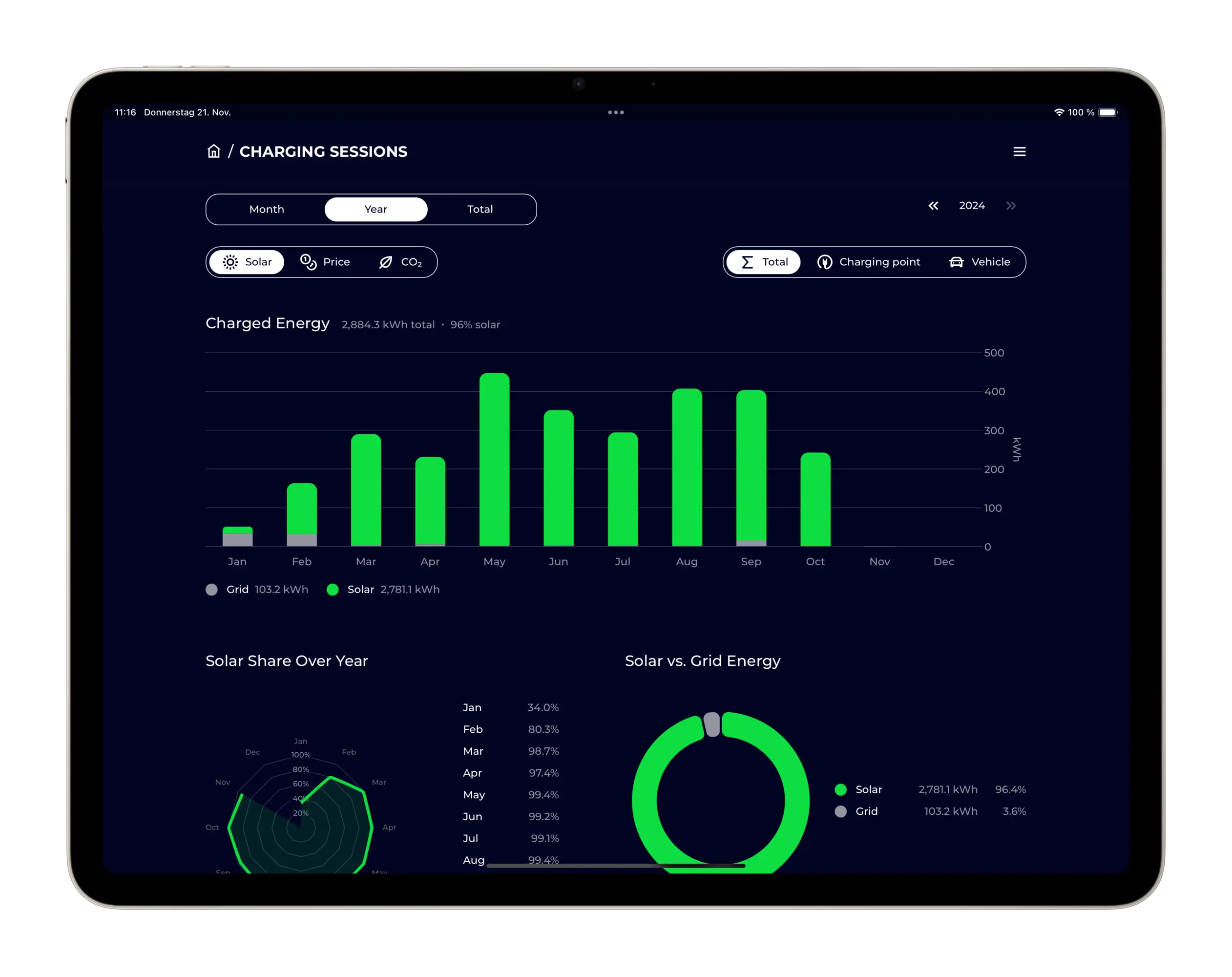
The Inspiration for this Widget was taken from the evcc Project, it was this Picture I took for reference.
This Widget has been created for one of my colleagues at work, they needed something like this in their Project. I just decided to open source it, so others can use it too.
If you like this widget, please consider leaving a star⭐!
If you enjoy my work and want to support me, feel free to check out my other projects, follow me on GitHub, or consider sponsoring me!