Homework 2 #8
Homework 2 #8
Conversation
 DanilRostov
left a comment
DanilRostov
left a comment
DanilRostov
left a comment
There was a problem hiding this comment.
Good job! Almost all responsive markup looks good :) Some small issues, but nothing critical.
Anatoly Shlom/flex/css/flex.less
Outdated
| align-self: center; | ||
| } | ||
| .nav-block__date { | ||
| width: 33%; |
There was a problem hiding this comment.
You may set fix width for the text box, to prevent this
There was a problem hiding this comment.
Somehow changing to width: 100px; didn't fix the issue( what am i doing wrong?
fix attempt here 3dee598
| background: rgba(0, 0, 0, 0.5); | ||
| margin: 10% 0 0 0; | ||
| } | ||
| @media (max-width: 600px) { |
There was a problem hiding this comment.
why you didn't use screen here?
There was a problem hiding this comment.
I thought i don't have to, because this conditions influence only mobile version
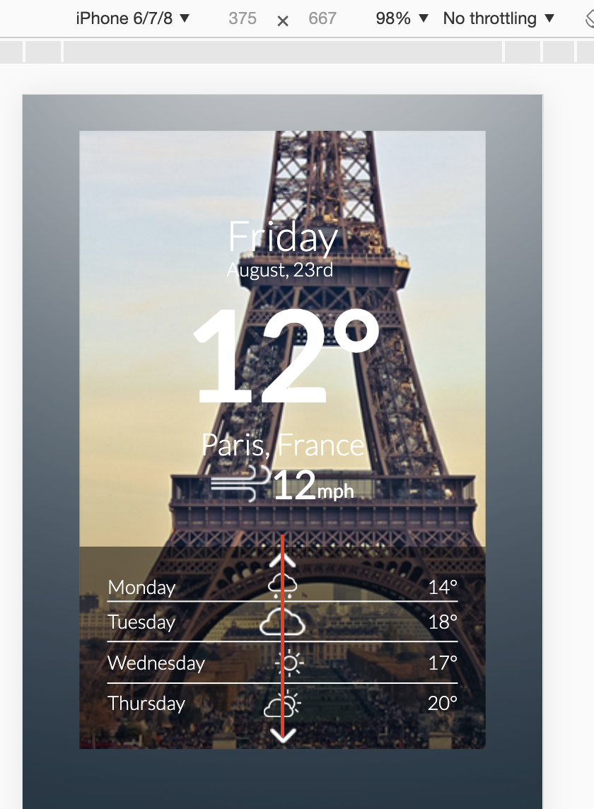
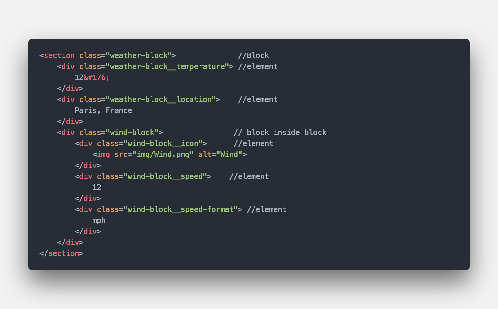
| <div class="weather-block__location"> | ||
| Paris, France | ||
| </div> | ||
| <div class="wind-block"> |
There was a problem hiding this comment.
Doesn't too matter, but why it's a block whether 'weather-block__location' is not?
There was a problem hiding this comment.
Hmm... looks fine as i see. But maybe I just not quite understood your point
There was a problem hiding this comment.
That's okay, but looks like that wind-block is an element of weather-block
| text-align: center; | ||
| } | ||
| } | ||
| /* И еще вопрос - можно ли задавать @media только для конкретных условий, как блок выше. Или делать @media для всех условий*/ |
There was a problem hiding this comment.
Which conditions do you mean? You may apply media for different devices and different sizes. All styles inside this block will work. More info and examples you can find here: https://developer.mozilla.org/en-US/docs/Web/CSS/@media
There was a problem hiding this comment.
It seems to me, that now i got the answer) thank you)
Anatoly Shlom/grid/css/grid.css
Outdated
| justify-content: center; | ||
| } | ||
| .nav-block__divider_active { | ||
| padding-top: 0.3em; |
There was a problem hiding this comment.
Not a good idea to mix different measures like px and em. Consider to use one please.
| <body> | ||
| <main class="widget"> | ||
| <!--article class="widget-data"--> | ||
| <!-- Интересный вопрос, как в моем случае сохранить сетку и не сломать семантику?--> |
There was a problem hiding this comment.
The same as I've added a comment to your previous PR, article isn't the most appropriate tag here.
| font-size: 29px; | ||
| font-weight: 400; | ||
| } | ||
| .wind-block__speed-format { |
There was a problem hiding this comment.
Preprocessor allows you to write it like so:
.wind-block {
    font-size: 29px;
    font-weight: 400;

    &__speed {
         ...
     }

    &__speed-format {
        ...
    }
}
By this way you wouldn't rename all styles when you decided to change name of the block
There was a problem hiding this comment.
Thats really awesome feature!! Thank you!!
2 participants
Reformated all classes with BEM methodology, started to use LESS
Created two responsive pages located in Flex/Grid folders.