A flexible grid layout for responsive dashboards
Inspired from http://patbuergin.github.io/angular-widget-grid/ and written as a pure Angular 2.x module.
Install with npm:
$ npm install ngx-widget-gridAdd the ngx-widget-grid module as a dependency to your application module:
import { NgxWidgetGridModule } from 'ngx-widget-grid/dist';

@NgModule({
  declarations: [
    ...
  ],
  imports: [
    ...
    NgxWidgetGridModule,
    ...
  ],
  bootstrap: [AppComponent]
})
export class AppModule { }
If using SystemJS add this to systemJS config:
packages: {
    ...
    'ngx-widget-grid/dist': {main: 'bundles/ngx-widget-grid.umd.js', defaultExtension: 'js'},
    ...
}<ngx-widget-grid [rows]="4" [columns]="5" [highlightNextPosition]="false"
[showGrid]="true" (widgetPositionChange)="onWidgetChange($event)">
<ngx-widget [(position)]="{top: 2,left: 2,height: 1,width: 1}"
[movable]="true" [resizable]="true">
<div style="height:100%;width:100%; display:flex;">
<div style="height:100%;width:100%; padding:10px; background-color: rgb(140, 198, 0);">
</div>
</div>
</ngx-widget>
</ngx-widget-grid>
<ngx-widget [(position)]="widget.position"...>You can bind the position of the widget to data received from server so that even if the widget is moved, the new positions are always updated in the widget configuration.
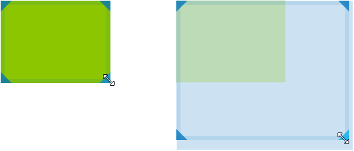
<ngx-widget [movable]="true" [(position)]="widget.position"...>If movable is true, users will be able to move the respective widget.

<ngx-widget [resizable]="true" [(position)]="widget.position"...>If resizable is true, users will be able to resize the respective widget.
Optionally, you can limit the resize directions:
<ngx-widget [resizeDirections]="['NW', 'NE', 'E', 'SW']" [(position)]="widget.position"...>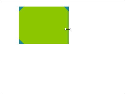
<ngx-grid columns="20" rows="15" [showGrid]="true">Toggles the gridlines.
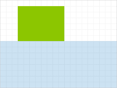
<ngx-grid columns="20" rows="15" [highlightNextPosition]="true">Highlights the largest free area in the grid, if any. This area will be automatically assigned to the next widget with a falsy or conflicting position.
The grid emits gridFullevent as true (when grid has been fully occupied) or false when there is still some space left in the grid, so that you can e.g. enable/disable UI elements accordingly.
<ngx-grid columns="20" rows="15" (gridFull)="onGridFull($event)">function onGridFull(isGridFull) {
if(isGridFull){
...
//make add widget button disabled
...
}else{
...
//make add widget button enabled
...
}
}Emitted whenever the position of a widget is changed. The event comes with an attached object argument, which contains the affected widget's index and its newPosition.
<ngx-grid columns="20" rows="15" (widgetPositionChange)="onWidgetChange($event)">getNextPosition is a function you could call to get details about the next available position that is being highlighted as part of highlightNextPosition.
Check out /src for the original source code.
MIT