
The Block Editor field in dotCMS is a rich content editor that allows you to create content in units called “blocks.” Every paragraph, image, code snippet, list, etc., is stored as a block capable of being edited, drag-and-drop reordered, transformed, or deleted.
By default, the Block Editor includes a variety of pre-defined block types — including Paragraphs, Headings, Lists, Images, Tables, and Contentlets. (For more information, see the documentation.)
In dotCMS 23.03 or later, you can also extend the capabilities of the Block Editor by creating extensions and including them in your dotCMS instance.
Follow these steps to expand the Block Editor's functionality by creating a new remote extension with a pre-generated example.
-
Clone this repository
git clone https://github.com/dotCMS/dotcms-block-editor-rollup.git -
Install the required dependencies
At the root of the workspace, run:
npm install -
Build the extensions
Run the following command:
npm run buildThis will generate the
/dist/folder with a compiled Javascriptcustom-blocks.jsfile inside, which contains the extensions defined in thecustom-blocksproject library. -
Browse to
/dist/libAfter running the previous command, it should generate a folder structure like the one below.


And just like that, you have a first extension. Now you can upload it to your dotCMS instance.
Take a look inside the /dist/ folder, and you'll see a compiled Javascript file, in this case named custom-blocks.js.
(Its exact file name may differ as defined in the project files — specifically, in the fileName property in /src/rollup.config.js. We recommend choosing a meaningful name!)
This file needs to be uploaded to a directory of your choice. Browse to that directory in the Site Browser — in this case, /application/block-editor/extensions — and then click the “Add” button.

Once the file is uploaded, go to the Block Editor field's settings within the Content Type, and browse to the tab displaying its field variables. Include the new variable customBlocks (case sensitive), which defines the remote extensions in use by the Block Editor.
For its value, it requires a JSON object with the property extensions. Its value is an array of objects, each representing a new extension. At bare minimum, each object must have a url. For example:
{
	"extensions": [{
		"url": "https://local.dotcms.site:8443/application/block-editor/extensions/custom-blocks.js"
	}]
}
When added, the result should resemble the image below, which uses the parameters above.

After setting this field variable, the Block Editor's behavior will change according to the extensions you've implemented. The example extension adds an "Add" button that creates a "Hello World" block, as seen below:

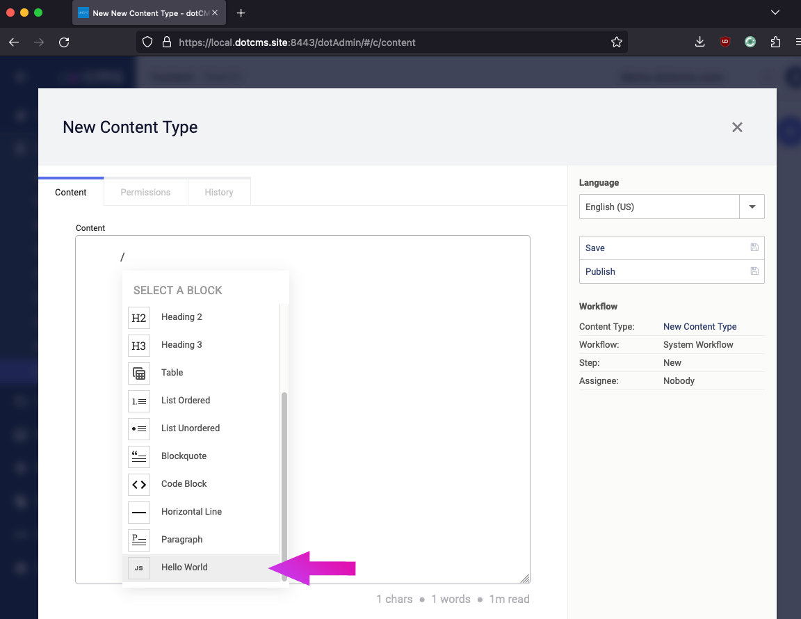
Suppose, instead of a button, you'd prefer for your extension to be selectable from the list of blocks. This can be achieved with just a small modifiction to the JSON we added to the Block Editor field variable.
After the url property, add a property named actions. This consists of an array of objects. Each object has three properties.
| Property | Description |
|---|---|
command |
The extension command being invoked at block selection |
menuLabel |
The label visible in the block list |
icon |
The name of the Material UI icon displayed in the block list |
For example, if we replace the previous customBlocks JSON with this new value, including an actions array of a single object:
{
	"extensions": [{
		"url": "https://local.dotcms.site:8443/application/block-editor/extensions/custom-blocks.js",
		"actions": [{
			"command": "addHelloWorld",
			"menuLabel": "Hello World",
			"icon": "javascript"
		}]
	}]
}
... this results in a brand new block in the block list, based on the above specifications:
Clicking this block creates the same golden "Hello World" box as earlier, as it invokes the same addHelloWorld function.
In the event of a remote extension with multiple defined commands, adding multiple blocks is as simple as adding more objects to the actions array, e.g.:
{
	"extensions": [{
		"url": "https://local.dotcms.site:8443/application/block-editor/extensions/custom-blocks.js",
		"actions": [{
			"command": "addHelloWorld",
			"menuLabel": "Custom Node",
			"icon": "javascript"
		}, {
			"command": "toggleHighlight",
			"menuLabel": "Highlight Custom",
			"icon": "highlight"
		}, {
			"command": "somethingElseEntirely",
			"menuLabel": "You Get The Idea",
			"icon": "add"
		}]
	}]
}One of the strengths of Tiptap is its extensibility. You don’t have to depend purely on its provided tools or even existing extensions; rather, you can extend the editor to your own liking.
With custom extensions you can add new blocks and new functionalities on top of what already exists — even completely from scratch. Let’s start with a few common examples of how you can extend existing nodes, marks and extensions.
First, create an initial skeleton, in which you create a Node that contains the basic functionality you're adding:
import { Node } from '@tiptap/core';

const CustomNode = Node.create({
  name: 'customNode',
  // Your code goes here, for example:
  addNodeView() {
    return () => {
        const dom = document.createElement('div');
        dom.contentEditable = 'false';
        const label = document.createElement('label');
        dom.append(label);
        return { dom };
    };
  },
})
Next, add commands that trigger the extension into the Block Editor. We'll be making use of the Tiptap addCommands() function:
    addCommands() {
      return {
         addHelloWorld: () => ({ commands }) => {
            return  commands.insertContent({ type: this.name });
         }
      }
    },
You can see code resembling the above in the Typescript source from the current project: src/lib/custom-blocks.ts.
-
What is a Block Editor, and how does it work?
The Block Editor is a tool for building rich text in WYSIWYG ("What You See Is What You Get") fashion. Per "rich text," it allows you to insert different kinds of content like images, videos, tables, code blocks and more into your text area.
Each new paragraph, table, etc., is stored as an element called a "block," which is a self-contained unit of pure JSON. This makes the Block Editor portable and highly tractable for use in both traditional (through a user interface) and headless (through an API) paradigms.
-
What is ProseMirror?
ProseMirror describes itself as "a toolkit for building rich-text editors on the web":
ProseMirror tries to bridge the gap between editing explicit, unambiguous content like Markdown or XML, and classical WYSIWYG editors.
It does this by implementing a WYSIWYG-style editing interface for documents more constrained and structured than plain HTML. You can customize the shape and structure of the documents your editor creates, and tailor them to your application's needs.
-
What is Tiptap?
Tiptap is "a headless wrapper around ProseMirror":
Tiptap comes with sensible defaults, a lot of extensions and a friendly API to customize every aspect. It’s backed by a welcoming community, open source, and free.
Tiptap does not provide a user interface, but offers robust tools for building your own. The Block Editor was built using these tools.
-
What is Rollup?
Rollup is a module bundler for JavaScript which compiles small pieces of code into something larger and more complex, such as a library or application.
-
Where can I find the Material UI Icons?
The Material UI Icons can be found in Google Fonts. Use the icon name as the value of the
iconproperty in thecustomBlocksJSON.