
⭐ Please star this repository to support the project! ⭐
TrinaGrid is a powerful data grid for Flutter that provides a wide range of features for displaying, editing, and managing tabular data. It works seamlessly on all platforms including web, desktop, and mobile.
- ✨ TrinaGrid
- 💖 Support This Project
- 🚀 Migration from PlutoGrid
- 📦 Installation
- 🏁 Basic Usage
- 🦄 Features
- Cell-Level Renderers
- Enhanced Scrollbars
- 📚 Documentation
- 🧑💻 Examples
- 📖 API Reference
- 🤝 Contributing
- 📝 License
TrinaGrid is a maintained and enhanced version of the original PlutoGrid package.
I'm Feras, the current maintainer, and I'm actively working on adding new features and keeping this great package rich and up-to-date.
I continued the development after the original package PlutoGrid was no longer being maintained.
If you find TrinaGrid useful, please consider supporting its development:

- Become a GitHub sponsor: Sponsor @doonfrs
- Your support will encourage me to dedicate more time to keeping this useful package updated and well-documented.
Automatic migration tool included!
If you're migrating from PlutoGrid, we've included a migration tool to help you automatically update your codebase:
# First, add trina_grid to your pubspec.yaml and run flutter pub get

# Run the migration tool (dry run first to see changes)
flutter pub run trina_grid --migrate-from-pluto-grid --dry-run

# Apply the changes
flutter pub run trina_grid --migrate-from-pluto-grid

# To scan all directories (including build and platform-specific directories)
flutter pub run trina_grid --migrate-from-pluto-grid --scan-all
The migration tool will automatically replace all PlutoGrid references with their TrinaGrid equivalents, including:
- Class names (PlutoGrid → TrinaGrid)
- Package imports:
package:pluto_grid/pluto_grid.dart→package:trina_grid/trina_grid.dartpackage:pluto_grid_plus/pluto_grid_plus.dart→package:trina_grid/trina_grid.dart
- All related components, widgets, and enums
See Migration Tool Documentation for more details.
Add the following dependency to your pubspec.yaml file:
dependencies:
  trina_grid: <latest version>
Then run:
flutter pub getimport 'package:flutter/material.dart';
import 'package:trina_grid/trina_grid.dart';
void main() {
runApp(const MyApp());
}
class MyApp extends StatelessWidget {
const MyApp({Key? key}) : super(key: key);
@override
Widget build(BuildContext context) {
return MaterialApp(
title: 'TrinaGrid Example',
theme: ThemeData(
primarySwatch: Colors.blue,
),
home: const MyHomePage(),
);
}
}
class MyHomePage extends StatefulWidget {
const MyHomePage({Key? key}) : super(key: key);
@override
State<MyHomePage> createState() => _MyHomePageState();
}
class _MyHomePageState extends State<MyHomePage> {
final List<TrinaColumn> columns = [
TrinaColumn(
title: 'ID',
field: 'id',
type: TrinaColumnType.text(),
),
TrinaColumn(
title: 'Name',
field: 'name',
type: TrinaColumnType.text(),
),
TrinaColumn(
title: 'Age',
field: 'age',
type: TrinaColumnType.number(),
),
TrinaColumn(
title: 'Role',
field: 'role',
type: TrinaColumnType.select(['Developer', 'Designer', 'Manager']),
),
TrinaColumn(
title: 'Completion',
field: 'completion',
type: TrinaColumnType.percentage(
decimalDigits: 1,
showSymbol: true,
),
),
];
final List<TrinaRow> rows = [
TrinaRow(
cells: {
'id': TrinaCell(value: '1'),
'name': TrinaCell(value: 'John Doe'),
'age': TrinaCell(value: 28),
'role': TrinaCell(value: 'Developer'),
'completion': TrinaCell(value: 0.75),
},
),
TrinaRow(
cells: {
'id': TrinaCell(value: '2'),
'name': TrinaCell(value: 'Jane Smith'),
'age': TrinaCell(value: 32),
'role': TrinaCell(value: 'Designer'),
'completion': TrinaCell(value: 0.5),
},
),
TrinaRow(
cells: {
'id': TrinaCell(value: '3'),
'name': TrinaCell(value: 'Mike Johnson'),
'age': TrinaCell(value: 45),
'role': TrinaCell(value: 'Manager'),
'completion': TrinaCell(value: 0.9),
},
),
];
late TrinaGridStateManager stateManager;
@override
Widget build(BuildContext context) {
return Scaffold(
appBar: AppBar(
title: const Text('TrinaGrid Example'),
),
body: Container(
padding: const EdgeInsets.all(16),
child: TrinaGrid(
columns: columns,
rows: rows,
onLoaded: (TrinaGridOnLoadedEvent event) {
stateManager = event.stateManager;
},
),
),
);
}
}TrinaGrid offers a comprehensive set of features for handling tabular data:
Support for various data types including:
- Text Type: Character value input
- Number Type: Numeric value input
- Boolean Type: True/false selection with custom options
- Selection Type: Dropdown selection from predefined options
- Date Type: Date picker input
- Time Type: Time picker input
- DateTime Type: Combined date and time input
- Currency Type: Currency value input with formatting
- Percentage Type: Percentage value input with decimal precision
Freeze columns to the left or right
Adjust column width by dragging
Change column order by drag and drop
Hide and show columns as needed
Sort data by clicking on column headers
Filter data with built-in filter widgets
Group related columns together
Customize column appearance with custom widgets
Customize column header appearance
Display aggregate values at the bottom of columns
Control column visibility based on viewport
Customize the menu on the right side of columns
Customize or hide the filter icon that appears in column titles after filtering
Select single or multiple rows
Reorder rows by drag and drop
Apply custom colors to rows
Customize row appearance and behavior
Built-in checkbox selection for rows
Group related rows together
Keep specific rows visible while scrolling
Paginate rows with built-in pagination support
Implement server-side pagination for large datasets
Add new rows when scrolling reaches the bottom end
Dynamically add or delete rows from the grid
Add or set rows asynchronously for better performance
Select individual cells or ranges
Edit cell values with appropriate editors
Customize individual cell appearance
Validate cell values during editing
Handle and track cell value changes
Customize the appearance of cells in edit mode
Built-in pagination support with comprehensive options
Handle pagination on the client side
Implement server-side pagination for large datasets
Load data as the user scrolls
Load data on demand
Copy and paste data between cells
Export data to various formats (CSV, JSON, PDF)
Customize rows pagination UI with your own design
Create custom pagination footer widgets at the bottom of the grid
Light and dark mode support
Customize colors, borders, and text styles
Customize loading states and indicators
Draggable scrollbars with hover effects, custom colors, and improved desktop experience
Right-to-left language support
Change the entire theme of the grid to dark mode
Format cell values for display with custom formatters
Navigate and edit using keyboard shortcuts
Right-click menus for columns and cells
Display two linked grids side by side
Use the grid as a popup selector
Track and manage data changes
Change the current cell position with arrow keys, enter key, and tab key
Control the editing state of cells
Navigate to detail pages with listing mode
Use the grid as a popup selector with TextField integration
Advanced filtering with multi-line or multi-item column filtering
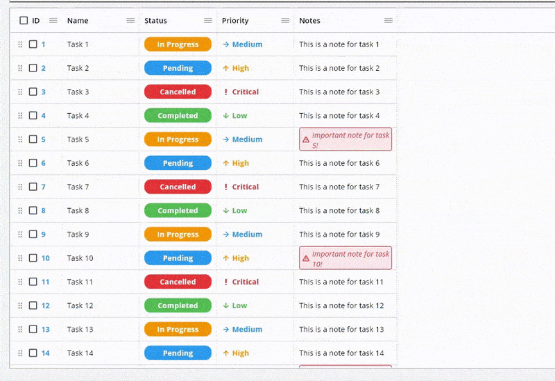
TrinaGrid now supports cell-level renderers, allowing you to customize the appearance of individual cells:
TrinaCell(
  value: 'Completed',
  renderer: (rendererContext) {
    return Container(
      padding: const EdgeInsets.symmetric(horizontal: 8, vertical: 4),
      decoration: BoxDecoration(
        color: Colors.green,
        borderRadius: BorderRadius.circular(12),
      ),
      child: Text(
        rendererContext.cell.value.toString(),
        style: const TextStyle(
          color: Colors.white,
          fontWeight: FontWeight.bold,
        ),
      ),
    );
  },
)
This powerful feature enables:
- Custom formatting for specific cells
- Visual indicators based on cell values
- Interactive elements within cells
- Conditional styling for individual cells
Cell renderers take precedence over column renderers, giving you fine-grained control over your grid's appearance.
TrinaGrid now includes enhanced scrollbar functionality, particularly useful for desktop applications:
- Draggable Scrollbars: Quickly navigate large datasets by dragging the scrollbar thumb
- Hover Effects: Visual feedback when hovering over scrollbars for better user experience
- Customizable Appearance: Control the colors, thickness, and behavior of scrollbars
- Desktop Optimized: Enhanced interaction model ideal for desktop applications
TrinaGrid comes with comprehensive documentation covering all features and use cases:
- 📖 Getting Started Guide - Installation, basic usage, and configuration
- 🚀 Migration Guide - Migrate from PlutoGrid with our automated tool
- ✨ Feature Documentation - Detailed guides for all features
- 🧑💻 Examples & Tutorials - Practical examples and use cases
- 📚 API Reference - Complete API documentation
Visit our Documentation Index for a complete overview.
Check out the example project for more usage examples.
For detailed API documentation, refer to the following resources:
- Core Classes: TrinaGrid, TrinaColumn, TrinaRow, TrinaCell
- State Management: TrinaGridStateManager
- Advanced Features: Custom Renderers, Filtering & Sorting
Contributions are welcome! If you'd like to help improve TrinaGrid, here's how you can contribute:
- Star the repository ⭐ to show your support
- Report bugs by opening issues
- Suggest new features or improvements
- Submit pull requests to fix issues or add functionality
- Improve documentation to help other users
- Share the package with others who might find it useful
- Sponsor the project to support its development Buy me a coffee Buy Me A Coffee
I'm committed to maintaining and improving this package, and your contributions help make it better for everyone. Feel free to reach out if you have any questions or ideas!
This project is licensed under the MIT License - see the LICENSE file for details.