Use full page for search results #2319
Conversation
|
Thanks for your pull request, @wilzbach! Bugzilla referencesYour PR doesn't reference any Bugzilla issue. If your PR contains non-trivial changes, please reference a Bugzilla issue or create a manual changelog. |
f1b6d40 to
6698777
Compare
|
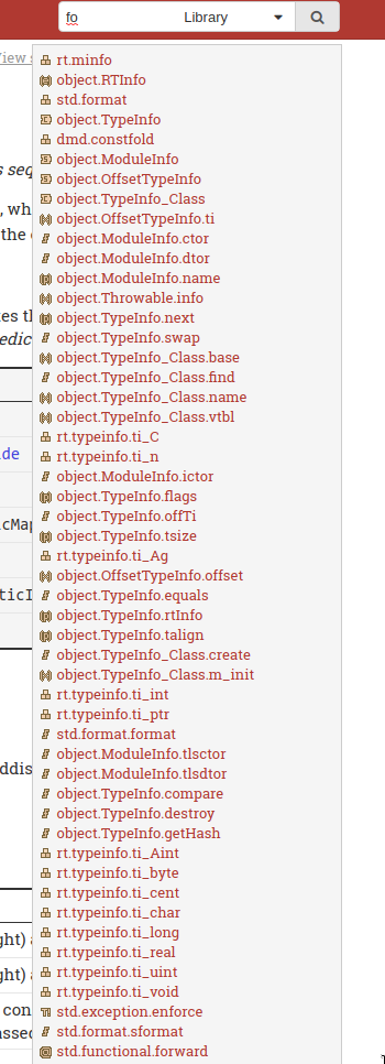
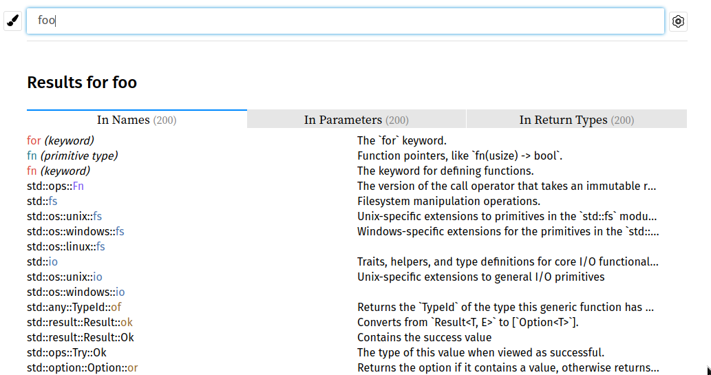
Okay. I finally got back to this and while this isn't perfect, imho it's a lot better than the dropdown. Old:
New:
What do you think? |
|
Not sure it's an improvement... it just throws more information in your face, most of which you don't care about, without any organization, and blocks the entire page while doing it. The screenshot in your example isn't of a typical search, I think they will typically be of more than two letters. |
6698777 to
375f32f
Compare
|
What do other people think about this? CC @thewilsonator maybe |
|
The dropdown is dynamically repopulated, correct? Is the new one? |
Yes and yes. Just test it out yourself via the DAutoTest preview. Select one page on the diff and enter things in the search bar. |
|
Hmm, I can't seem to trigger either the dropdown on the main site nor the new one on the DAutoTest preview. |
|
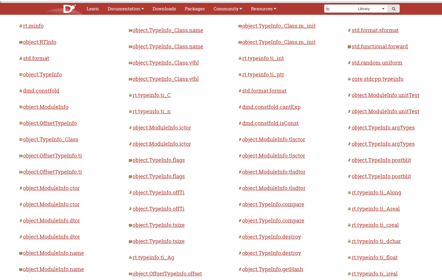
New:
Old:
https://dlang.org/library/core/atomic.html It only works for the Ddox doc pages. |
|
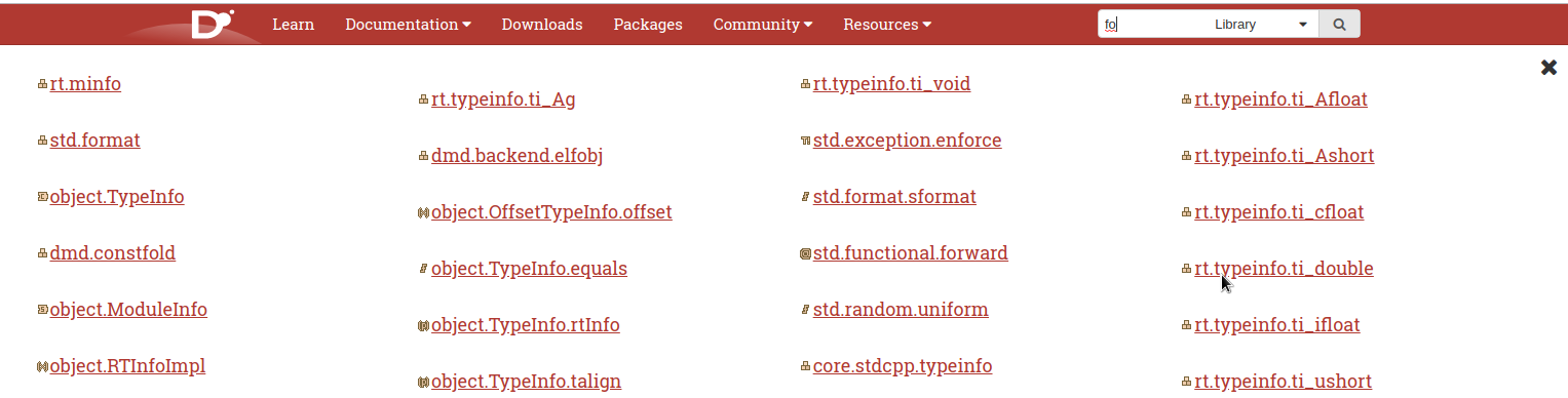
I think I like the older one more, possibly because I'm used to dropdown menus and the new ones is a bit jarring if you're not expecting that to happen, but not by a whole lot. All the new one does for me is having a slightly bigger font size. If it made use of that space e.g:
it might have some use over the dropdown. I note that pressing enter take you to the page for the top result for the partial search, given the apparently random ordering of the results, I'd be all for making it "expand" to the new one with the extra info mentioned above instead. |
|
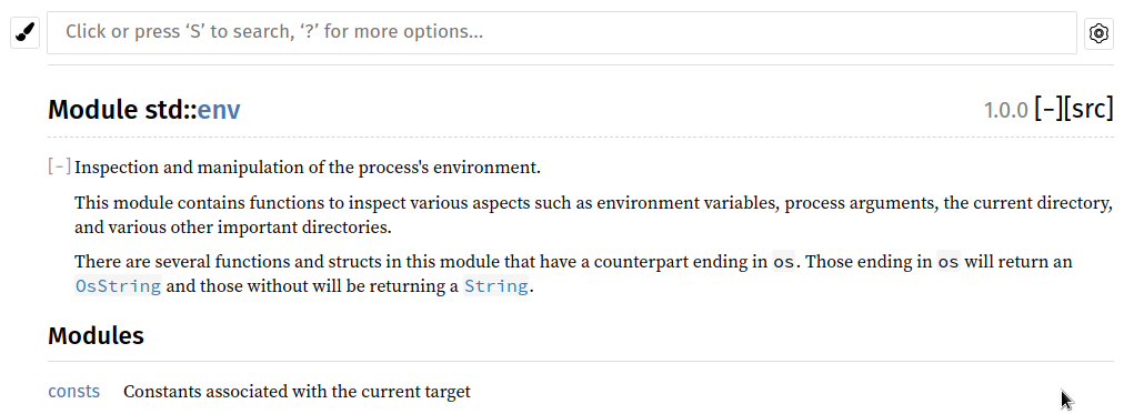
We should probably make the search bar more prominent and similar to e.g. like Rust docs does it:
|
|
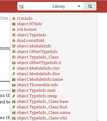
I tried the preview now. I don't like it. It's like a wall of text. It's quite unexpected. It's more difficult for the eyes to have to scan to left and right, that's why newspaper columns are narrow and we prefer code to not be more than 80 characters wide. |
|
@wilzbach Seems like people are reluctant to this. Is it ok to close? |
A start and experiment with using the full site for showing the search results.
Preview:
This is the initial "proof of concept". When I find more time, I will try to tweak it and make it more "visually appealling". Ideas or examples of other good searches are of course always welcome.
See also:
BTW in case someone wants to test this locally, the most pleasant way is with:
(as then the JS/CSS is always "up-to-date" / needs to manual copy-overs)