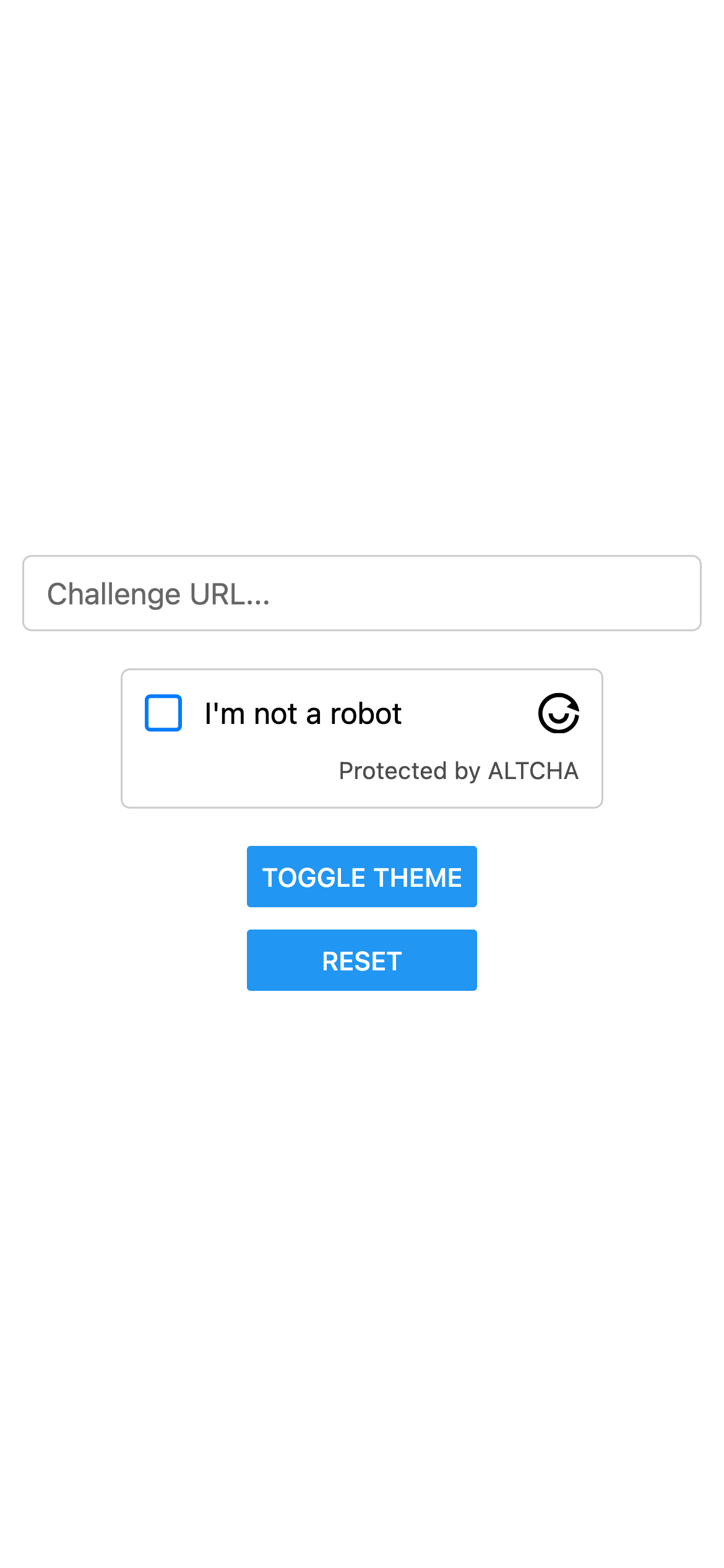
The AltchaWidget is a CAPTCHA-like React Native component that provides a secure, privacy-friendly way to verify that a user is human — without the frustration of traditional CAPTCHAs.
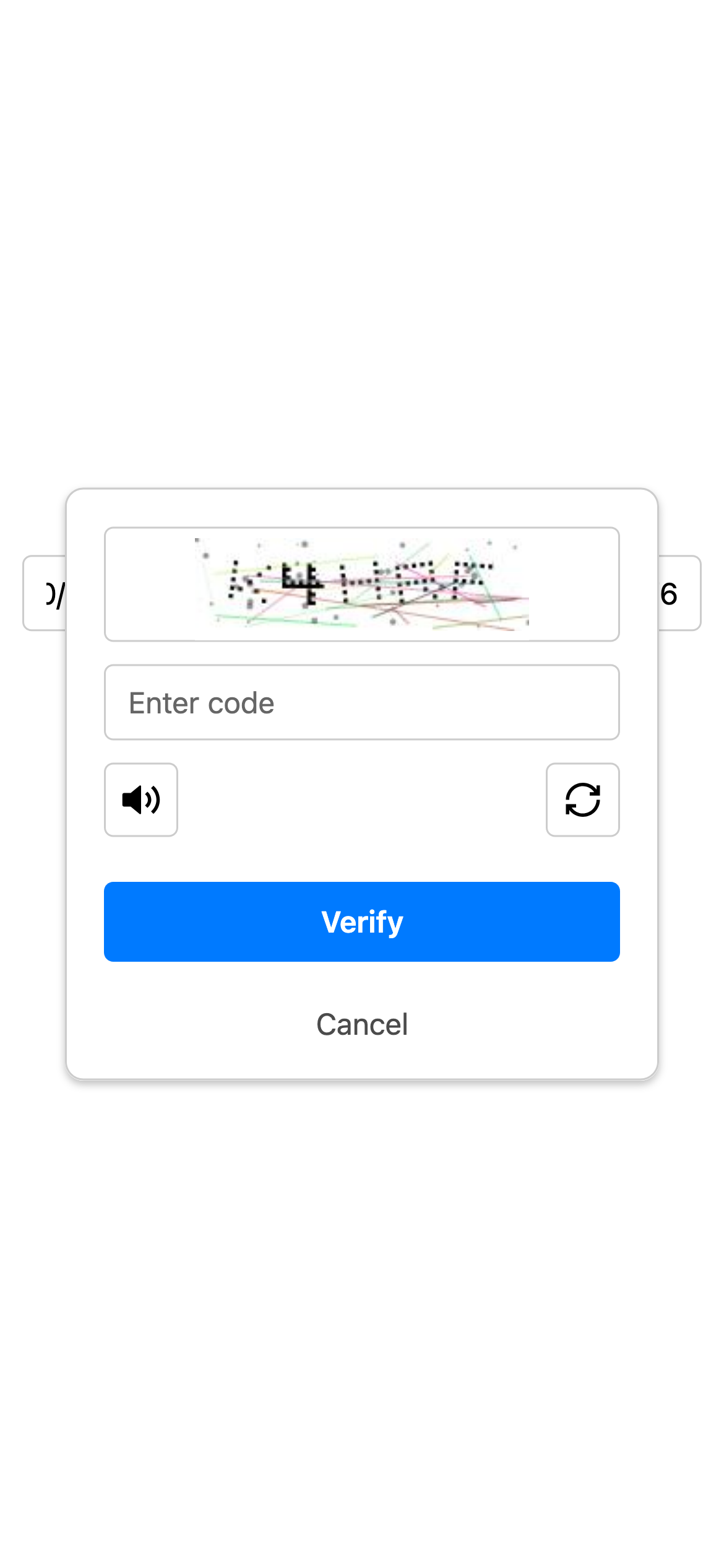
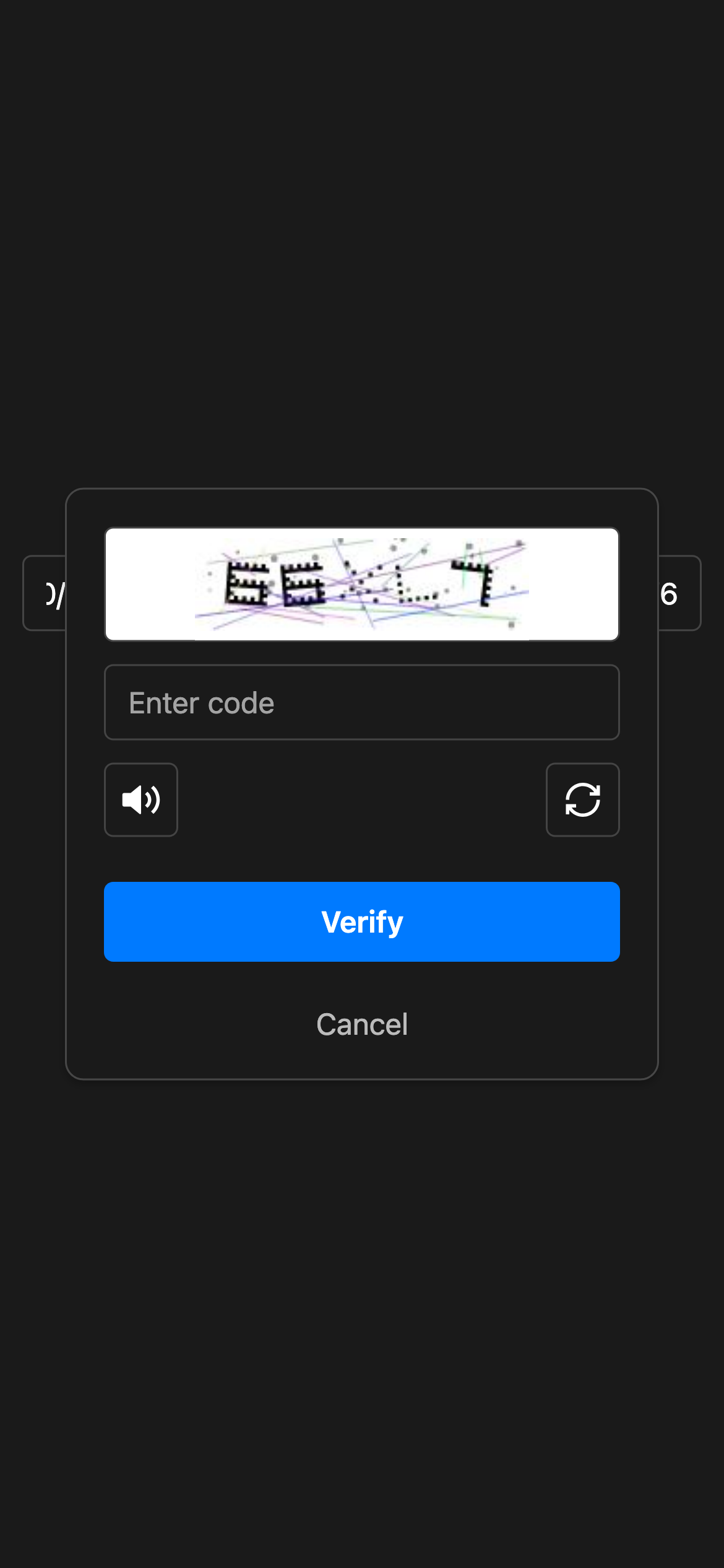
It uses a cryptographic proof-of-work mechanism combined with an optional code challenge, making it resilient against bots and spam.
ALTCHA is an open-source alternative to traditional CAPTCHA, designed to be fast, accessible, and privacy-respecting.
For more information and documentation, visit altcha.org.
- Native React Native component – no WebView required
- Privacy-friendly, CAPTCHA-like verification
- Supports image and audio code challenges with ALTCHA Sentinel (adaptive CAPTCHA)
- Localization support for multiple languages
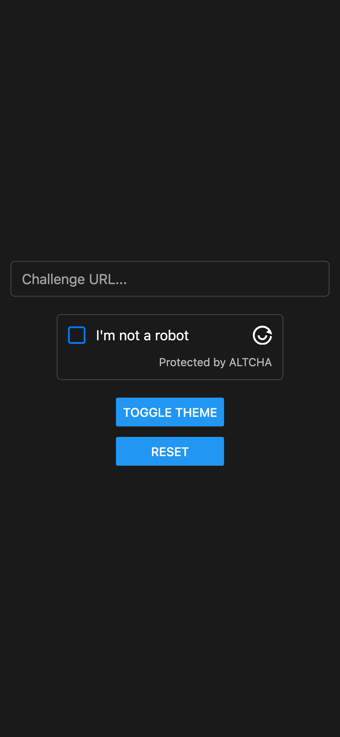
- Light and Dark theme support
With npm:
npm install altcha-react-nativeOr with Yarn:
yarn add altcha-react-nativeIf your project uses Expo, no extra native setup is needed.
If you are using bare React Native, you may need to run pod install.
import React from 'react';
import { View } from 'react-native';
import { AltchaWidget } from 'altcha-react-native';

export default function App() {
  return (
    <View style={{ padding: 16 }}>
      <AltchaWidget
        challengeUrl="https://api.example.com/altcha/challenge"
        debug={true}
        onVerified={(payload) => {
          // Send the payload to your backend
          console.log('Payload:', payload);
        }}
      />
    </View>
  );
}One of challengeUrl or challengeJson is required.
The widget will return the ALTCHA payload via onVerified, which you should send to your server for verification.
| Prop | Type | Description |
|---|---|---|
challengeUrl |
string |
URL to fetch the challenge JSON |
challengeJson |
object |
Challenge object provided directly |
colorScheme |
'light' | 'dark' |
Force color scheme (optional, otherwise follows system) |
locale |
string |
Language to use (defaults to en) |
onFailed |
(error: any) => void |
Called with an error on verification failure |
onVerified |
(payload: string) => void |
Called with encoded payload after verification |
onServerVerification |
(result: any) => void |
Called with server verification result |
delay |
number |
Optional delay before solving (ms) |
debug |
boolean |
Enable verbose logging |
hideLogo |
boolean |
Hide the ALTCHA logo |
hideFooter |
boolean |
Hide the footer text |
httpHeaders |
Record<string,string> |
Custom HTTP headers (optional) |
themes |
{ dark: {}, light: {} } |
Override theme properties |
customTranslations |
Record<string,Translation> |
Override default translations |
verifyUrl |
string |
Server endpoint to verify the solution |
The component includes built-in translations for multiple languages.
You can pass a customTranslations prop to override or add custom text.
<AltchaWidget
  challengeUrl="https://api.example.com/altcha/challenge"
  locale="en"
  customTranslations={{
    en: {
      label: 'I am human',
    },
  }}
/>You can customize the widget’s appearance using the style prop for layout and basic styling:
<AltchaWidget
  style={{
    backgroundColor: '#ddd',
    borderColor: '#0000ff',
    fontSize: 20,
    width: '100%',
  }}
/>
For color customization, use the themes prop to define separate color sets for light and dark modes:
<AltchaWidget
  themes={{
    dark: {
      primaryColor: '#00ff00',
    },
    light: {
      primaryColor: '#00ff00',
    },
  }}
/>
Available theme colors:
type AltchaTheme = {
  backgroundColor: string;
  borderColor: string;
  errorColor: string;
  primaryColor: string;
  primaryContentColor: string;
  textColor: string;
};cd example
npm install
npm startMIT