LiteSlider is a customizable, vertical slider component for SwiftUI. It supports dynamic, fixed, or expandable track lengths, and provides full flexibility over thumb appearance, and styling, and accessibility.

- Vertical slider for SwiftUI
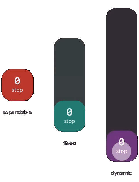
- Dynamic, fixed, or expandable track length behaviors
- Customizable thumb views with drag-state awareness
- Smooth drag gestures with elastic drag effect customization
- Extensive track styling options (thickness, radius, colors, stroke)
- Fine-grained control over drag elasticity (offset, compression, expansion)
- Full accessibility support with custom value formatting and step size
- Support for binding to continuous or stepped values
By default, this creates a vertically oriented slider with a dynamic height that automatically fills its parent view. It adapts to the available space and requires minimal configuration to get up and running.
LiteSlider(value: $value, in: 0...100)- A range from 0 to 100, stepping by 5.
- A custom thumb displaying the current value as a number, growing in size when dragged.
- An expandable track that grows up to 500 points from the center as the container allows.
- A red track with a transparent background and a solid red progress fill.
@State var value: Double = 50

LiteSlider(
    value: $value,
    in: 0...100,
    step: 5,
    thumbView: thumbView
)
.sliderLengthBehavior(.expandable(direction: .center, maxLength: 500))
.sliderTrackColor(.red.opacity(0.5))
.sliderProgressColor(.red)

let thumbView: (Bool) -> some View = { isDragging in
    Text("\(Int(value))")
        .font(.system(size: isDragging ? 40 : 32))
        .padding([.top], 30)
}
More customization options, including layout behavior, thumb rendering, color customization, and gesture interaction, are described in the documentation.
In Xcode:
- Open your project
- Go to
File>Add Packages Dependencies... - Enter the URL:
https://github.com/SylvainRX/LiteSlider.git
- Select the version and add the package
- iOS 17 and iPadOS 17
https://sylvainrx.github.io/LiteSlider/
LiteSlider is released under the Apache 2.0 license.