Elaborado por Barzola Bustamante José Mathias,Ccanto Vargas Eduardo Ivan, Cuenca Cajusol Nicole Allison y Angie Sylvana Flores Gutierrez, 5 de febrero del 2021
En este proyecto analizaremos los datos del COVID en el Perú para luego con ayuda de la libreria ggplot2 extraer los mapas de casos postivos y fallecidos por COVID en el Perú.
-library(rgdal)

-library(rgeos)

-library(dplyr)

-library(tmap)

-library(leaflet)

-biblioteca (ggplot2)

-library(sp)

-library(viridisLite)

-library(viridis)

-library(tidyverse)

-library(sf)
-library(rayshader)
¡ No olvidarte setear tu directorio de trabajo!
Descargar los datos shapefile de algún geoservidor oficial. Como este: https://www.geogpsperu.com/
1. Cargamos la librería donde tenemos guardado nuestro shp. y csv. para este caso, que es PROVINCIAS
setwd("C:/Users/NICOLE/Desktop/PROGRA")
mapa <- readOGR("C:/Users/NICOLE/Desktop/PROGRA/PROVINCIAS.shp")
datacovid <- read.csv2("C:/Users/NICOLE/Desktop/PROGRA/positivos_covid.csv
	 head(mapa)
names(mapa)[2]="DEPARTAMENTO"
covid <- datacovid %>% group_by(PROVINCIA) %>% summarise(Frequency=n())
head(mapa)
head(datacovid)
covid_mapa1 <- merge(mapa,covid,by="PROVINCIA")
plot(covid_mapa1)
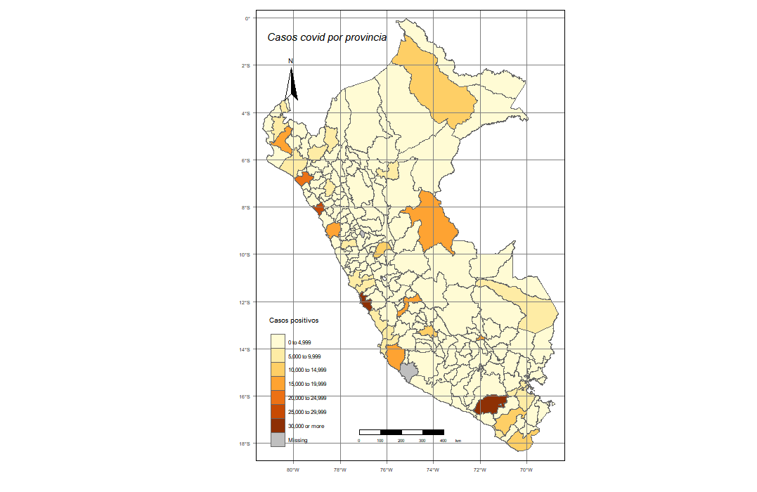
qtm(covid_mapa1,fill = "Frequency",col="col_blind")
qtm(covid_mapa1,fill=c("Frequency"),
    col = "Median_income",
    title="Casos covid por provincia",
    palette = " BuGn" ,
    scale = 0.7 ,
    fill.title="Casos positivos",
    title.font=1,
    sill.style ="fixed",
    title.fontface=3,
    fill.breaks=round(c(seq(0,30000,length.out = 7),Inf),),0)
+ tm_scale_bar(position = c("center","bottom"))+
  tm_graticules()+
  tm_compass(position = c("left","top")) + tm_borders()
5. Cargamos la librería donde tenemos guardado nuestro shp. y csv. para este caso, que es DEPARTAMENTOS
mapa <- st_read("C:/Users/NICOLE/Desktop/PROGRA/DEPARTAMENTOS.shp")
head(mapa)
names(mapa)[2]="DEPARTAMENTO"

covid2 <- datacovid %>% group_by(DEPARTAMENTO) %>% summarise(Frequency=n())

covid_mapa2 <- merge(mapa,covid2,by="DEPARTAMENTO")
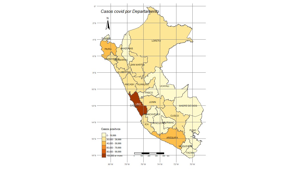
qtm(covid_mapa2,fill = "Frequency",col="col_blind")
qtm(covid_mapa2,fill=c("Frequency"),
    col = "Median_income",
    title="Casos covid por Departamento",
    palette = " BuGn" ,
    scale = 0.7 ,
    fill.title="Casos positvos",
    title.font=1,
    sill.style ="fixed",
    title.fontface=3,
    fill.breaks=round(c(seq(0,100000,length.out = 6),Inf)),0)+
  tm_text("DEPARTAMENTO", size = 0.7)+
  tm_layout(legend.format = list(text.separator = "-"),frame = F, asp=NA)+
  tm_legend(legend.position = c("left", "bottom"))+
  tm_scale_bar(position = c("center","bottom"))+
  tm_graticules()+
  tm_compass(position = c("left","top"))
View(covid2)
covid3 <- covid2[c(-15,-16),]
View(covid3)
mapa2 <- mapa[-15,]
covid_mapa3 <- merge(mapa2,covid3,by="DEPARTAMENTO)
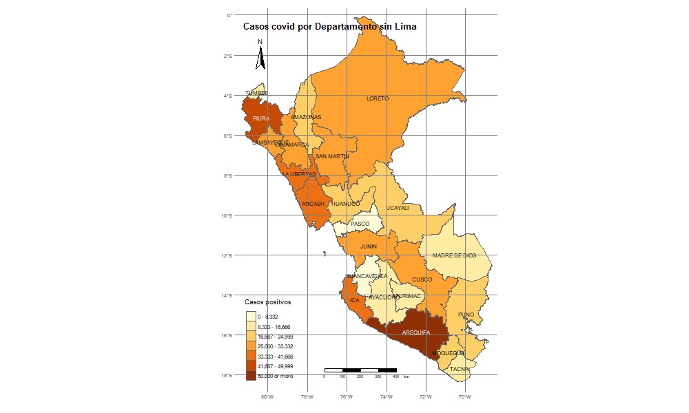
qtm(covid_mapa3,fill = "Frequency",col="col_blind")
qtm(covid_mapa3,
fill=c("Frequency"),
col = "Median_income",
title="Casos covid por Departamento sin Lima",
palette = " BuGn" ,
scale = 0.7 ,
fill.title="Casos positvos",
title.font=1,
sill.style ="fixed",
title.fontface=2,
fill.breaks=round(c(seq(0,50000,length.out = 7),Inf)),0)+
tm_text("DEPARTAMENTO", size = 0.7)+
tm_layout(legend.format = list(text.separator = "-"),frame = F, asp=NA)+
tm_legend(legend.position = c("left", "bottom"))+
tm_scale_bar(position = c("center","bottom"))+
tm_graticules()+
tm_compass(position = c("left","top"))
Cargamos y llamamos a las siguientes librerias
library(viridisLite)
library(viridis)
library(tidyverse)
library(sf)
install.packages("rayshader")
library(rayshader)
install.packages("magick")
library(magick)
install.packages("av")
library(av)
library(dplyr)
install.packages("rayrender")
library(rayrender)
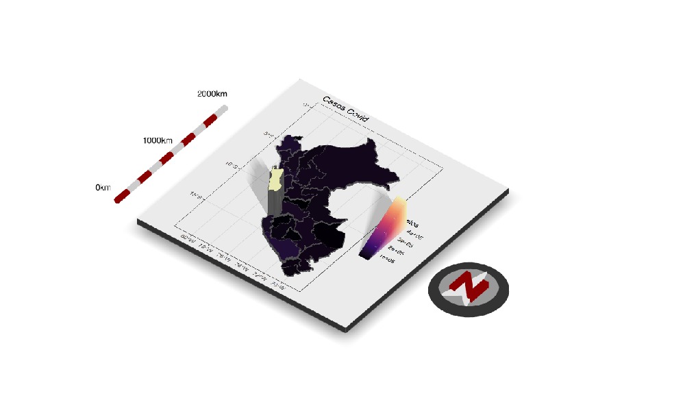
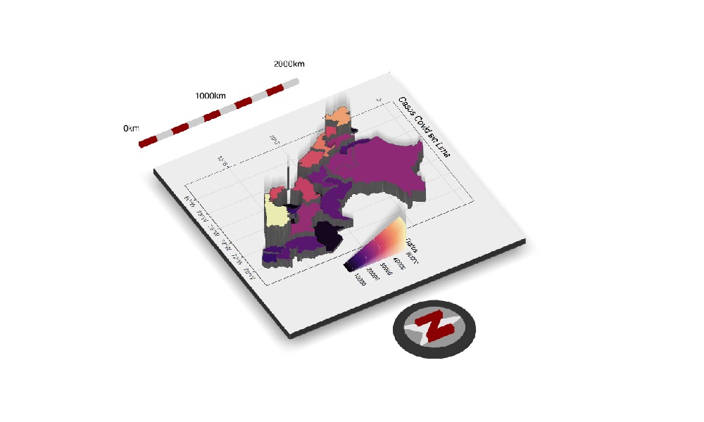
covid_mapa2 <- mutate(covid_mapa2,Datos =Frequency)
ggcovid <- ggplot(data = covid_mapa2) +
  geom_sf(aes(fill = Datos)) +
  scale_fill_viridis_c(option = "A")+
  ggtitle("Casos Covid") +
  theme_bw()
plot_gg(ggcovid,
	multicore = T,
	width = 5 ,
	height = 5,
	scale = 200,
	windowsize = c(1280,720),
	zoom = 0.60 ,
	phi = 50 ,
	sunangle = 120,
	theta=45)
render_camera(fov = 0, theta = 60, zoom = 0.75, phi = 45)
render_scalebar(limits=c(0, 1000, 2000),
		label_unit = "km",
		position = "W",
		y=50,
		scale_length = c(0.33,1))
render_compass(position = "E")
render_snapshot(clear=TRUE)
covid3 <- covid2[c(-15,-16),]
mapa2 <- mapa[-15,]
covid_mapa3 <- merge(mapa2,covid3,by="DEPARTAMENTO")
covid_mapa3 <- mutate(covid_mapa3,Datos =Frequency)

ggcovid <- ggplot(data = covid_mapa3) +
  geom_sf(aes(fill = Datos)) +
  scale_fill_viridis_c(option = "A")+
  ggtitle("Casos Covid sin Lima") +
  theme_bw()


plot_gg(ggcovid,
	multicore = T,
	width = 5 ,
	height = 5,
	scale = 200,
	windowsize = c(1280,720)
	,zoom = 0.60 ,
	phi = 50 ,
	sunangle = 120,
	theta=45)

render_camera(fov = 0, theta = 60, zoom = 0.75, phi = 45)
render_scalebar(limits=c(0, 1000, 2000),label_unit = "km",position = "W", y=50,
		scale_length = c(0.33,1))

render_compass(position = "E")
render_snapshot(clear=TRUE)
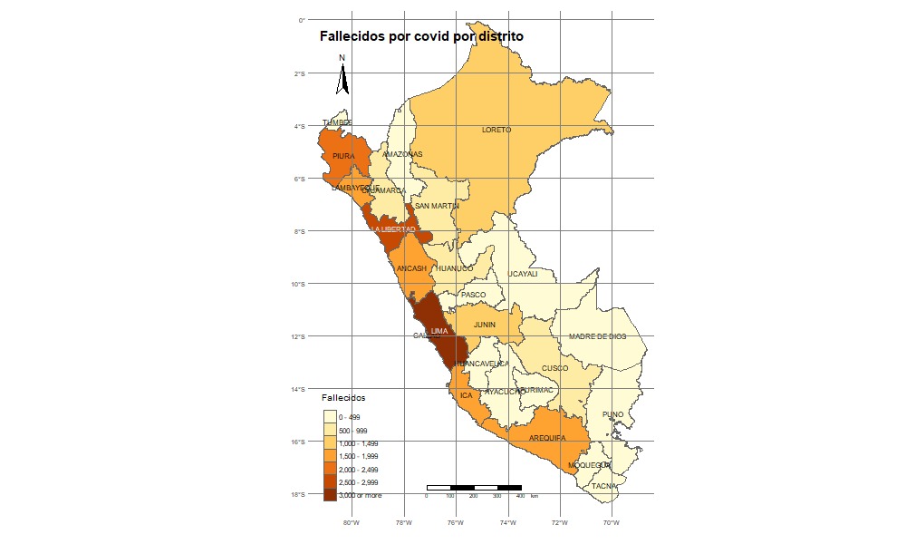
fallecidos <-read.csv2("C:/Users/NICOLE/Desktop/PROGRA/fallecidos_covid.csv")
fallecidos_covid <- fallecidos %>%
  group_by(DEPARTAMENTO) %>%
  summarise(Frequency=n())
fallecidos_mapa <- merge(mapa,fallecidos_covid,by="DEPARTAMENTO")
qtm(fallecidos_mapa,fill = "Frequency",col="col_blind")
qtm(fallecidos_mapa,fill=c("Frequency"),col = "Median_income",
    title="Fallecidos por covid por distrito",palette = " BuGn" ,
    scale = 0.7 , fill.title="Fallecidos",
    title.font=1,sill.style ="fixed",title.fontface=2,
    fill.breaks=round(c(seq(0,3000,length.out = 7),Inf)),0)+
  tm_text("DEPARTAMENTO", size = 0.7)+
  tm_layout(legend.format = list(text.separator = "-"),frame = F, asp=NA)+
  tm_legend(legend.position = c("left", "bottom"))
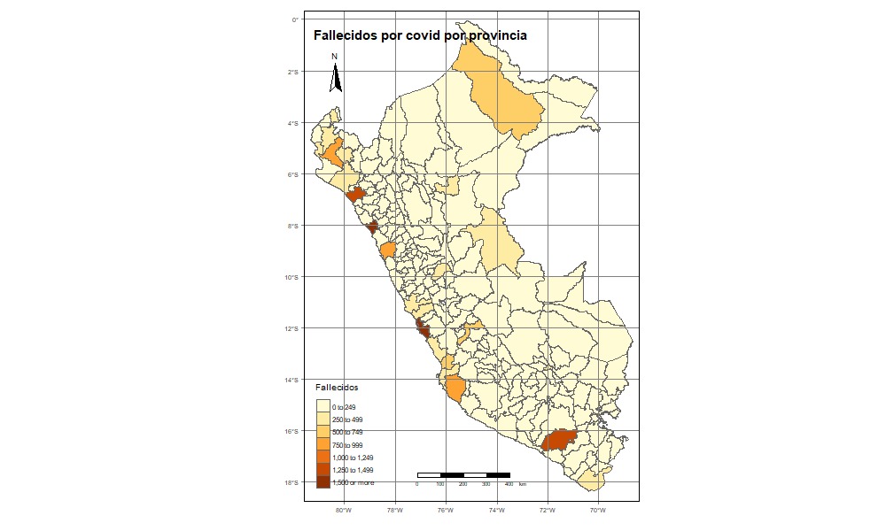
fallecidos_covid2 <- fallecidos %>%
  group_by(PROVINCIA) %>%
  summarise(Frequency=n())
fallecidos_mapa2 <- merge(mapa,
			  fallecidos_covid2,
			  by="PROVINCIA")
names(mapa)

qtm(fallecidos_mapa2,fill = "Frequency",col="col_blind")
qtm(fallecidos_mapa2,fill=c("Frequency"),col =
      "Median_income",title=
      "Fallecidos por covid por provincia",
    palette = " BuGn" , scale =
      0.7 , fill.title="Fallecidos",
    title.font=1,sill.style =
      "fixed",title.fontface=2,
    fill.breaks=round(c(seq(0,1500,
	length.out = 7),Inf)),0)
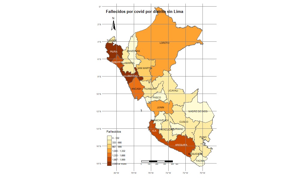
fallecidos_covid3 <- fallecidos_covid[c(-15),]
fallecidos_mapa3 <- merge(mapa2,fallecidos_covid3,by="DEPARTAMENTO")
qtm(fallecidos_mapa3,fill = "Frequency",col="col_blind")
qtm(fallecidos_mapa3,fill=c("Frequency"),
    col = "Median_income",
    title="Fallecidos por covid por distrito sin Lima",
    palette = " BuGn" , scale = 0.7 , fill.title="Fallecidos",
    title.font=1,sill.style =
      "fixed",title.fontface=2,
    fill.breaks=round(c(seq(0,2000,
    length.out = 7),Inf)),0)+
  tm_text("DEPARTAMENTO", size = 0.7)+
  tm_layout(legend.format = list(text.separator = "-"),
	    frame = F, asp=NA)+
  tm_legend(legend.position = c("left", "bottom"))
No olvidar llamar a las siguientes librerias
library(viridisLite)
library(viridis)
library(tidyverse)
library(sf)
library(rayshader)
library(magick)
library(av)
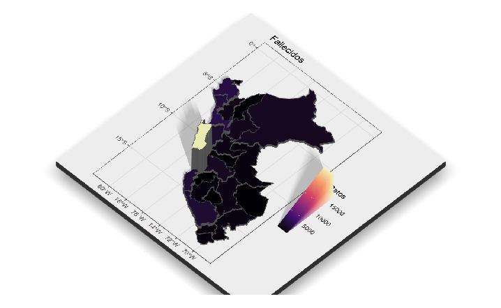
fallecidos_mapa <- mutate(fallecidos_mapa,Datos =Frequency)
ggfallecidos <- ggplot(data = fallecidos_mapa) +
  geom_sf(aes(fill = Datos)) + scale_fill_viridis_c(option = "A")+ ggtitle("Fallecidos") +
  theme_bw()
plot_gg(ggcovid,multicore = T,width = 5 , height = 5, scale = 200, windowsize = c(1280,720)
	,zoom = 0.60 ,phi = 50 ,sunangle = 120,theta=45)
render_camera(fov = 0, theta = 60, zoom = 0.75, phi = 45)
render_scalebar(limits=c(0, 1000, 2000),label_unit = "km",position = "W", y=50,
		scale_length = c(0.33,1))
render_compass(position = "E")
render_snapshot(clear=TRUE)
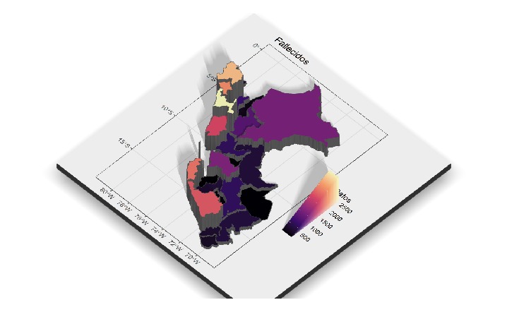
fallecidos_mapa3 <- mutate(fallecidos_mapa3,Datos =Frequency)
ggfallecidos2  <- ggplot(data = fallecidos_mapa3) +
  geom_sf(aes(fill = Datos)) + scale_fill_viridis_c(option = "A")+ ggtitle("Fallecidos sin contar Lima") +
  theme_bw()
plot_gg(ggcovid,multicore = T,width = 5 , height = 5, scale = 200, windowsize = c(1280,720)
	,zoom = 0.60 ,phi = 50 ,sunangle = 120,theta=45)
render_camera(fov = 0, theta = 60, zoom = 0.75, phi = 45)
render_scalebar(limits=c(0, 1000, 2000),label_unit = "km",position = "W", y=50,
		scale_length = c(0.33,1))
render_compass(position = "E")
render_snapshot(clear=TRUE)
Llamamos a las siguientes librerias
library(ggplot2)
library(dplyr)
library(ggplot)
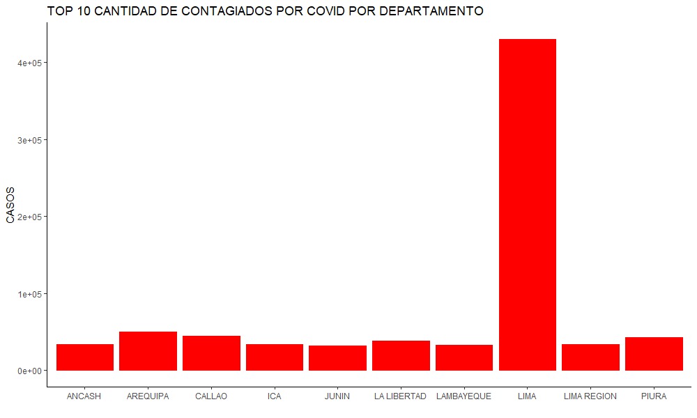
top_10 <- covid2 %>%
  top_n(wt = Frequency,n=10)%>%
  arrange(desc(Frequency))
top_10[top_10$Frequency]
g_top10 <- ggplot(top_10,
		  aes(x= DEPARTAMENTO,y= Frequency))+
  geom_col(fill="Red",col = "Red")+
  ggtitle("TOP 10 CANTIDAD DE CONTAGIADOS POR COVID POR DEPARTAMENTO")+
  xlab("")+
  ylab("CASOS") +
  theme_classic()
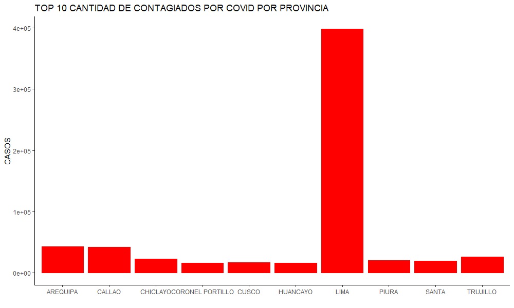
covid3<- covid[-72,]
top_10pro<- covid3 %>%
  top_n(wt = Frequency,n=10)%>%
  arrange(desc(Frequency))
g_top10pro <- ggplot(top_10pro,
		     aes(x= PROVINCIA,y= Frequency))+
  geom_col(fill="Red",col = "Red")+
  ggtitle("TOP 10 CANTIDAD DE CONTAGIADOS POR COVID POR PROVINCIA ")+
  xlab("")+
  ylab("CASOS") +
  theme_classic()
Llamamos a las siguientes librerías library(ggplot2) library(dplyr)
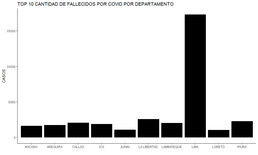
top_10falle <- fallecidos_covid%>%
  top_n(wt = Frequency,n=10)%>%
  arrange(desc(Frequency))
g_top10falle <- ggplot(top_10falle,
		       aes(x= DEPARTAMENTO,y= Frequency))+
  geom_col(fill="Black",col = "Black")+
  ggtitle("TOP 10 CANTIDAD DE FALLECIDOS POR COVID POR DEPARTAMENTO")+
  xlab("")+
  ylab("CASOS")+
  theme_classic()
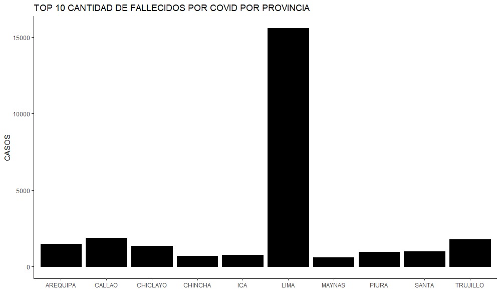
top_10falle2 <- fallecidos_covid2%>%
  top_n(wt = Frequency,n=10)%>%
  arrange(desc(Frequency))
g_top10falle2 <- ggplot(top_10falle2,
			aes(x= PROVINCIA,y= Frequency))+
  geom_col(fill="Black",col = "Black")+
  ggtitle("TOP 10 CANTIDAD DE FALLECIDOS POR COVID POR PROVINCIA")+
  xlab("")+
  ylab("CASOS") +
  theme_classic()
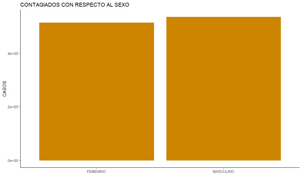
covidsex <- datacovid %>%
  group_by(SEXO) %>% summarise(Frequency=n())
g_sex <- ggplot(covidsex,
		aes(x=SEXO,y=Frequency))+
  geom_col(fill="ORANGE3",col = "ORANGE3")+
  ggtitle("CONTAGIADOS CON RESPECTO AL SEXO")+
  xlab("")+
  ylab("CASOS") +
  theme_classic()
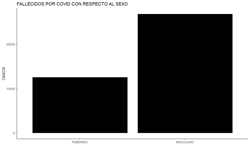
covidfallesex <- fallecidos%>%
  group_by(SEXO) %>%
  summarise(Frequency=n())
covidfallesex2<- covidfallesex[c(-1,-2),]
g_sexfalle <- ggplot(covidfallesex2,
		     aes(x=SEXO,y=Frequency))+
  geom_col(fill="black",col = "black")+
  ggtitle("FALLECIDOS POR COVID CON RESPECTO AL SEXO")+
  xlab("")+
  ylab("CASOS") +
  theme_classic()
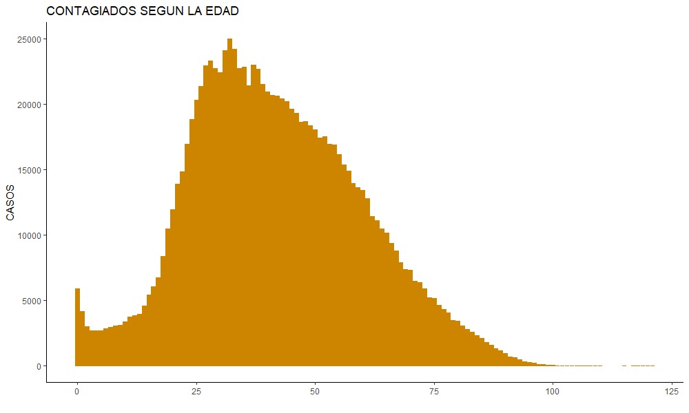
covidage<- datacovid %>%
  group_by(EDAD) %>%
  summarise(Frequency=n())
g_age <- ggplot(covidage,
		aes(x=EDAD,y=Frequency))+
  geom_col(fill="ORANGE3",col = "ORANGE3")+
  ggtitle("CONTAGIADOS CON RESPECTO A LA EDAD")+
  xlab("")+
  ylab("CASOS")+
  theme_classic()
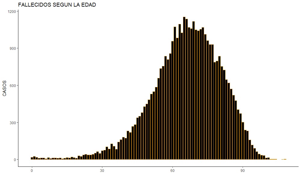
covidagedead<- fallecidos %>%
  group_by(EDAD_DECLARADA) %>%
  summarise(Frequency=n())
g_agedead <- ggplot(covidagedead,
		    aes(x=EDAD_DECLARADA,y=Frequency))+
  geom_col(fill="ORANGE3",col = "ORANGE3")+
  ggtitle("CONTAGIADOS CON RESPECTO A LA EDAD")+
  xlab("")+
  ylab("CASOS")+
  theme_classic()
R studio y Git
Barzola Bustamente Jose Mathias - Análisis de casos positivos por Covid en el Perú en 2D
Ccanto Vargas Eduardo Ivan - Análisis de casos positvos por Covid en el Perú en 3D
Cuenca Cajusol Nicole Allison - Análisis de los fallecidos por Covid en el Perú
Flores Gutiérrez Angie Sylvana - Ploteo de fallecidos por Covid en el Perú
Agradecemos al docente Roy Yali Samaniego por su apoyo en este trabajo.