GUI Library
The Dashboard object exposes a GUI class. You can access it like this:
const GUI = Dashboard.GUIor import it
import { GUI } from 'Dashboard'💁🏻 Wrapped GUI components A wrapped GUI component is a component that is wrapped by an extra element. This is to support components to render for example Icons or other children content inside of them. A wrapped component is marked with (wrapped) in the following documentation.
- button
- card
- checkbox
- columns layout
- config checkbox
- config editor
- config dropDown
- config input
- config json tree
- config password
- config switch button
- config textarea
- data list
- date picker
- drop down
- drop menu
- gallery
- header
- heading
- html
- icon
- icon switch
- webview
- img
- input
- json tree
- label
- list
- markdown viewer
- menu
- multi select list
- paragraph
- popover
- search
- suggest search
- section
- span
- switch button
- tabs
- textarea
- text button
- title
- upload button
- widget button
- widget icon
- wrapper
- writer publish flow
<GUI.Button text="My button" onClick={() => {}} />| Attr | Type | Default | Description |
|---|---|---|---|
onClick |
function | null | On click callback function |
text |
string | null | Icon text, will render a span text for the icon if declared |
className |
string | null | Custom class |
disabled |
boolean | false | If button should be disabled |
spinner |
boolean | false | Render spinner icon inside button if true |
size |
string | "normal" | Size of button, can be "small", "normal", "large" |
submit |
boolean | false | Will render a submit button if set to true or just declared on the button tag |
reset |
boolean | false | Will render a reset button if set to true or just declared on the button tag |
inverted |
boolean | false | Will render with inverted style if true. For example a button with border without background |
primary |
boolean | false | Button will get the primary action style |
warning |
boolean | false | Button will get the warning style |
textOnly |
boolean | false | Display button in a link like fashion |

💁🏻 If none of submit or reset is declared button will render as a normal button. If both submit and reset is declared button will be rendered as a submit button. or other children content inside of them. A wrapped component is marked with (wrapped) in the following documentation.
<GUI.Card card={myCard} />| Attr | Type | Default | Description |
|---|---|---|---|
className |
string | null | Custom class |
style |
object | null | Custom inline style |
width |
string | null | Custom width style |
height |
string | null | Custom height style |
disabled |
boolean | false | Disables card if true |
onClick |
function | null | On click callback function for click on the whole card, returns passed card object |
*GUI.Card takes drag/drop props see: GUI.Wrapper for more details.
| Attr | Type | Default | Description |
|---|---|---|---|
title |
string | null | Mouse over data-tooltip title |
status |
string | null | Card handler on left side, Supported status: draft, done, approved, withheld, usable, canceled
|
statusColor |
css color value | null | Custom card handler color |
icon |
react elemnt / object | null | Valied react element to render on the right side of the card header, if it's an object will use GUI.Icon to be rendered |
header |
react elemnt / string | null | Valied react element or string to be rendered on the top section of the card |
headline |
string | null | Custom headline will be rendered in the top of the card body |
content |
react elemnt | null | Valid react element to be rendered in the body section of the card |
images |
array | null | Array of images url, will be rendered in the right side of card body with a number of images |
footer |
react elemnt / string | null | Valied react element or string to be rendered on the bottom section of the card |
| Attr | Type | Default | Description |
|---|---|---|---|
iconClass |
string | null | Name of icon. Dashboard leverage the awesome font set Dripicons by Amit Jakhu. View all available icons here. |
onClick |
function | null | On click callback function |
const myCardIcon = {
    iconClass: 'world',
    onClick: () => {
        // On icon clicked....
    }
}

const myCard = {
    ...
    icon: myCardIcon,
    ...
}const myCard = {
title: 'My card No: 1',
status: 'done',
header: myHeaderComponent,
headline: 'Boomers smugglas in via Helsinborgs hamn och monteras på bilar - "De ska explodera när bilen öppnas"',
images: ['http://www.url.se/image1.png', 'http://www.url.se/image2.png'],
footer: 'SVERIGE | NYHET | Mathilda Sigurdardottir'
}
<GUI.Card card={myCard} onClick={card => //Do stuff with the card....}/>
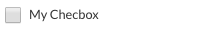
<GUI.Checkbox className="custom-class" onChange={checked => {}} />| Attr | Type | Default | Description |
|---|---|---|---|
onChange |
function | null | On change callback function. Returns checked boolean |
className |
string | null | Custom class |
style |
object | null | Custom inline style |
checked |
boolean | false | Default checked value |
label |
string | null | Will render a label component |
inline |
boolean | false | For display inline |
disabled |
boolean | false | Disables checkbox if true |
title |
string | null | Displays a tooltip with title string when hovering the input part |
<GUI.ColumnsLayout className="custom-class" columns={columns} />| Attr | Type | Default | Description |
|---|---|---|---|
id |
string | null | Id for each column, Column won't be rendered without an id |
columns |
array | null | Array encluds cloumns objects |
columnsClass |
string | null | Custom class will be applied for all columns |
rowsClass |
string | null | Custom class will be applied for all column's rows |
className |
string | null | Custom class will be applied for ColumnsLayout wrapper |
[
    {
        id: '63a43aa4-29b5-4e84-b0d2-52de5adfd1ef',
        align: 'left',
        rows: [
            {
                id: '12fd54-2gfd5-400e84-b0dddd2-gfdde5a41',
                content: 'My row content'
            }
        ]
    }
]| Attr | Type | Default | Description |
|---|---|---|---|
id |
string | null | Id for each row, Row won't be rendered without an id |
rows |
array | null | Array encluds rows objects |
content |
react elemnt | null | Valied react element or string |
className |
string | null | Custom class will be applied just for this row |
const columns = [
    {
        id: '63a43aa4-29b5-4e84-b0d2-52de5adfd1ef',
        align: 'left',
        rows: [
            {
                id: 'columns-1-rows-1-id',
                content: 'column 1 - row 1'
            },
            {
                id: 'columns-1-rows-2-id',
                content: 'column 1 - row 2'
            },
            {
                id: 'columns-1-rows-3-id',
                content: 'column 1 - row 3'
            }
        ]
    },
    {
        id: 'ffdf35-f3325-00sd-1cxxxa-sd2ffjj39717s',
        align: 'center',
        rows: [
            {
                id: 'columns-2-rows-1-id',
                content: 'column 2 - row 1'
            },
            {
                id: 'columns-2-rows-2-id',
                content: 'column 2 - row 2'
            },
            {
                id: 'columns-2-rows-3-id',
                content: 'column 2 - row 3'
            }
        ]
    },
    {
        id: '12fd54-2gfd5-400e84-b0dddd2-gfdde5a41',
        align: 'right',
        rows: [
            {
                id: 'columns-3-rows-1-id',
                content: 'column 3 - row 1'
            },
            {
                id: 'columns-3-rows-2-id',
                content: 'column 3 - row 2'
            },
            {
                id: 'columns-3-rows-3-id',
                content: 'column 3 - row 3'
            }
        ]
    }
]

<GUI.ColumnsLayout columns={columns} columnsClass={'my-custom-columns-class'} rowsClass={'my-custom-rows-class'}/>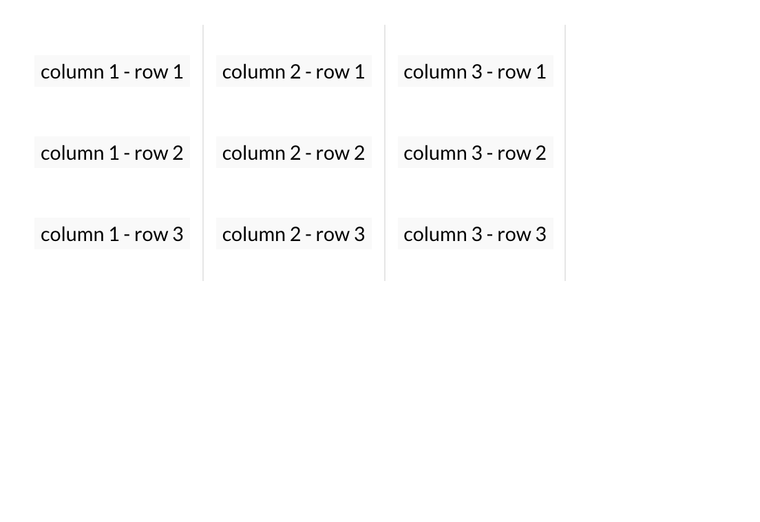
<GUI.ConfigCheckbox ref="configRef" label="config text" />| Attr | Type | Default | Description |
|---|---|---|---|
ref |
function | null | Use refs callback: this.handleRefs(ref, 'CONFIG_KEY') |
className |
string | null | Custom class |
style |
string | null | Custom inline style |
checked |
boolean | false | Default checked value |
label |
string | null | Config name text |
inline |
boolean | false | For display inline |
disabled |
boolean | false | Disables checkbox if true |
constructor(props) {
	super(props)
	this.state = {
		myConfig: props.config.myCheckboxConfig
	}
}

<GUI.ConfigCheckbox ref="myCheckboxConfig" label="My Checkbox Config" />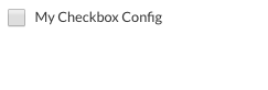
<GUI.ConfigDropDown items={items} ref="configRef" />| Attr | Type | Default | Description |
|---|---|---|---|
ref |
function | null | Use refs callback: this.handleRefs(ref, 'CONFIG_KEY') |
items |
array | null | Array of items. |
style |
string | null | Custom inline style |
className |
string | null | Custom class |
onSelect |
function | null | Return selected item. |
defaultSelectedItem |
object | null | One of the items in the items array, will be selected at start. |
const items = [
   {
		iconClass: 'rocket',
		iconColor: 'gray',
		content: 'My content 1',
		id: 'my-custom-id-1'
	},
	{
		iconClass: 'star',
		iconColor: 'gray',
		content: 'My content 2',
		id: 'my-custom-id-2'
	}
]

<GUI.ConfigDropDown ref="myDropDownConfig" defaultSelectedItem={items[0]} items={items} />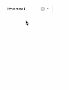
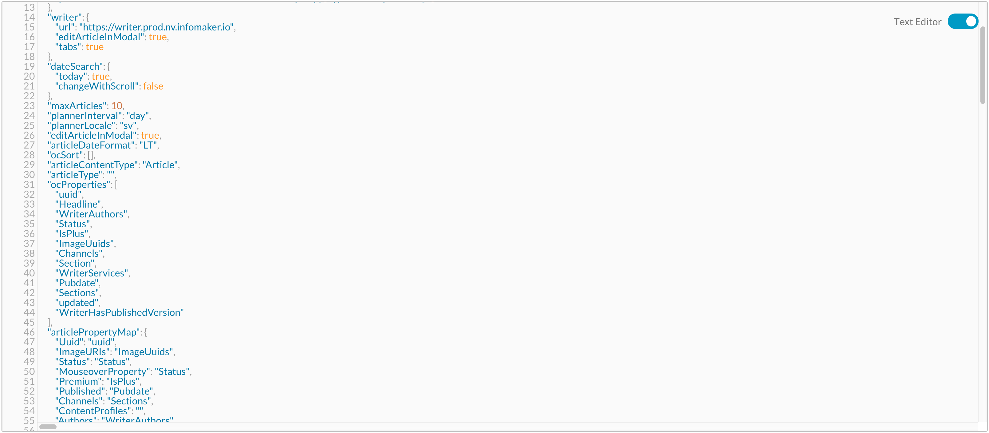
<GUI.ConfigEditor ref="configEditorRef"/> | Attr | Type | Default | Description |
|---|---|---|---|
ref |
function | null | Use refs callback: this.handleRefs(ref, 'CONFIG_KEY') |
schema |
object | null | Use schema to validate your config object, available schema constructors 🤓, for more details see jsonschema GitHub page |
json |
boolean | false | If true will get a JSON object instead of a stringify object |
name |
string | null | ConfigEditor label name |
width |
string | '100%' | The hight of the editor. 'px' or '%' |
height |
string | '700px' | The hight of the editor. 'px' or '%' |
style |
boject | null | Custom inline style |
className |
string | null | Custom class |
<GUI.ConfigInput ref="configRef" name="config text" /> | Attr | Type | Default | Description |
|---|---|---|---|
ref |
function | null | Use refs callback: this.handleRefs(ref, 'CONFIG_KEY') |
name |
string | null | Config name text |
value |
string | null | Default config input value |
style |
string | null | Custom inline style |
className |
string | null | Custom class |
validation |
array | null | Config validation can be : 'required', 'alpha', 'numerical', 'alphanumerical', 'email' |
<GUI.ConfigInput ref="myConfig" name="My Config Input" validation={['required']} />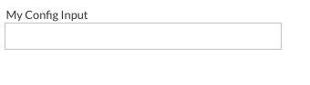
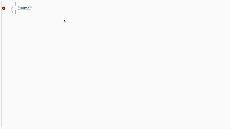
<GUI.ConfigJsonTree ref="configRef" name="config text" value={}/> | Attr | Type | Default | Description |
|---|---|---|---|
ref |
function | null | Use refs callback: this.handleRefs(ref, 'CONFIG_KEY') |
name |
string | null | ConfigJsonTree name text |
style |
string | null | Custom inline style |
className |
string | null | Custom class |
readOnly |
boolean | false | Read only mode can't be edit values
|
disabled |
boolean | false | Disable ConfigJsonTree if it's true
|
json |
boolean | false | If true will get a JSON object instead of a stringify object |
data |
object | null | Set default value for the config json tree |
<GUI.ConfigJsonTree ref="myConfig" name="My Config JsonTree" />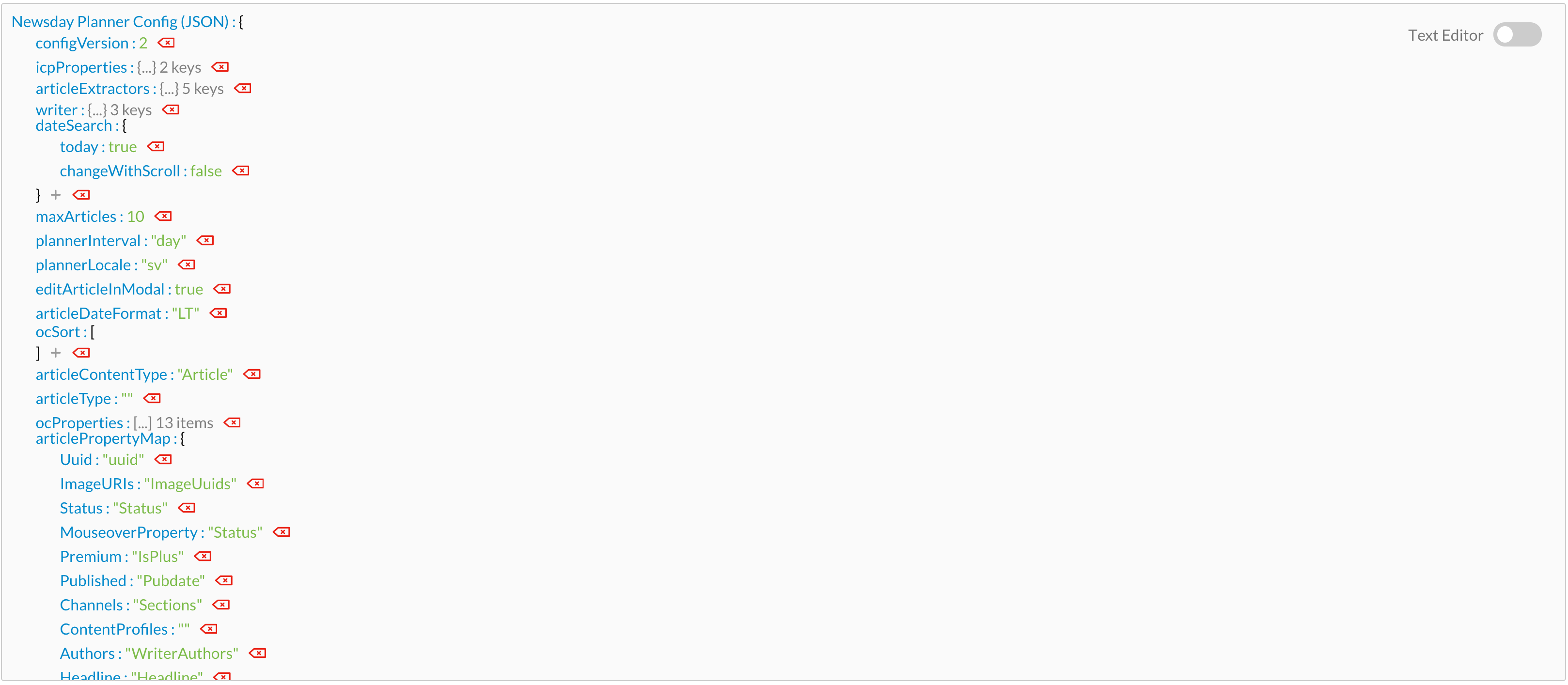
<GUI.ConfigPassword ref="configRef" name="config text" />| Attr | Type | Default | Description |
|---|---|---|---|
ref |
function | null | Use refs callback: this.handleRefs(ref, 'CONFIG_KEY') |
style |
string | null | Custom inline style |
className |
string | null | Custom class |
name |
string | null | Config name text |
validation |
array | null | Config validation can be : 'required', 'alpha', 'numerical', 'alphanumerical', 'email' |
<GUI.ConfigPassword ref="myPasswordConfig" name="My Password Config Input" validation={['required']} />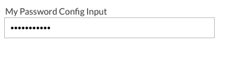
<GUI.ConfigSwitchButton ref="configRef" label="Config SwitchButton" />| Attr | Type | Default | Description |
|---|---|---|---|
ref |
function | null | Use refs callback: this.handleRefs(ref, 'CONFIG_KEY') |
label |
string or object | null | Config label text, {left: 'left text', right: 'right text'} |
validation |
array | null | Config validation can be : 'required', 'alpha', 'numerical', 'alphanumerical', 'email' |
style |
string | null | Custom inline style |
className |
string | null | Custom class |
<GUI.ConfigSwitchButton ref="mySwitchButtonConfig" label="My SwitchButton Config Input" validation={['required']} />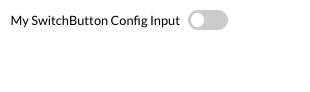
<GUI.ConfigTextarea ref="configRef" name="config text" />| Attr | Type | Default | Description |
|---|---|---|---|
ref |
function | null | Use refs callback: this.handleRefs(ref, 'CONFIG_KEY') |
name |
string | null | Config name text |
validation |
array | null | Config validation can be : 'required', 'alpha', 'numerical', 'alphanumerical', 'email' |
style |
string | null | Custom inline style |
className |
string | null | Custom class |
<GUI.ConfigTextarea ref="myTextareaConfig" name="My Textarea Config Input" validation={['required']} />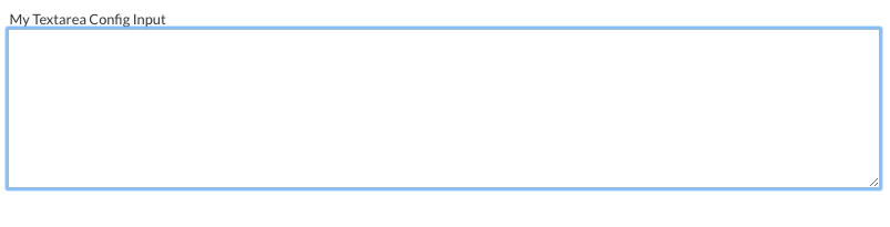
<GUI.Datalist id={} options={}/>| Attr | Type | Default | Description |
|---|---|---|---|
id |
string | null | Id to use it in GUI.Input won't render with out an id |
style |
string | null | Custom inline style |
options |
array | null | An array with option item objects to display |
className |
string | null | Custom class |
{
    value: 'my option1',
    id: '63a43aa4-29b5-4e84-b0d2-52de5adfd1ef'
}const items = [
{
id: "my-custom-id-1",
value: "apple"
},
{
id: "my-custom-id-2",
value: "anything!"
},
{
id: "my-custom-id-3",
value: "option 1"
}
]
<GUI.Input list={'my-input-list-id'} />
<GUI.Datalist id={'my-input-list-id'} options={items} />
<GUI.DatePicker />| Attr | Type | Default | Description |
|---|---|---|---|
className |
string | null | Custom class |
onChange |
function | null | On change callback function. Returns current value |
selected |
string or moment object | null | Sets the initial value of the datepicker |
icon |
string or object | null | Render custom icon with DatePicker |
label |
string or object | null | Render custom label with DatePicker |
textMode |
boolean | false | Render DatePicker with the same style and with uneditable mood |
readOnly |
boolean | false | Disable DatePicker |
primary |
boolean | false | Primary style for input |
onBlur |
function | false | onBlur callback function |
onFocus |
function | false | onFocus callback function |
const icon = {
    position: 'right',
    iconClass: 'calendar'
}
const label='My label text'

<GUI.DatePicker label={label} icon={icon} />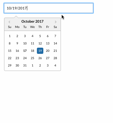
<GUI.DropDown items={[]} />| Attr | Type | Default | Description |
|---|---|---|---|
items |
array | null | Array of items. |
selectedItem |
object | null | One of the items in the items array, will be selected at start. |
filterable |
boolean | false | Will insert Search component if true to enable filtering of items |
compact |
boolean | false | True or false if the dropdown should have a compact layout |
maxHeight |
number | 300 | The max height of the dropdown, px will automatically be appended |
onSelect |
string, object | - | Will return id for selected item, recieves object reference as second parameter. It is also possible to add a onSelect callback to each item |
style |
object | null | Add inlinestyle to the dropdown |
keyToggle |
boolean | false | Toggle between list items with arrow keys, and "Retern" key will select the item |
className |
string | null | Custom class |
| Name | Returns | Description |
|---|---|---|
isOpen |
boolean | Check if the dropDown is open or not |
{
    id: "my-custom-dropdown-id",
    iconClass: "network-1",
    iconSize: "large",
    style: {
      color: 'gray'
    },
    content: "dropdown item value"
}| Attr | Type | Default | Description |
|---|---|---|---|
iconClass |
string | null | Icon class for the item. |
iconSize |
string | small | Icon size for the item. |
style |
object | null | To style the item's icon. |
const items = [
		{
			id: "my-custom-dropdown-id-1",
			iconClass: "network-1",
			content: "Dropdown item 1",
			style: {
				color: 'gray'
			}
		},
		{
			id: "my-custom-dropdown-id-2",
			iconClass: "network-2",
			content: "Dropdown item 2",
			style: {
				color: 'red'
			}
		},
		{
			id: "my-custom-dropdown-id-3",
			iconClass: "network-3",
			content: "Dropdown item 3",
			style: {
				color: 'blue'
			}
		}
	]

<GUI.DropDown items={items} />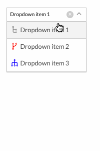
<GUI.DropMenu items={[]} />Dropmenu is rendered inside a Popover GUI component. It will pass on all props to the Popover so you can also use Popover functionality.
| Attr | Type | Default | Description |
|---|---|---|---|
items |
array | null | Array of DropMenu items. |
compact |
boolean | true | Array of DropMenu items. |
iconClass |
string | normal | Class for icon |
customIcon |
element | null | Custom icon element. |
iconSize |
string | normal | Size of icon: (small, normal or large) |
align |
string | center | Align of DropMenu icon, left, center and right. |
width |
int | auto | Width of DropMenu. px
|
height |
string | auto | Height of DropMenu, 'to-bottom' or 'auto' |
maxWidth |
int | 700 | Max width of DropMenu. |
maxHight |
int | 300 | Max hight of DropMenu, will be ignored if the height='to-bottom' |
border |
boolean | true | Border of DropMenu. |
scrollable |
boolean | true | Render passed content inside a scrollable wrapper |
disabled |
boolean | false | Disable DropMenu |
{
    iconClass: "icon class name",
    id: 'my-drop-menu-custom-id',
    content: "dropmenu item content",
    onClick: () => {
	//Do Something.
    }
}| Prop | Type | Default | Description |
|---|---|---|---|
id |
string | null | Custom id, won't be rendered without an ID |
iconClass |
string | null | Name of icon. Dashboard leverage the awesome font set Dripicons by Amit Jakhu. View all available icons here. |
content |
string or element | null | Can be a string or an element. Pass an element to override the default class |
disabled |
boolean | false | Disable the item |
onClick |
function | null | On click callback function for click on the whole item, returns react wrapped event |
className |
string | null | Custom class |
const items = [
	{
		iconClass: "network-1",
		id: 'my-item-1-id',
		content: "dropmenu item content 1",
		onClick: () => {
			//Do Something.
		}
	},
	{
		iconClass: "network-2",
		id: 'my-item-2-id',
		content: "dropmenu item content 2",
		disabled: true,
		onClick: () => {
			//Do Something.
		}
	},
	{
		iconClass: "network-3",
		id: 'my-item-3-id',
		content: "dropmenu item content 3",
		onClick: () => {
			//Do Something.
		}
	}
]

<GUI.DropMenu items={items} />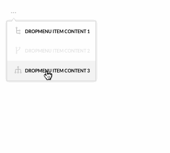
We create a dropmenu with two items. First item defines a custom component for it's title and an on click callback for the whole item. The second item defines a normal text content.
<GUI.Gallery items={items} />| Attr | Type | Default | Description |
|---|---|---|---|
items |
array | null | An array with images or videos urls objects to display |
width |
string | '100%' | The width for the gallery |
height |
string | '100%' | The height for the gallery |
className |
string | null | Custom class |
onClick |
function | null | On click call back function |
onPlay |
function | null | On play call back function |
onSlide |
function | null | On slide call back function |
onPause |
function | null | On pause call back function |
showNav |
boolean | true | Show navigation arrows |
showIndex |
boolean | true | Show images index number |
autoPlay |
boolean | false | Auto play when component did mount |
showBullets |
boolean | true | Show bullets under images |
slideInterval |
int | 200 | Set slide interval |
disableSwipe |
boolean | false | Dispale swipe between images |
showThumbnails |
boolean | true | Display thumbnails for images and videos |
showPlayButton |
boolean | true | display play button |
thumbnailPosition |
string | 'bottom' | Thumbnail position: top, bottom, left and right
|
showFullscreenButton |
boolean | false | display full screen button |
{
	original: 'PATH_TO_FULL_SIZE_IMAGE',
	thumbnail: 'PATH_TO_THUMBNAIL',
	description: 'Optional description...',
	sizes: { width: '200px', height: '150px'}
}| Prop | Type | Default | Description |
|---|---|---|---|
original |
string | null | The url for the original image to display it in the gallery |
thumbnail |
string | null | The url for the thumbnail image to display it in the gallery bar , support youtube thumbnail images |
description |
string | null | An optional description to display it beside the image |
sizes |
object | null | An optional size to display the image with specific size |
video |
boolean | false | If the url was a video should be " true " |
embedUrl |
string | null | The url for the video to display it in the gallery |
const items = [
	{
		original: 'https://static.ewtest.infomaker.io/wp-content/uploads/sites/2/2017/03/22081303/icon-writer.png',
		sizes: { width: '150px', height: '200px'},
		description: 'IMAGE NUMBER 1',
	},
	{
		original: 'https://static.ewtest.infomaker.io/wp-content/uploads/sites/2/2017/03/22081344/icon-everyware.png',
		description: 'IMAGE NUMBER 2',
	},
	{
		embedUrl: 'https://www.youtube.com/embed/2ul5GTBYCd0',
		description: 'VIDEO NUMBER 1',
		video: true
	}
]

<GUI.Wrapper style={{width: '100%', height: '500px'}}>
	<GUI.Gallery items={items} />
</GUI.Wrapper>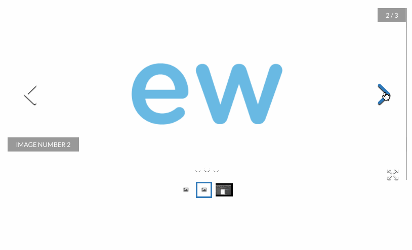
We create a gallery with two pictures and two videos. First two items display a nature pic, And the secound two item a nature videos from youtube.
<GUI.Header text="My header title" />| Attr | Type | Default | Description |
|---|---|---|---|
text |
string | null | Header text |
className |
string | null | Custom class |
direction |
string | "ltr" | Text direction, can be "ltr", "rtl" |
onClick |
function | null | OnClick callback function |
<GUI.Heading level="3" text="My h3 title" />| Attr | Type | Default | Description |
|---|---|---|---|
level |
integer | 2 | What kind of heading that will be rendered. Can be 2, 3, 4, 5, 6 |
text |
string | null | Heading text |
className |
string | null | Custom class |
direction |
string | "ltr" | Text direction, can be "ltr", "rtl" |
onClick |
function | null | OnClick callback function |
<GUI.Heading level="3" text="My h3 title" />
<GUI.HTML htmlValue={__html} />| Attr | Type | Default | Description |
|---|---|---|---|
htmlValue |
string | null | Dangerously Set InnerHTML value |
className |
string | null | Custom class |
const htmlValue = "<h1>Hi there!</h1>"

<GUI.HTML htmlValue={htmlValue} />
<GUI.Icon iconClass="star" onClick={e => {}} text="My icon text" />| Attr | Type | Default | Description |
|---|---|---|---|
iconClass |
string | null | Name of icon. Dashboard leverage the awesome font set Dripicons by Amit Jakhu. View all available icons here. |
onClick |
function | null | On click callback function, returns react wrapped event |
text |
string | null | Icon text, will render a span text for the icon if declared |
className |
string | null | Custom class |
disabled |
boolean | false | If icon should be disabled |
size |
string | "normal" | Size of button, can be small", "normal", "large" |
iconColor |
string | "white" | Color of icon, can be e.g "black" or "#333" |
textColor |
string | "white" | Color of text, can be e.g "black" or "#333" |
spin |
boolean | false | Spiner Icon |
<GUI.Icon iconClass="star" text="My star icon" iconColor={"gray"}/>
<GUI.Icon iconClass="graph-bar" iconColor={"blue"}/>
<GUI.Icon iconClass="cloud" text="My cloud icon" iconColor={"red"}/>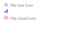
<GUI.IconSwitch icons={myIcons} onClick={() => { /* Do something */ }} onChange={item => {console.log(item)}} />| Attr | Type | Default | Description |
|---|---|---|---|
onChange |
function | null | On change callback function, return the icon OBJ. |
onClick |
function | null | On click callback function |
className |
string | null | Custom class |
disabled |
boolean | false | If icon should be disabled |
| Attr | Type | Default | Description |
|---|---|---|---|
iconClass |
string | null | Name of icon. Dashboard leverage the awesome font set Dripicons by Amit Jakhu. View all available icons here. |
id |
string-number | null | An id for the icon, *required won't be displayed with out an id |
className |
string | null | Custom class for the icon |
any other custom properties |
any | null | Custom properties will be returned with onChange callback |
const icons = [
    {
        id: 'my-lock-icon-switch-id',
        iconClass: 'lock',
        locked: true
    },
    {
        id: 'my-unlock-icon-switch-id',
        iconClass: 'lock-open',
        locked: false
    }
]
<GUI.IconSwitch icons={icons} onClick={() => console.log('Clicked !')} onChange={item => console.log(item)}/>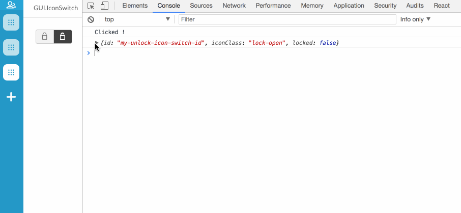
<GUI.Webview src={'my url src'} />| Attr | Type | Default | Description |
|---|---|---|---|
frameBorder |
integer | 0 | The border for the frame |
onLoad |
function | null | On load callback returns: (event, WebviewRef)
|
identifier |
string | null | Identifier for send and receiving data from/to src web page |
onReceive |
function | null | On Receive callback function works same as onMessage returns: receivedData, receivedData should has identifier property same Webview identifier, won't receive any data if the identifier dosen't match |
width |
string | 100% | The width for iframe |
height |
string | 100% | The height for iframe |
className |
string | null | Custom class |
<Webview src='my-src-url' ref={ref => this.myWebview = ref}/>
...
const myDataObj = {
    // Some data to send ....
}
this.myWebView.sendData(myDataObj)const url = "https://www.infomaker.se/"
<GUI.Webview src={url} height={"600px"}/>
<GUI.Img src={'my url img'} />| Attr | Type | Default | Description |
|---|---|---|---|
width |
string | null | The width for image |
height |
string | null | The height for image |
draggable |
boolean | false | Set draggable prop on img element |
onClick |
function | null | On click callback function returns Img src |
onError |
function | null | On error loading the img src callback |
className |
string | null | Custom class |
const url = "https://s3-eu-west-1.amazonaws.com/dashboard-plugin-wiki-screenshots/gui/Infomaker+logo.png"

<GUI.Img src={url} />
<GUI.Input placeholder="My input placeholder text" onChange={value => {}} />| Attr | Type | Default | Description |
|---|---|---|---|
onChange |
function | null | On change callback function. Returns current value |
change |
boolean | false | Will trigger onChange once on first render if set to true |
onEnter |
function | null | Callback function for enter keypress. Returns current value |
placeholder |
string | null | Input placeholder text |
list |
string | null | Input list for GUI.Datalist |
className |
string | null | Custom class |
disabled |
boolean | false | If input should be disabled |
autoFocus |
boolean | false | Boolean if input should get focus on render |
icon |
object | null | Render custom icon inside input, {iconClass: 'cross', position: 'right'}
|
label |
object | null | render custom label |
textMode |
boolean | false | If true GUI.Input will be treat as a text element |
multiple |
boolean | false | Allow multiple values in GUI.Input |
onClick |
function | null | On click callback function returns click event |
uncontrolled |
boolean | false | Control the input by ref set, get and clear value with: getValue(), setValue() and clear()
|
onBlur |
function | null | On blur callback function returns blur event |
onFocus |
function | null | On focus callback function returns focus event |
onKeyPress |
function | null | On key press callback function returns input value |
onKeyDown |
function | null | On key down callback function returns an object with pressed key and input value, {key: PRESSED_KEY, value: INPUT_VALUE}
|
<GUI.Input placeholder="My input placeholder text" onChange={value => console.log(value)} />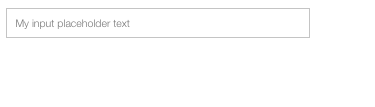
<GUI.JsonTree name="My JsonTree name" data={myDataObject} onChange={value => //Do stuff with modyfied DataObject} />| Attr | Type | Default | Description |
|---|---|---|---|
name |
string | null | JsonTree name text |
data |
object | null | JSON object data |
style |
string | null | Custom inline style |
className |
string | null | Custom class |
readOnly |
boolean | false | Read only mode can't edit values
|
disabled |
boolean | false | Disable JsonTree if it's true
|
onChange |
function | null | On change callback function. Returns modyfied data object |
const myDataObject = {
    srting: 'My string',
    object: {
        key1: 'my key1 value',
        key2: 'my key2 value'
        key3: 'my key3 value'
    },
    array: [
        'item1',
        'item2',
        'item3'
    ],
    boolean: true
}

<GUI.JsonTree name="Newsday Planner Config (JSON)" data={myDataObject} />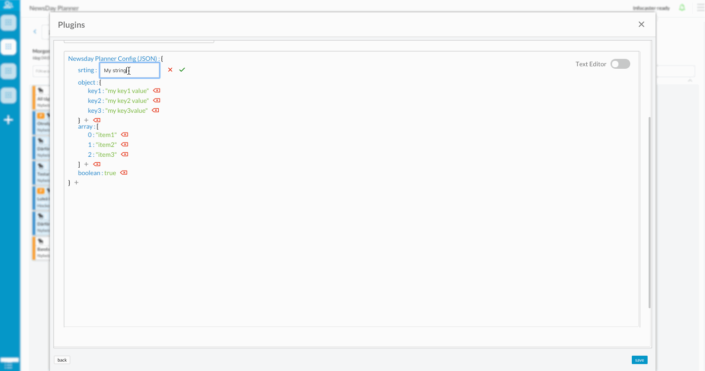
<GUI.Label className="custom class" htmlFor={htmlForValue} text={myText} />| Attr | Type | Default | Description |
|---|---|---|---|
text |
string | null | Label text |
htmlFor |
string | null | HtmlFor value |
className |
string | null | Custom class |
const myText = "My label text"

<GUI.Label htmlFor={'my-example-input'} text={myText} />
<GUI.List items={[]} />| Attr | Type | Default | Description |
|---|---|---|---|
items |
array | null | Array of list items. |
inlineItems |
boolean | false | By setting true GUI.List will render as a grid view. |
before |
element | null | A custom element render in the top of the list . |
after |
element | null | A custom element render in the bottom of the list . |
compact |
boolean | false | True or false if the dropdown should have a compact layout |
ItemClass |
element | false | Custom Item component to render the list items with. |
className |
string | null | Custom class |
{
    id: "2b42d026-e5cb-4731-8fc0-2f87fde06b38",
    title: "list item title",
    content: "list item content",
    image: { src: "list-item-image.png" },
    author: "list item author"
}| Prop | Type | Default | Description |
|---|---|---|---|
id |
string or integer | null | Id for list item. An item without an id will not be rendered. If your objects don't have an id just call Dashboard.createUUID() |
title |
string or element | null | Can be a string or a element. Pass an element to override the default class |
content |
string or element | null | Can be a string or a element. Pass an element to override the default class |
style |
object | null | Inline style for the item. |
image |
object | null | Object with a src and size property representing the image |
author |
string or element | null | Can be a string or a element. Pass an element to override the default class |
onClick |
function | null | On click callback function for click on the whole item, returns react wrapped event |
children |
array | null | List items rendered as a children inside the item |
const items = [{
    id: "my-custom-list-id-1",
    title: 'Title 1',
    content: "content 1"
}, {
    id: "my-custom-list-id-2",
    title: "title 2",
    content: <GUI.Header text="content 2" onClick={() => {}} />,
    image: { src: "list-item-image.png" }
}]

<GUI.List items={items} />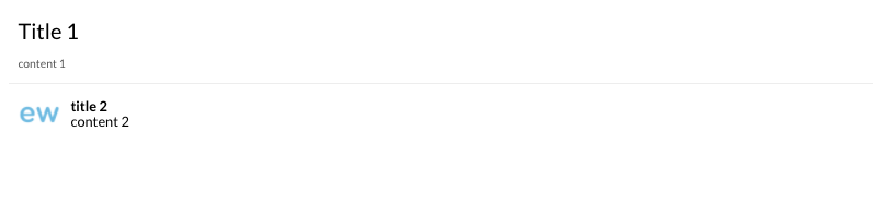
💁🏻 You can also display your list as a grid by passing inlineItems={true}
<GUI.List items={items} inlineItems={true}/>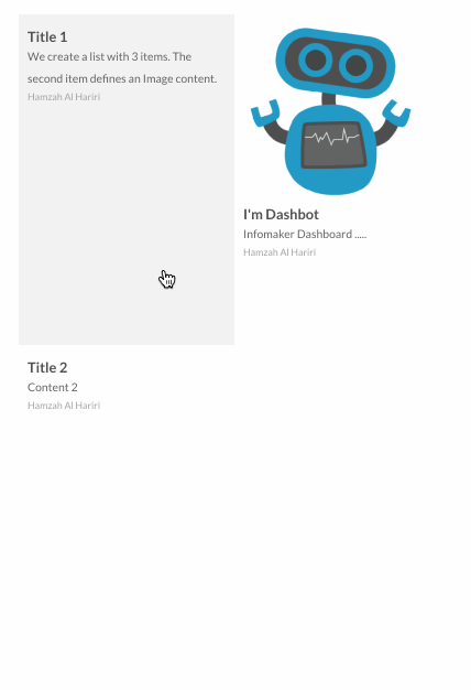
<GUI.MarkdownViewer className="custom class" htmlFor={htmlForValue} text={myText} />| Attr | Type | Default | Description |
|---|---|---|---|
text |
string | null | Markdown text |
const myMarkdownText = `
    # Headline 1
    ## Headline 2

    **Cool bold text**
`

<GUI.MarkdownViewer text={myMarkdownText} /><GUI.Menu items={myItems} />| Attr | Type | Default | Description |
|---|---|---|---|
items |
array | null | List items to render inside menu |
iconClass |
string | null | Name of icon. Dashboard leverage the awesome font set Dripicons by Amit Jakhu. View all available icons here. |
showText |
boolean | false | Show or hide text prop |
link |
string | null | Link url text |
className |
string | null | Custom class |
{
    iconClass: 'rocket',
    id: 'my-menu-item-id',
    text: 'My title text',
    showText: true
}const items = [
{
iconClass: 'rocket',
iconColor: 'black',
text: 'My title text',
link: 'https://www.infomaker.se',
showText: true,
id: "my-custom-menu-id-1",
},
{
iconClass: 'star',
iconColor: 'black',
text: 'Title 2',
link: 'https://www.google.se',
showText: true,
id: "my-custom-dropdown-id-2",
}
]
<GUI.Menu items={items} />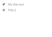
<GUI.MultiSelectList className="custom_class" items={seletListItems} />| Attr | Type | Default | Description |
|---|---|---|---|
className |
string | null | Custom class |
items |
array | null | Multi select array of items |
placeholder |
srting | null | Text place holdetr in MultiSelectList |
noSelectionLabel |
srting | null | Fixed text will be displayed if there was no selected items |
renderCheckedLabels |
boolean | true | Render selected item's labels as a text |
clearButton |
boolean | true | Display a clear button to deselect all the items |
clearPlaceholder |
string | Clear | Clear button text |
align |
string | left | Align of Popover icon, left, center and right |
primary |
boolean | false | Use Dashboard primary style |
minWidth |
string | 250px | Set minWidth for MultiSelectList |
maxHeight |
string | null | Set maxheight for MultiSelectList |
style |
object | null | Inline style for MultiSelectList |
onClear |
function | null | On clear callback, will fire when clear button is clicked or if all the items deselected |
onChange |
function | null | On change callback with two arg: (activeItems, items) activeItems is the selected ones, items is all the items |
onItemChange |
function | null | On any item changed will fire, with the changed item |
If you have both
onChangeandonItemChangecallbacks both will be fired.
Each item require a uniq
uuidto be rendered.
{
    uuid: 'my-item-1',
    label: 'my item label  text',
    checked: false,
    ...ANY_OTHER_PROERTIES
}
you can pass any other custom property with the MultiSelectList item object and it will be passed with callback
const items = [
    {
        uuid: 'my-item-1',
        label: 'my label 1',
        checked: false,
    },
    {
        uuid: 'my-item-2',
        label: 'my label 2',
        checked: false,
    }
]

<GUI.MultiSelectList items={items} />
<GUI.Paragraph text="My paragraph text" />| Attr | Type | Default | Description |
|---|---|---|---|
text |
string | null | Paragraph text, Will try to use children content if text attribute is omitted. Children content should only contain text and no html |
className |
string | null | Custom class |
direction |
string | "ltr" | Text direction, can be "ltr", "rtl" |
<GUI.Paragraph text="My paragraph text" />
<GUI.Paragraph>
   My paragraph <strong>text</strong>
<GUI.Paragraph><GUI.Search className='my-class' placeholder='search here' />accept all GUI.Input props
| Attr | Type | Default | Description |
|---|---|---|---|
placeholder |
string | null | Paragraph text, Will try to use children content if text attribute is omitted |
list |
string | null | Input list for GUI.Datalist |
className |
string | null | Custom class |
<GUI.Popover />| Attr | Type | Default | Description |
|---|---|---|---|
content |
element | null | Custom element or a react component to be rendered in the popover. |
trigger |
element | <GUI.Icon iconClass = "dots-2"/> | To trigger a custom element or a react component to display a popover. |
arrow |
boolean | true | Display arrow with the popover. |
hold |
boolean - object | false | An hold functionality to display the popover after hold on the trigger. defualt timeout = 500 ms, hold={{timeout: 2000}} |
hover |
boolean | false | Open Popover on mouse hover the trigger instead of onClick |
onClick |
function | null | OnClick callback function. |
align |
string | center | Align of Popover icon, left, center and right. |
width |
int | auto | Width of Popover. |
height |
string | auto | Height of Popover, 'to-bottom' or 'auto' |
maxWidth |
int | 700 | Max width of Popover. |
maxHight |
int | 300 | Max hight of Popover, will be ignored if the height='to-bottom' |
border |
boolean | true | Border of Popover. |
useRelativePosition |
boolean | false | Use position: 'relative' instead of default position: 'fixed' |
scrollable |
boolean | true | Render popover content inside a scrollable component |
| Name | Returns | Description |
|---|---|---|
isOpen |
boolean | Check if the popover is open or not |
Click and hold the trigger to dipslay popover
<GUI.Popover content={<MyCustomImportComponent />} trigger={<MyCustomPlusIcon />} hold={{timeout: 300}} arrow={false} />Hover the trigger to dipslay popover
<GUI.Popover hover content={<MyCustomMenuComponent />} trigger={<MyCustomMenuIconElement />} />
<GUI.Section title="my-section" buttons={[]} />| Attr | Type | Default | Description |
|---|---|---|---|
title |
string | null | Section title. |
className |
string | null | Custom class |
headerClassName |
string | null | Custom class for header |
buttons |
array | null | Array of GUI.Button rendered in the upper right of the section header. Requires the title prop to be set |
minimized |
boolean | false | Render a minimized section |
toggleable |
boolean | true | If the section is toggleable or not |
<GUI.Section title="my-title" buttons={[
    <GUI.Button text="first button" />,
    <GUI.Button text="second button" />
]}>
    // Section content
</GUI.Section><GUI.Wrapper className="@plugin_bundle_class">
<GUI.Section title="First Section" buttons={[
<GUI.Button text="first button" />
]}>
// first section content
</GUI.Section>
<GUI.Section title="Second Section" minimized buttons={[
<GUI.Button text="second button" />
]}>
// second section content
</GUI.Section>
<GUI.Section toggleable={false} title="Third Section">
// Third section content
</GUI.Section>
</GUI.Wrapper>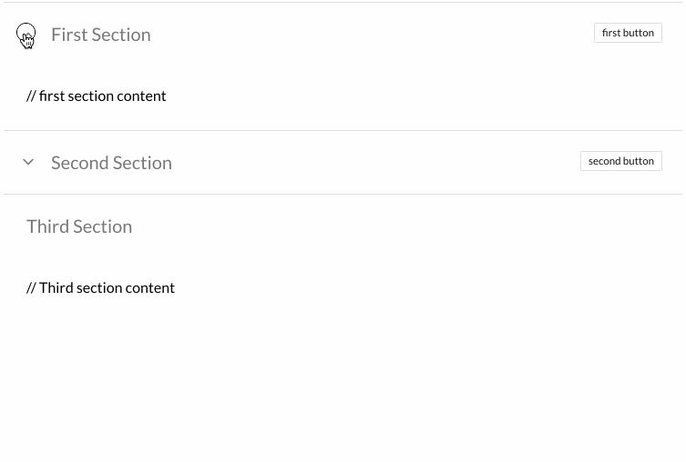
<GUI.Span text="my-span" />| Attr | Type | Default | Description |
|---|---|---|---|
text |
string | null | Span text |
className |
string | null | Custom class |
<GUI.Span text="my-span" />
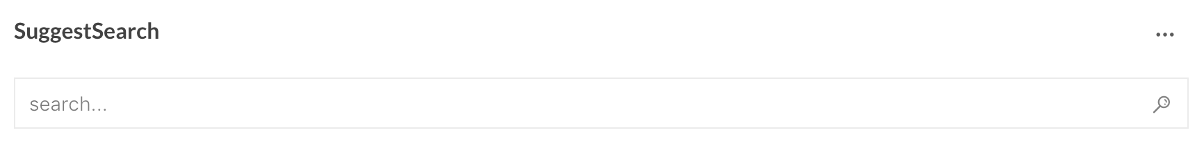
<GUI.SuggestSearch title={} ocInstance={} config={} onSearch={} cacheKey={} />| Attr | Type | Default | Description |
|---|---|---|---|
title |
string | null | A title string represented in upper left corner |
ocInstance |
object | null | A instance of LCC open content object |
config |
object | null | Object containing config for suggest search (see below) |
onSearch |
function | null | callback function when a search has occurred |
cachekey |
string | null | string added to the cache key in order for either have same saved queries for each application or unique ones |
constructor(props) {
    super(props)

    this.lcc = null
    this.ocInstance = null

     this.state = {
        title: "Example",
        config: {
            suggestFields: [
                {
                    name: 'PubStatus',
                    order: 10
                },
                {
                    name: 'Tags',
                    order: 15
                },
                {
                    name: 'Authors',
                    order: 20
                }
            ],
            suggestLabels: {'PubStatus': 'Status', 'Tags': 'Tagg', 'Authors': 'Författare'},
            searchOptions: {
                start: 0,
                limit: 10,
                property: ['uuid', 'PubStatus', 'Tag', 'Authors'],
                defaultQuery: '*:* NOT PubStatus:draft',
                filterQuery: 'contenttype:Article',
                sortField: 'updated',
                sortAscending: false
            },
            initialSearch: [
                {
                    "value": "Dans",
                    "field": "Tags",
                }, {
                    "value": "Mat och dryck",
                    "field": "Tags",
                }, {
                    "value": "John Doe",
                    "field": "Authors",
                    "operator": "AND"
                }
            ]
        }
    }
}

const LCC_BUNDLE = 'io.infomaker.lcc'
const LCC_GET_LIB = `${LCC_BUNDLE}:getLCCLib`
const LCC_LIB = `${LCC_BUNDLE}:LCCLib`

componentDidMount() {
    try {
        this.ready(LCC_BUNDLE, () => {
            this.on(LCC_LIB, userData => {
                let LCC = userData.LCC

                this.lcc = new LCC({
                    plugin: this,
                    onLccReadyStateChange: this.onLccReadyStateChange.bind(this)
                })

                this.lcc.start()
            })

            this.send(LCC_GET_LIB, {v:1})
        })
    } catch(err) {
        console.warn(err)
    }
}

onLccReadyStateChange(lccReady) {
    this.ocInstance = this.lcc.opencontent("my-opencontent-provider")
}

onSearch(result) {
    /**
        result === {
            items: [...],
            search: {
               start: 0,
               limit: 10,
               property: [...list of properties to fetch],
               q: '(Tags: "Dans" OR Tags: "Mat och dryck") AND Authors: "John Doe" AND contenttype:Article',
               sort.indexfield: "updated",
               sort.updated.ascending: false
            },
            suggestionSeach: [{value:"Dans", field:"Tags", operator:null}, {value:"Mat och dryck", field:"Tags", operator:null}, {value:"John Doe", field:"Authors", operator:"AND"}],
            totalHits: 0
        }
     */
}

render() {
    return (
        <GUI.SuggestSearch title={this.state.title} ocInstance={this.ocInstance} config={this.state.config} onSearch={this.onSearch} cacheKey={"my-cache-key"} />
    )
}
<GUI.SwitchButton onChange={checked => {}} />| Attr | Type | Default | Description |
|---|---|---|---|
onChange |
function | null | On change callback function |
label |
string or object | null | SwitchButton title |
className |
string | null | Custom class |
checked |
boolean | false | Default value |
const myLabel = {
    left: 'Disable',
    right: 'Enable'
}

<GUI.SwitchButton label={myLabel} />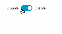
<GUI.Tabs tabs={myTabs} />| Attr | Type | Default | Description |
|---|---|---|---|
className |
string | null | Custom class. |
style |
object | null | Inline style for Tabs component. |
border |
boolean | false | Render a custom border style around Tabs component. |
onSelect |
function | null | OnSelect tab callback function, return: selectedTab, clickEvent. |
forceRender |
boolean | false | By set it to true all tabs contents will be rendered in the DOM even the not active tabs. |
{
    id: "2b42d026-e5cb-4731-8fc0-2f87fde06b38",
    title: "My tab title",
    content: 'My tab content'
}| Prop | Type | Default | Description |
|---|---|---|---|
id |
string or integer | null | Id for tab item. A tab without an id will not be rendered. If your objects don't have an id just call Dashboard.createUUID() id: Dashboard.createUUID()
|
title |
string or element | null | Can be a string or a element. Pass an element to override the default class. |
content |
string or element or component | null | Can be a string or an element or a component. |
style |
object | null | Inline style for the tab. |
disabled |
boolean | false | If it passed true the tab will be rendered in the header but it won't be active and won't be clickable. |
you can pass any other custom property with the tab object and it will be passed with onSelect tab callback example:
const tabs = [ { id: 'my-tab-id', title: 'Tab1', content: myTab1Content, myCustomProperty: myCustomProperty } ]
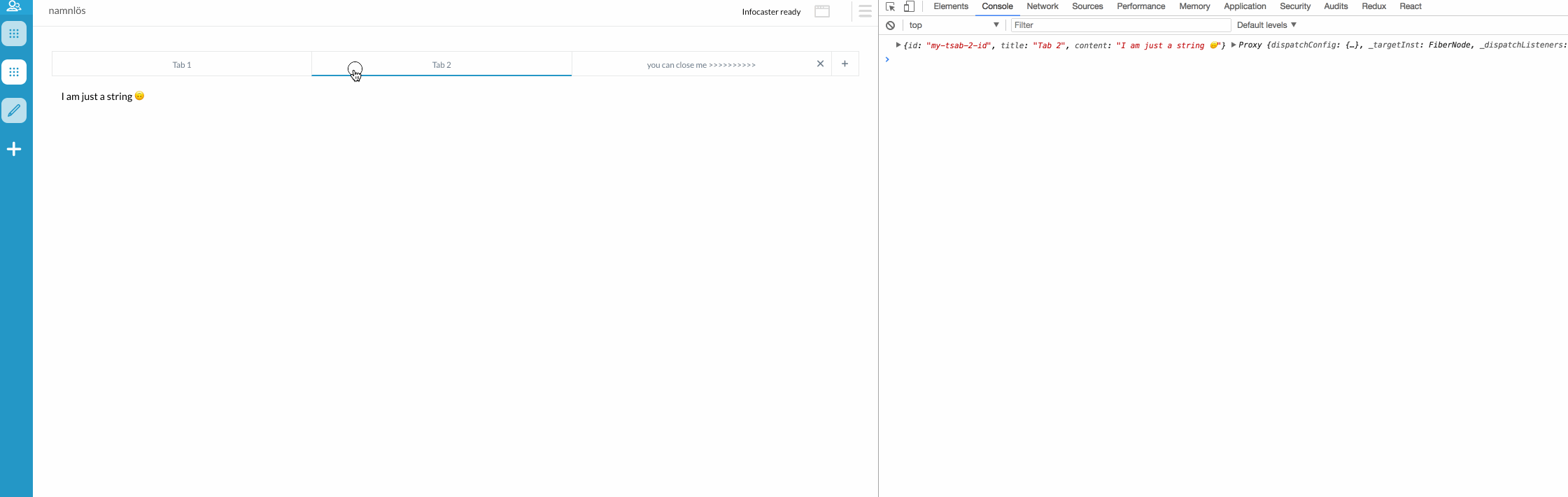
Normal tabs:
tabs: [
	{
		id: 'my-tsab-1-id',
		title: 'Tab 1',
		content: <Tab1 myTitle={'i am a custom component inside Tab 1'}/>
	},
	{
		id: 'my-tsab-2-id',
		title: 'Tab 2',
		content: 'I am just a string 🙃'
	},
	{
		id: 'my-tsab-3-id',
		title: 'Tab 3',
		content: 'tab 3 content'
	}
]
<GUI.Tabs tabs={myTabs} />
Advanced tabs:
class Tab1 extends React.Component {
	constructor(props) {
		super(props)
	}

	render() {
		return <GUI.Wrapper>
			<GUI.Header text={this.props.myTitle} />
		</GUI.Wrapper>
	}
}

class Application extends Dashboard.Application {
    constructor(props) {
    	super(props)

    	this.state = {
    		tabs: [
    			{
    				id: 'my-tsab-1-id',
    				title: 'Tab 1',
    				content: <Tab1 myTitle={'i am a custom component inside Tab 1'}/>
    			},
    			{
    				id: 'my-tsab-2-id',
    				title: 'Tab 2',
    				content: 'I am just a string 🙃'
    			},
    			{
    				id: 'my-tsab-3-id',
    				title: 'you can close me >>>>>>>>>>',
    				content: 'I am a closeable tab 😎',
    				onClose: newTabs => {
    					console.log(newTabs) //return an Array with the new tabs without the closed one, here you should update you state with the new tabs 😊
    				}
    			}
    		]
    	}
    }
    <GUI.Tabs tabs={this.state.tabs} onSelect={(index, event) => console.log(index, event)} onAdd={() => this.setState({
    	tabs: [
    		...this.state.tabs,
    		{
    			id: 'my-tab-4-id',
    			title: 'New tab',
    			content: 'NEW TAB 🎉'
    		}
    	]
    })}/>
}
<GUI.Textarea onChange={() => myFunction()} />| Attr | Type | Default | Description |
|---|---|---|---|
primary |
boolean | false | Use Dashboard primary style |
placeholder |
string | null | Textarea placeholder text |
autosize |
boolean | false | Auto size textarea element |
className |
string | null | Custom class |
onChange |
function | null | OnChange callback function |
textMode |
boolean | false | Render Textarea with the same style and with uneditable mood |
<GUI.TextButton text={'Text Button Only'} onClick={() => {/* Do something... */} />
<GUI.Title text="My h1 title" />| Attr | Type | Default | Description |
|---|---|---|---|
text |
string | null | Title text |
className |
string | null | Custom class |
direction |
string | "ltr" | Text direction, can be "ltr", "rtl" |

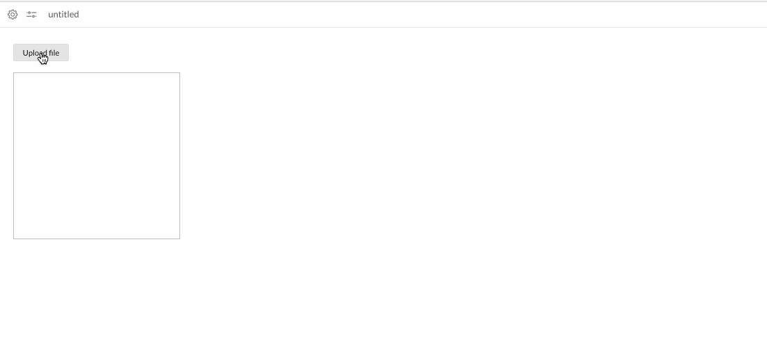
<GUI.UploadButton text='Upload file' size='large' onSuccess={file => /* Do something with the file */} onError={err => console.log(err)}/>| Attr | Type | Default | Description |
|---|---|---|---|
onSuccess |
function | null | On file uploaded success callback, return uploaded file |
onError |
function | null | On error file uploaded event callback, return the error |
parseJson |
boolean | false | If the file has a json format |
text |
string | null | UploadButton text to display |
size |
string | normal | Upload Button size |
className |
string | null | Custom class |
disabled |
boolean | false | If button should be disabled |
...
    <GUI.UploadButton text='Upload file' size='large' onSuccess={file => this.setState({imgSrc: file})}/>
    <GUI.Img src={this.state.imgSrc} width='300px' height='300px'/>
...
<GUI.WidgetButton text="My button" />| Attr | Type | Default | Description |
|---|---|---|---|
onClick |
function | null | On click callback function |
text |
string | null | Icon text, will render a span text for the icon if declared |
className |
string | null | Custom class |
disabled |
boolean | false | If button should be disabled |
<GUI.WidgetIcon iconClass={'my-icon-class'}/>| Attr | Type | Default | Description |
|---|---|---|---|
iconClass |
string | normal | Name of icon. Dashboard leverage the awesome font set Dripicons by Amit Jakhu. View all available icons here. |
onClick |
function | null | On click callback function |
style |
object | null | Style that will be applied to the button |
    <GUI.WidgetIcon iconClass={'store'} iconColor={'red'} />
	<GUI.WidgetIcon iconClass={'web'} iconColor={'black'} />
	<GUI.WidgetIcon iconClass={'shopping-bag'} iconColor={'gray'} />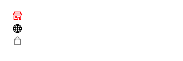
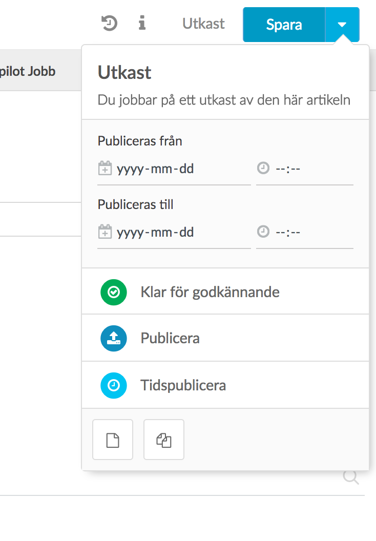
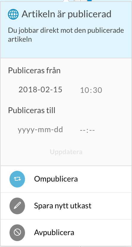
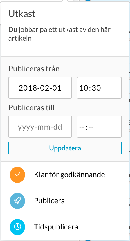
<GUI.WriterPublishFlow
    article={article}
    writerPublishFlow={writerFlowConfig}
    onFlowClicked={actions => console.log(actions)}
    articleHasUpdated={this.state.articleHasUpdated}
    onPubStopChange={date => console.log(date)}
    onPubStartChange={date => console.log(date)}
    onClose={() => {}}
/>| Attr | Type | Default | Description |
|---|---|---|---|
className |
string | null | Custom class |
article |
object | null | Article object structure. |
writerPublishFlow |
object | null | Writer workflow config, can be found: https://WRITER_ENDPOINT/api/config > plugins[id: se.infomaker.publishflow].data.workflow |
onClose |
function | null | On close callback function will be called when GUI.WriterPublishFlow will un mount |
onPubStartChange |
function | null | On pubStart date/time value changed |
onPubStopChange |
function | null | On pubStop date/time value changed |
onFlowClicked |
function | null | On any flow actions clicked, will pass actions object |
"se.infomaker.publishflow" is the only plugin supported, please be sure that you have this version in your Writer config or contact the support team
--- All of article item properties are required ---
{
    uuid: 'ARTICLE_UUID',
    status: 'DEFAULT_WRITER_STATUS', // draft, done, approved, withheld, usable, canceled
    hasPublishedVersion: 'WRITER_HAS_PUBLISH_VERSION_VALUE', // true or false
    headline: 'ARTICLE_HEADLINE_VALUE',
    published: 'ARTICLE_PUBDATE_VALUE',
    pubStart: 'ARTICLE_PUBSTART_VALUE',
    pubStop: 'ARTICLE_PUBSTOP_VALUE'
}
<GUI.Wrapper>
    // content
</GUI.Wrapper>| Attr | Type | Default | Description |
|---|---|---|---|
className |
string | null | Custom class |
style |
object | null | Style that will be applied to the wrapper. |
onClick |
function | null | On click callback function |
draggable |
boolean | false | Set to true to be able to drag |
onDragStart |
function | null | On drag start callback function return null
|
onDragEnd |
function | null | On drag end callback function return null
|
onDragOver |
function | null | On drag over callback function return null
|
onDragLeave |
function | null | On drag leave callback function return null
|
onDrag |
function | null | On dragging callback function firring while wrapper is dragging |
dragData |
object | null | Object include custom data, will be droped on drop wrapper |
onDrop |
function | null | On drop callback function return dragData object from draged wrapper |
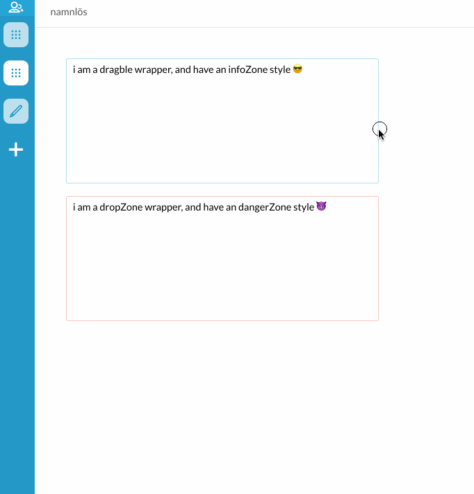
infoZone |
boolean | false | Custom blue area style |
dangerZone |
boolean | false | Custom red area style |
dropZone |
boolean | false | Custom drop area style when an item be dropped in |
💁🏻 Use Wrapper to wrap your content when your return multiple children in a render return statement. It is also possible to pass a style object to style the wrapper with, and by this way affect the children.
Each GUI component should have an
eventIdprop to pass it to GUI-Listener to listen for that GUI component
| GUI Components | Events name | Description |
|---|---|---|
Popover |
open, close |
Open: to open Popover by dispatching an event with eventName: 'open', Close: to close Popover by dispatching an event with eventName: 'close' |
DropMenu |
close |
Close: to close DropMenu by dispatching an event with eventName: 'close' |
DropDown |
open, close |
Open: to open DropDown by dispatching an event with eventName: 'open', Close: to close DropDown by dispatching an event with eventName: 'close' |
this.send({
    name: 'GUI:Popover',
    userData: {
        eventName: 'close',
        eventId: 'my-popover-eventId'
    }
)

<GUI.Popover eventId={'my-popover-eventId'} />