mf-design-components is a collection of reusable React components designed to streamline your development process. This package includes a variety of components styled with Tailwind CSS and optimized for modern React applications.
- Node.js: Version 18.x or higher. You can check your Node.js version with:
node -v
- Package Manager: Either npm or Yarn. Ensure you have one of these installed:
- npm: Comes with Node.js. Verify with:
npm -v
- Yarn: Install with:
Verify with:
npm install -g yarn
yarn -v
- npm: Comes with Node.js. Verify with:
To install the mf-design-components library, you can use either npm or yarn:
npm install mf-design-componentsor
yarn add mf-design-componentsYou can explore and test all components in the Storybook documentation.
For an example of how to use mf-design-components in a Next.js project, check out the mf-frontend repository.
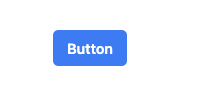
A customizable button component with various styles and sizes.
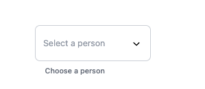
A versatile dropdown component with support for sorting, searching, and custom icons.
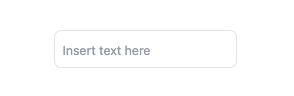
A customizable input with variants to support different types.
A customizable text with based in <p/> tag.

You can view the package details and download the latest version from npm.
To create a new component in this library, follow these steps:
-
Create a Directory: Add a new directory for your component under
src/components/. -
Component Files: Include the following files in the component directory:
index.tsx: The main component file where you define your component's logic and JSX.index.stories.tsx: Storybook stories for your component. This helps in visualizing and testing different states of the component.styles.ts: Define your component's styles here.Component.test.tsx: Write unit tests for your component to ensure it behaves as expected.README.md: Documentation for your component, including usage instructions and examples.
Here’s an example of what your Tooltip component structure might look like:
- File Structure:
src/components/Tooltip
├── index.tsx
├── Tooltip.stories.tsx
├── styles.ts
├── Tooltip.test.tsx
└── README.md
Here's an example of how to use the Dropdown component:
import React from 'react';
import { Dropdown } from 'mf-design-components';
import { UserIcon, BookmarkSlashIcon, ComputerDesktopIcon, DocumentCurrencyEuroIcon, ExclamationTriangleIcon } from '@heroicons/react/20/solid';

const Example = () => {
  const handleSelect = (value: string) => {
    console.log(`Selected value: ${value}`);
  };

  return (
    <Dropdown
      options={[
        { value: '1', label: 'Juan Perez', icon: <UserIcon className="w-4 h-4 text-gray-500" /> },
        { value: '2', label: 'Maria Gonzalez', icon: <BookmarkSlashIcon className="w-4 h-4 text-gray-500" /> },
        { value: '3', label: 'Carlos Martinez', icon: <ComputerDesktopIcon className="w-4 h-4 text-gray-500" /> },
        { value: '4', label: 'Ana Lopez', icon: <DocumentCurrencyEuroIcon className="w-4 h-4 text-gray-500" /> },
        { value: '5', label: 'Luis Hernandez', icon: <ExclamationTriangleIcon className="w-4 h-4 text-gray-500" /> },
      ]}
      placeholder="Select a person"
      label="Choose a person"
      isSortable={true}
      showIcon={true}
      searchable={true}
      onSelect={handleSelect}
    />
  );
};

export default Example;To develop and test the components locally, you can use the following commands:
-
Start development server:
npm run dev
-
Build the library:
npm run build
-
Run Storybook:
npm run storybook
-
Build Storybook:
npm run build-storybook
-
Run tests:
npm test
To ensure code quality, we use ESLint and Prettier. To lint and format your code, use the following commands:
-
Lint code:
npm run lint
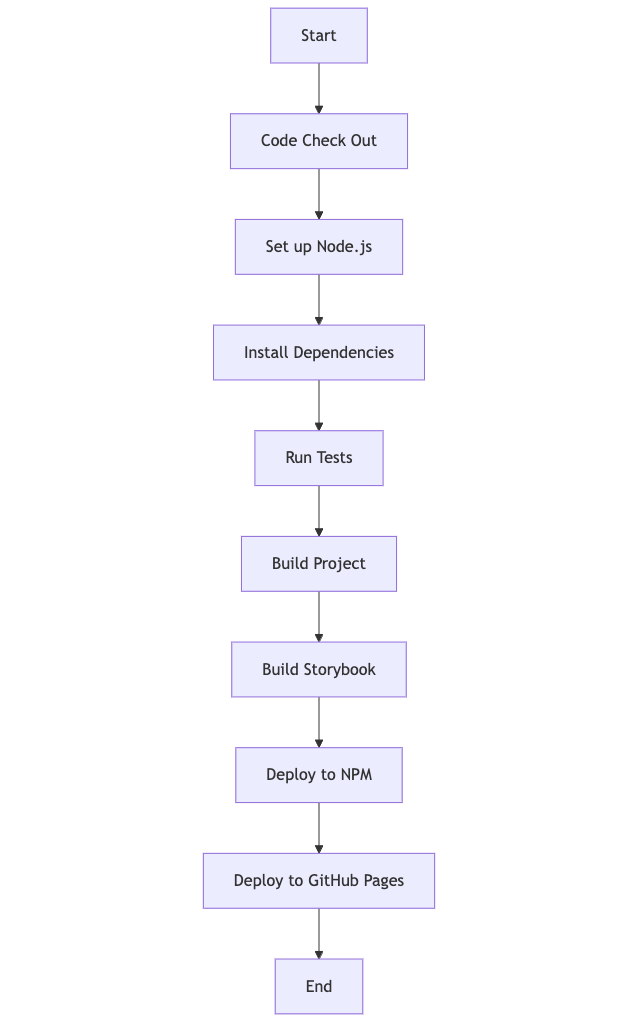
- Start: Initiate the CI process when code is pushed or a pull request is made.
- Code Check Out: The CI system checks out the code from the repository.
- Set up Node.js: Configure the Node.js environment.
- Install Dependencies: Install the necessary dependencies for the project.
- Run Tests: Execute the test suite to ensure the code is working as expected.
- Build Project: Compile and build the project.
- Build Storybook: Generate the Storybook build for documentation.
- Deploy to NPM: Publish the package to NPM if the build and tests are successful.
- Deploy to GitHub Pages: Deploy Storybook to GitHub Pages if the build and tests are successful.
- End: Complete the deployment process.
This flowchart represents the CI/CD process as a series of steps, making it easier to understand the order and dependencies involved in deploying the project.
Contributions are welcome! Please open an issue or submit a pull request with any changes or improvements.
This project is licensed under the MIT License. See the LICENSE file for details.
This project uses several open-source libraries:
This structure will help users navigate to the specific README files for each component to get more detailed information.