Replies: 9 comments 16 replies
-
|
Some notes on what actually motivated this component as a navigation mechanism for an online tutorial:
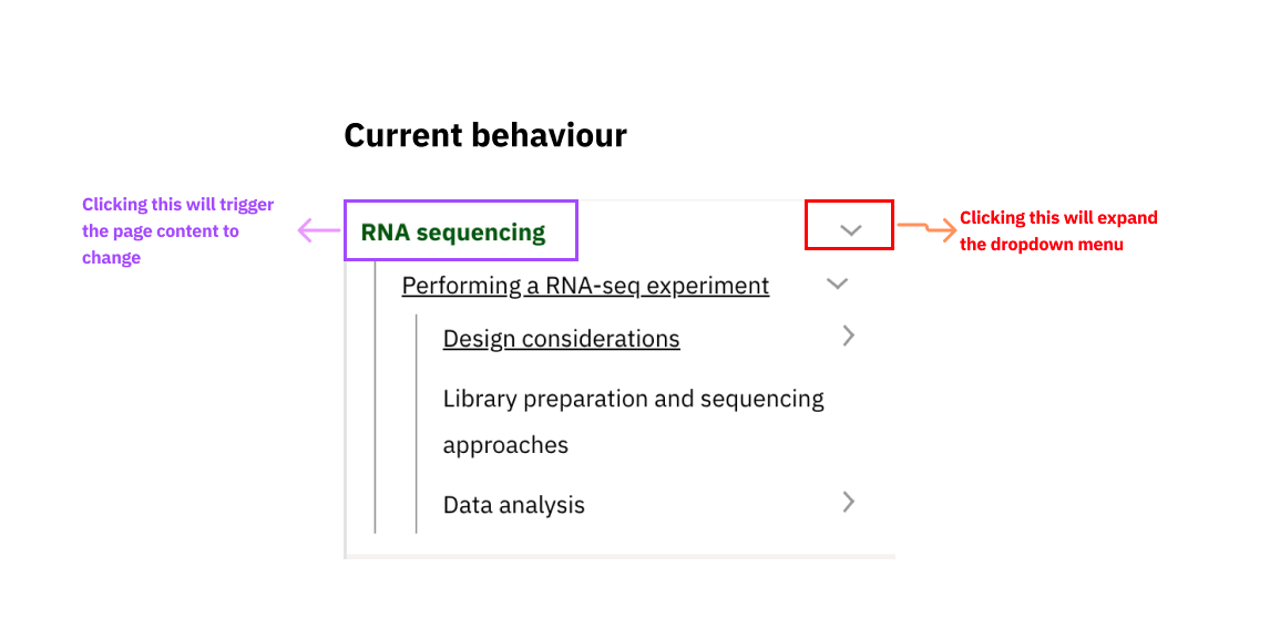
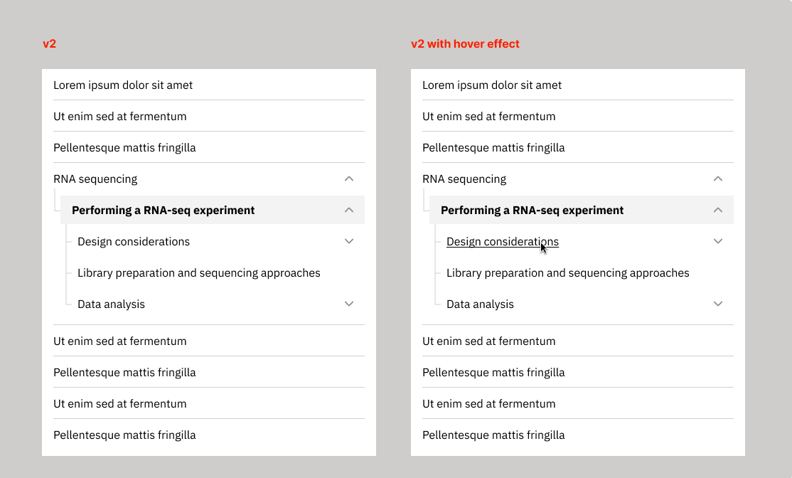
In this context we wanted people to recognise that this page is part of an online tutorial, have an overview of the other pages in the tutorial and go to one of these pages from this page if they want to. This is the primary purpose of this component.
We'd like to be able to show these three states but we can consider other options for highlighting the displayed page as well as visited vs unvisited links that are more compatible with the VF.
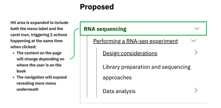
There are some additional mouseover effects depending on which level of the hierarchy you point the mouse (change in the background for top levels, underlying for pages at levels 2 & 3) as well as a change in the gray background when a category is expanded. We decided to only show pages at level 2 & 3 on demand because otherwise the navigator becomes too long and may end up going way beyond the end of the actual text on the page. The split button was motivated by the idea that one may want to preview what's under e.g. "RNA sequencing" before actually visiting this page (otherwise the navigation menu would behave exactly as an accordion).
This led to some discussions about the actual positioning of the navigation bar (far left or closer to the main text). I wasn't clear if the embl grid can help us with this. Also one thing to note is that the headings of the pages are quite long so together with the indentation which is applied to show their level in the hierarchy they also often span over one line on the navigation menu. |
Beta Was this translation helpful? Give feedback.
-
|
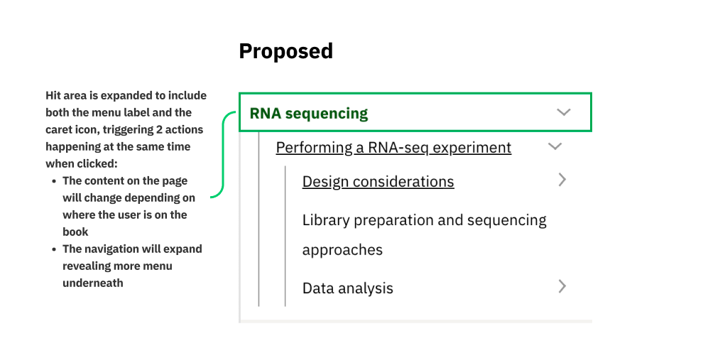
Summarising @nikiforosk 's comments above, I think we could visualise the component's behavior as follows (ignore the UI at the moment as it hasn't changed from the current one):
|
Beta Was this translation helpful? Give feedback.
-
|
I think in the Proposed you mean that the navigation will "expand" instead of "collapse" when clicked. Worth keeping in mind @nitinja's suggestion to gather some analytics about screen sizes and potentially how much and how this component is used for the re-design of this component. I'm adding a link to the version in stable for cross-reference: https://stable.visual-framework.dev/components/vf-tree/ |
Beta Was this translation helpful? Give feedback.
-
|
Yes, I was meant to write "expand" than "collapse". Regarding the screen sizes and where to put this component on the page, I think it's “safe” to place the nav closer to the page content when there’s no data available, as it is the best practice for people on wide screens but it could also work with people with small screens, so it basically suits both. Example from what Prakash mocked up below: @khawkins98 @sturobson would love to hear your input on the positioning of this component on the page. |
Beta Was this translation helpful? Give feedback.
-
|
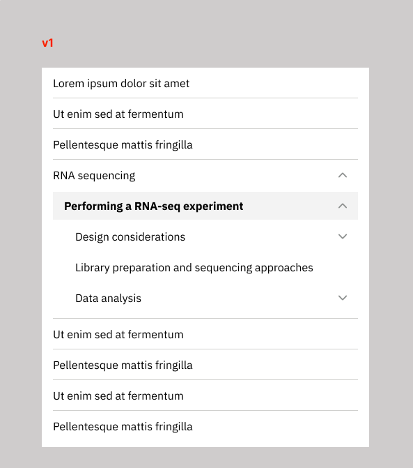
Visually, I created a couple of mockups for the new tree component's visuals:
On v1:
On v2:
|
Beta Was this translation helpful? Give feedback.
-
|
Adding @nikiforosk comment on Slack from Friday last week:
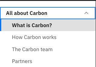
I would use our own style that is consistent with the Visual Framework rather than using the same style as what Carbon does (the blue line on the left isn't our VF library-style for an active state). Also, adding “visited and unvisited links” will add some complexity to the component. Gov.uk accordion component and Carbon left nav bar both don’t use the visited link colour. Only active state and hover effect. Since this component is a high priority task to finish this week before I go on holiday, I will go ahead with the first version as I think we could already develop the minimum requirements for the component, instead of the “ideal” version of it, considering we just have less than a couple of weeks left (minus the holidays). We could improve this component along the way this year as we see fit. |
Beta Was this translation helpful? Give feedback.
-
|
Iterating the proposed v1 above, I created the active state in our interactive Blue colour:
@khawkins98 @sturobson let me know if you got any other feedback :) |
Beta Was this translation helpful? Give feedback.
-
|
Try to ignore the look of Carbon's tree, it's the UX of things either being an accordion OR link. That way trying to open a folder won't cause a page refresh/rebuild. |
Beta Was this translation helpful? Give feedback.
-
|
Agreed with @khawkins98 suggestions though I think it will require a content restructure from the training team to make it this way... how could we update the current component but still make it implementable to the training website? |
Beta Was this translation helpful? Give feedback.
-
|
I think it's the recommendation to not mix the folder UI action+link, but the vf-tree component would still need to support the mixed behaviour due to legacy content like training. The Training team could then in the future revise their IA to support the better UX method. |
Beta Was this translation helpful? Give feedback.
-
|
Just in case there is a misunderstanding
relates to -
|
Beta Was this translation helpful? Give feedback.
-
|
@sturobson is this about the visuals or the behaviour of the component? |
Beta Was this translation helpful? Give feedback.
-
|
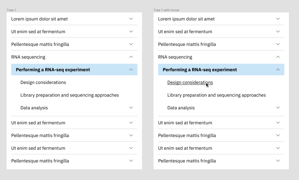
Trying to summarise this discussion so far in order to create an issue: Best practices to apply to the update of the VF tree (which could be basis for the documentation of this component):
Ideally, the top level element should be a grouping folder and not a link as suggested by @khawkins98.
The latest mockup of the Vf tree is this: The latest version of the online tutorial (with wrapped text and updated masthead) is in dev: Comments:
I'm not sure why the label is indented in active state. Also, I'd start without the blue background (just use bold) and only add it if needed.
https://user-images.githubusercontent.com/928100/116085976-a7ca5c80-a69f-11eb-9467-55b195c203e1.png
This could be helpful for the navigator of the training site. This is an example from NN: https://www.nngroup.com/articles/guidelines-for-visualizing-links/
|
Beta Was this translation helpful? Give feedback.
-
|
Do we want to show the mouse pointer ("hand" icon) on hover instead of a default mouse cursor? or may be its just a mockup oversight |
Beta Was this translation helpful? Give feedback.
-
|
Good spot @nitinja! I suspect that it will actually be the "hand" but let's clarify with @cindyebi in our catch-up today! |
Beta Was this translation helpful? Give feedback.
-
|
@nitinja @nikiforosk whatever a hover icon on desktop looks like works for me. There won't be a VF catch-up today unfortunately, I have a last-minute design to do. |
Beta Was this translation helpful? Give feedback.
-
|
@sturobson I turned the comment above into an issue as we just discussed. It didn't pickup Nitin's follow up comment about the cursor. |
Beta Was this translation helpful? Give feedback.
-
|
This is now being tracked at #1525 |
Beta Was this translation helpful? Give feedback.
-
|
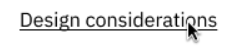
On @cindyebi 's mockup at #1498 (comment) it looks like all sections get a downward arrow ( 🔽 ). That feels non-helpful if a section doesn't have children? How will this function if a tree entry doesn't have children? No arrow? (aside: under the current implementation — with a right-facing arrow — this distinction of having children or not wasn't required)
|
Beta Was this translation helpful? Give feedback.
-
|
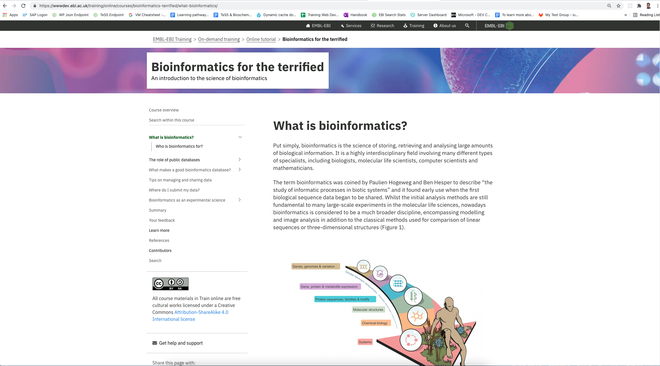
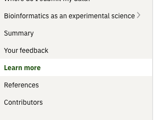
It looks like in the current EBI Training implementation the arrows are hidden when there are no child sections. https://www.ebi.ac.uk/training/online/courses/bioinformatics-terrified/get-help-and-support/
|
Beta Was this translation helpful? Give feedback.
-
|
Good spot, I'd assume that if there are no children in a section, there is no arrow. Are we tracking this issue here or have we switched to #1525 |
Beta Was this translation helpful? Give feedback.
-
|
@khawkins98 shall we close this discussion? |
Beta Was this translation helpful? Give feedback.
Uh oh!
There was an error while loading. Please reload this page.
Uh oh!
There was an error while loading. Please reload this page.
-
Documenting @nikiforosk discussions on Slack a couple of months ago:
Beta Was this translation helpful? Give feedback.
All reactions