Block Grid Editor area labels #13143
Replies: 2 comments 2 replies
-
|
There's a slightly different but related example here where no custom views are used. It's not an example of great practice on the dev's part as the icons and labels haven't been customised, but it does show that there might be scope to look at how to add a bit of differentiation between the blocks which are areas and those which aren't, as at the moment it's quite tight and lacking a bit of subtle weight/hierarchy.
|
Beta Was this translation helpful? Give feedback.
-
|
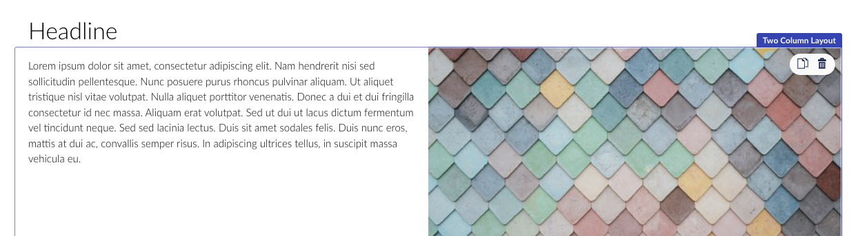
Hi @danbramall Thanks for your interest and for sharing your thoughts/concerns on this topic. Big thanks! I first have to add that we will add a Sort-mode. This mode would basically turn all custom views off and add additional space and indications for clarifying the structure. I would say this could additionally help in your case — identifying the structure, and reaching Blocks in any placement. I also have to mention that you can still make Custom Views for these Block with Areas, making them appear as it makes sense. But this does not change the default experience, so let me explain a bit of why this is and maybe some idea appears? The concept from a visual perspective is to provide a minimalistic UI that can be turned into something looking/appearing just like your website. This is why the design is super tight. This enables having the custom views right next to each other with no spacing in between. This also counts for Blocks with Areas, meaning Blocks acting like layouts. Such Blocks can have a Custom View that just renders its Areas(Like the demo block view: umbBlockGridDemoTwoColumnLayoutBlock.html). This Custom View just contains this:
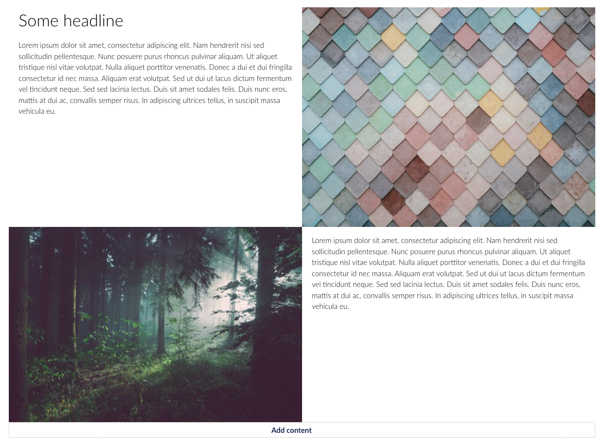
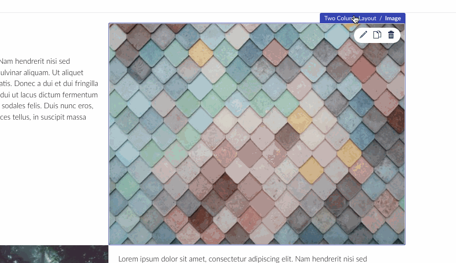
When one or more Blocks are created in those Areas, it then could look like this: This enables using Layout-Block after each other and still get the same look as it would on the website: But this does reveal a immediate problem of such design choice, which is 'How would you edit the Layout-Block when then it takes no visual space'. And to cover such we have made the Context-bar, which enable you to navigate to the parent Block. This Gif shows how it works:
I hope that shows you how it is possible to navigate between Blocks. This UX flow also works for several levels of Blocks, as there is no limit to how much nesting you can establish in your project. Let me know how you feel about this approach and what comes to mind. Thanks |

Beta Was this translation helpful? Give feedback.
-
|
Thanks @nielslyngsoe, this all makes sense. To me, it needed to go one way or another: either more obvious editing tools meaning probably more gaps between things in the UI, less minimal and a less representative view of the rendered front-end, or a totally minimal editing UI which is very representative of the rendered front-end but relies on some discoverability/knowledge from the content editor. The first impression I had was that it sat a little awkwardly in between but it looks like by customising the back-office views to remove the title part and by utilising the context bar to determine which block you're editing it should be possible to go down the totally minimal route and educate editors to understand how to do things. I'd entirely missed the fact that you could click the context bar to select different blocks within the nested structure! I wonder whether anything could be done to help discoverability wrt that context bar. Could hovering over the various block names in the context bar reveal an outline on that block? That would help the editor pre-visualise the extent of that block and might also be something that they happen to mouse-over and notice which might aid discoverability. If I'd moused over 'Two column layout' and it highlighted that block it would have helped me realise I could click to change context to that block. Alternatively making the buttons in the context bar more button-like rather than breadcrumb-like might aid discoverability (crude mock-up before/after below)? There's no doubt space could be tight for the context bar in some situations but a slightly more generous appearance could help promote the fact these things are interactive and not just informative labels.
Thanks again for reviewing this feedback. |


Beta Was this translation helpful? Give feedback.
-
|
Hi @danbramall Good idea, I'll look into highlighting the 'effect' of clicking it. :-) |
Beta Was this translation helpful? Give feedback.
Uh oh!
There was an error while loading. Please reload this page.
Uh oh!
There was an error while loading. Please reload this page.
-
Hi,
First up, great job on the new Block Grid editor! It all makes perfect sense, follows on nicely from the concepts introduced in the Block List editor and opens up a whole new level of possibilities for content editors. Really fantastic work Niels and team! 👏
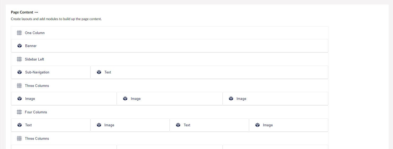
From initial exploration, the only gripe I have is the prominent label bar at the top of the grid areas, as per the below screen-grab.
I can totally see the need for this because it differentiates the copy/delete actions of the area from those of the non-area blocks. If that space wasn't there it would require some other mechanism for the editor to be able to discern between copying/deleting/dragging the nested blocks.
That said, particularly where there are nested areas and if there are settings within the blocks which control vertical spacing, I can foresee content editors getting a little confused. It would be really nice if there was some other means of being able to present the area and block actions without having the prominent label 'gap' above each area.
One idea might be to make use of the 3 dots pattern, like this (they could appear on hover/focus as elsewhere in the UI):
The copy/delete/drag actions would appear on click or mouse-over for each area. The challenge with this approach is when it comes to nested areas.
Another option might be to have some sort of overall toggle which gives a more schematic view of the grid, a bit like the document type sorting UI when editors want to manage areas.
Or perhaps a more minor change of moving the non-area block labels which appear on hover to the inside of the blocks (rather than above) and having a smaller gap for the area labels/actions which only appear on hover/focus?
...Or having the area labels hidden by default but expand into visibility when a block is clicked/focused.
Since areas and non-area blocks are quite different things, perhaps there could be more differentiation in the UI between what you're editing, e.g. one outline and label colour for areas and a different colour for non-area blocks?
I don't have an answer and it's a very tricky UI challenge, but I just wanted to start a conversation to see if anyone could think of a way of making that part of the experience a little more streamlined.
Beta Was this translation helpful? Give feedback.
All reactions