Improve login UX when using external providers #12901
Replies: 4 comments 1 reply
-
|
I think most customers who are new to this screen are confused the first time, would be nice if someone can come up with suggestions for a better UI/UX for showcasing external login providers. |
Beta Was this translation helpful? Give feedback.
-
|
Do we know who these clients are? Edit: So I had a little talk with @meyntony and I now see what the issue here is. ScenarioJohn, an editor who works in a medium sized company and has no technical experience, wants to log into the Umbraco Backoffice to change some text content on the company's website. Due to the company's size, they have a lot of tools, which require logins. These logins are intefrated with Azure AD.
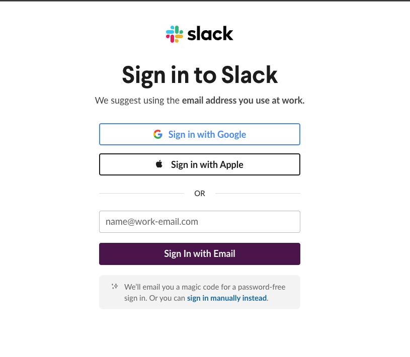
We can try and spare dear John for this experience and maybe indicate a little better that the Azure AD is a button he can click on to login with, and that there's a difference between an Umbraco Backoffice user, and an external login provider 😄 SuggestionPersonally, I like the approach Slack has here, so I'll plug it for inspiration: Maybe we can add that "------ OR --------" divider they have also. |
Beta Was this translation helpful? Give feedback.
-
|
@HamDerAndrew I think the important difference with what Slack has done compared to Umbraco, is hide the password field, so new users don't put in their external login providers password there, thinking the button for the external login was just a banner/label. |
Beta Was this translation helpful? Give feedback.
-
|
but we need to remember that Umbraco ships with and without enternal login providers, so the UX needs to address both scenarios |
Beta Was this translation helpful? Give feedback.
-
|
Thank you Andre ! I think John would be happy |
Beta Was this translation helpful? Give feedback.
Uh oh!
There was an error while loading. Please reload this page.
-
Some clients are confused when seeing this UX for login. As they are not aware whether this is a button to click on or that they need to enter their credentials in the fields beneath. This is only for when external login providers are used.
Beta Was this translation helpful? Give feedback.
All reactions