UX for Table Filter sections (Office hours: Sept 29, 2020) #798
-
|
The specific questions I have are...
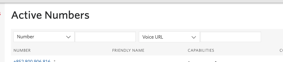
Before:
After:
Background: Was going to migrate this page to Paste but was wondering if 1) there were any UX improvements that could be made at the same time and if 2) there was a generalized DSYS way to handle filter sections. We arbitrarily stuff a few options into these Selects, when there really could be multiple Inputs as the filters are all independent. We also will be working on migrating another page with more complex filters, so this question is pre-emptively setting up to tackle that migration as well. |

Beta Was this translation helpful? Give feedback.
Replies: 2 comments 5 replies
-
|
Hey @vnguyen94 - thanks for working to make UX improvements to this! 🙌 This will definitely be easier to talk through live, but I've got a couple of functionality questions in the meantime:
|
Beta Was this translation helpful? Give feedback.
-
there is no backend limitation; the frontend limitation I'm assuming is how to maximize customer value while minimizing visual clutter (unfortunately i currently don't have any data on whether customers mostly search by single or >2 filters on the public API).
To leave out the technical details, the first dropdown deals with the resource properties, and the second with subresource properties -- but this is pretty opaque from the customer's perspective imo. |
Beta Was this translation helpful? Give feedback.
-
|
Some quick UX improvements right off the bat:
For your second question, it'd be great to talk through the more complex filters you've got coming up. My first thought is that you could align to something similar to what Messaging Insights is doing for filters, but it might not work for every use case: https://www.twilio.com/console/sms/insights/delivery btw since Numbers just hired a new PD, it'd be great if you could see if they'd be available to come to office hours with you tomorrow, too! |
Beta Was this translation helpful? Give feedback.
-
|
Hi @vnguyen94 I threw together a CodeSandbox example of the Messaging Insights filters built with Paste. This is just presentational, but maybe it'll help you along with the Paste migration. |
Beta Was this translation helpful? Give feedback.
-
|
And here are a few screens that were thrown together really quickly a few months ago on the DSYS design side for the Buy a Number page:
I definitely would not use this as prescriptive. They were created to demo the checkbox components, but feel free to use them as a starting point! |
Beta Was this translation helpful? Give feedback.
-
|
Thank you both so much 🙏 this and the office hours is more than enough to solve my current tasks. |
Beta Was this translation helpful? Give feedback.
-
|
@ramoneguru you should get access for this too |
Beta Was this translation helpful? Give feedback.
Some quick UX improvements right off the bat:
For your second question, it'd be great to talk through the more complex filters you've got coming up.…