Using text input as button for popover, problem with space bar #1027
Unanswered
marcantoinepelletier
asked this question in
Help
Replies: 0 comments
Sign up for free
to join this conversation on GitHub.
Already have an account?
Sign in to comment
Uh oh!
There was an error while loading. Please reload this page.
Uh oh!
There was an error while loading. Please reload this page.
-
Hi,
I am trying to use the
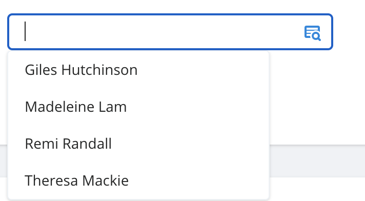
<Popover/>component (for React) to create a Dropdown list search/filter but I am encountering some issue.This is how it look like to give some visual context :
What I have done is to use a
<input/>DOM element inside the<Popover.Button/>in order to open the popover when the user focus the input.The problem is that when I am focusing the text input and start to type something, the space bar event doesn't reach my
OnChangeevent. Instead it toggle the panel on and off..I couldn't find any information about how to either "disabled" or bypass the toggle on space bar so I resolved myself to do this "dirty hack" on my
<input/>(the popover button) :onKeyDown={(e: any) => { if (e.keyCode === 32) { const elem: any = inputRef.current setSearchTerm( searchTerm.slice(0, elem.selectionStart) + ' ' + searchTerm.slice(elem.selectionStart) ) e.preventDefault() e.stopPropagation() } }}The
stopPropagationdoes the tricks but it also prevent the event to reach theOnChangeone.I am using the popover component because I wanted to have full control on the panel content (not closing when clicking items etc), hopefully it make sense.
Right now, the trick is working but I wanted to know if it was something nicer that I could do to achieve what I need to do.
This is my
<Popup/>component :const Popup: React.FunctionComponent<IPopupProps> = ({ children, button, buttonClassNames, panelClassNames, }) => { return ( <Popover className="relative"> <Popover.Button as={Fragment}> <div className={classNames('cursor-pointer', buttonClassNames)}> {button} </div> </Popover.Button> <Transition as={Fragment} enter="transition ease-out duration-300" enterFrom="transform opacity-0 -translate-y-10" enterTo="transform opacity-100 translate-y-0" leave="transition ease-in duration-150" leaveFrom="transform opacity-100 translate-y-0" leaveTo="transform opacity-0 -translate-y-10" > <Popover.Panel className={classNames( 'absolute bg-white shadow flex flex-col z-40 border-vsm-grey-lighest border', panelClassNames )} > {({ close }) => ( <> {React.cloneElement(children as any, { closePopup: close, })} </> )} </Popover.Panel> </Transition> </Popover> ) }And this is how I used it with my
<Input/>component :<Popup button={ <Input type="text" onChange={(e) => { setSearchTerm(e.target.value) }} value={searchTerm} onKeyDown={(e: any) => { if (e.keyCode === 32) { const elem: any = inputRef.current setSearchTerm( searchTerm.slice(0, elem.selectionStart) + ' ' + searchTerm.slice(elem.selectionStart) ) e.preventDefault() e.stopPropagation() } }} /> } > <DropdownList setSelection={setSelection} selection={selection} filteredItems={filteredItems} /> // The content of the popup panel </Popup>Beta Was this translation helpful? Give feedback.
All reactions