Replies: 2 comments 1 reply
-
|
This worked for me, using the // DocsContainer.tsx
import { DocsContainer as BaseContainer, DocsContainerProps } from '@storybook/blocks';
import { addons } from '@storybook/preview-api';
import { themes } from '@storybook/theming';
import React, { FC, PropsWithChildren, useEffect, useState } from 'react';
import { DARK_MODE_EVENT_NAME } from 'storybook-dark-mode';
const channel = addons.getChannel();
export const DocsContainer: FC<PropsWithChildren<DocsContainerProps>> = ({ children, context }) => {
const [isDark, setDark] = useState(false);
useEffect(() => {
channel.on(DARK_MODE_EVENT_NAME, setDark);
return () => channel.off(DARK_MODE_EVENT_NAME, setDark);
}, [channel]);
return (
<BaseContainer theme={isDark ? themes.dark : themes.light} context={context}>
{children}
</BaseContainer>
);
};// preview.tsx
const preview: Preview = {
...
parameters: {
...
docs: {
container: DocsContainer,
}
}
}; |
Beta Was this translation helpful? Give feedback.
1 reply
-
|
@T0miii Hi! My working solution:
module.exports = {
// ...
  "addons": [
    '@storybook/addon-essentials',
    '@storybook/addon-links',
    '@storybook/addon-interactions',
    '@storybook/preset-scss',
    '@storybook/addon-mdx-gfm',
    '@storybook/addon-styling',
    '@storybook/addon-themes',
    {
      name: '@storybook/addon-styling',
      options: {},
    },
    '@storybook/addon-webpack5-compiler-babel',
    '@chromatic-com/storybook',
  ],
// ...
}
import { addons } from '@storybook/manager-api'
import { themes } from '@storybook/theming'

addons.setConfig({
  theme: themes.dark,
})
import React from "react";

import { withThemeFromJSXProvider } from "@storybook/addon-themes";
import { themes } from "@storybook/theming";
import { DocsContainer } from "@storybook/addon-docs/blocks";

import { ThemeProvider } from "@mui/material/styles";
import CssBaseline from "@mui/material/CssBaseline";

import { myMuiTheme } from "../src/theme/theme";

export const parameters = {
  actions: { argTypesRegex: "^on[A-Z].*" },
  controls: {
    expanded: true,
    matchers: {
      color: /(background|color)$/i,
      date: /Date$/,
    },
  },
  docs: {
    container: DocsContainerWithTheme,
  },
};

function DocsContainerWithTheme({ children, ...props }) {
  const currentThemeType =
    props?.context?.store?.userGlobals?.globals?.theme || "light";
  const theme = currentThemeType === "light" ? themes.light : themes.dark;

  return (
    <DocsContainer {...props} theme={theme}>
      {children}
    </DocsContainer>
  );
}

export const decorators = [
  withThemeFromJSXProvider({
    GlobalStyles: CssBaseline,
    Provider: MuiThemeProvider,
    themes: {
      light: themes.light,
      dark: themes.dark,
    },
    defaultTheme: "light",
  }),
];

function MuiThemeProvider({ children }) {
  return <ThemeProvider theme={myMuiTheme}>{children}</ThemeProvider>;
}

export const tags = ["autodocs"]; |
Beta Was this translation helpful? Give feedback.
0 replies
Sign up for free
to join this conversation on GitHub.
Already have an account?
Sign in to comment

Uh oh!
There was an error while loading. Please reload this page.
-
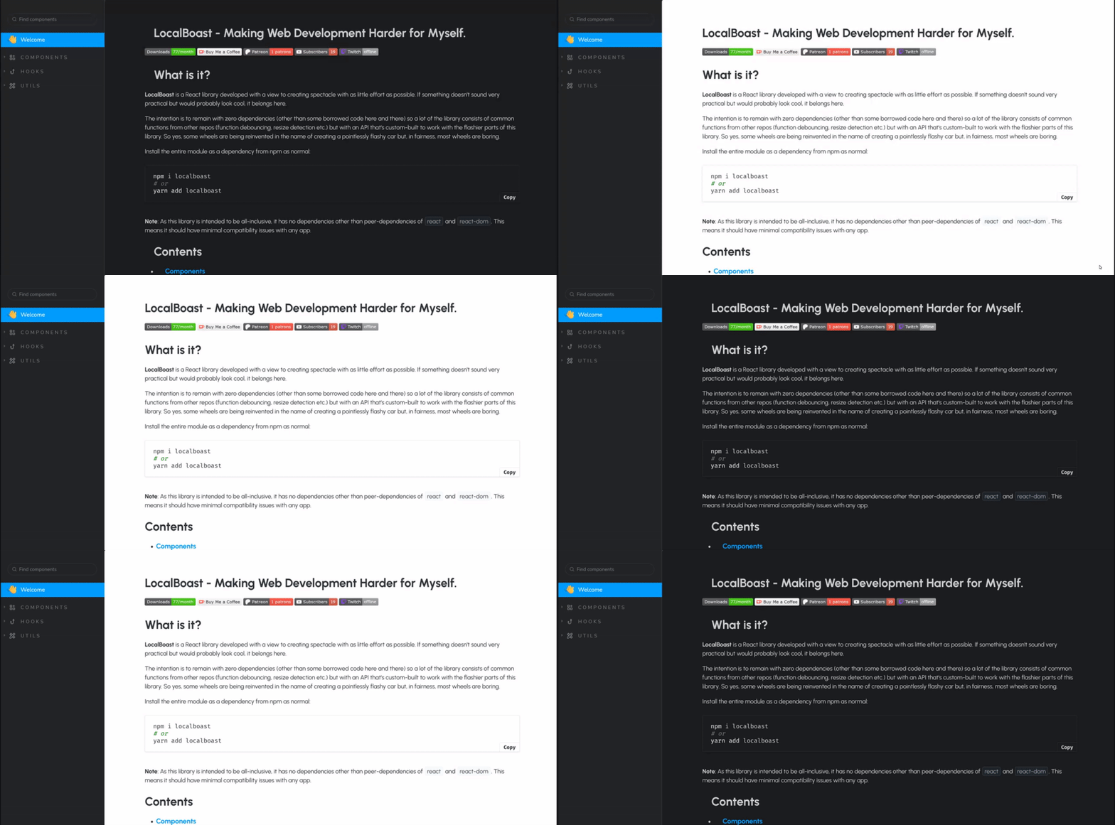
Is there an official way to change the Documentation Theme Dynamically at runtime (without refreshing)? I have a
setTimeoutin my preview.ts and my manager.ts one is changing thehtmlattribute in the preview => class='dark' the other is done like this:But i cant seem to make the documentation to change this is what i am trying currently:
Beta Was this translation helpful? Give feedback.
All reactions