-
Notifications
You must be signed in to change notification settings - Fork 2.6k
Open
Labels
A-timingsArea: timingsArea: timingsC-feature-requestCategory: proposal for a feature. Before PR, ping rust-lang/cargo if this is not `Feature accepted`Category: proposal for a feature. Before PR, ping rust-lang/cargo if this is not `Feature accepted`S-triageStatus: This issue is waiting on initial triage.Status: This issue is waiting on initial triage.
Description
Problem
Currently the timings graph is often very tall, but most of it is empty space, you have to scroll up and down a lot to get the full picture. You also don't see clearly where are empty time slots when threads are waiting.
Proposed Solution
It'd be useful to have an option to "squash" the graph in fewer rows (naturally to the number of jobs). Something like this, but correct (and more readable somehow):
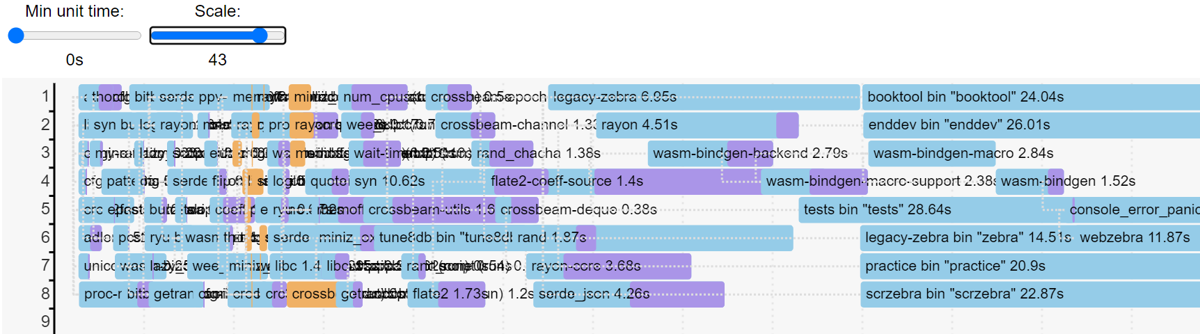
Note: rows are allocated incorrectly on this picture, I just tried to do this naively with y = i % num_jobs
.
Notes
No response
Metadata
Metadata
Assignees
Labels
A-timingsArea: timingsArea: timingsC-feature-requestCategory: proposal for a feature. Before PR, ping rust-lang/cargo if this is not `Feature accepted`Category: proposal for a feature. Before PR, ping rust-lang/cargo if this is not `Feature accepted`S-triageStatus: This issue is waiting on initial triage.Status: This issue is waiting on initial triage.