Checkboxes should have more prominent style #956
Replies: 12 comments 4 replies
-
|
See also https://github.com/deathau/obsidian-snippets#checkboxes and https://github.com/deathau/obsidian-snippets/blob/main/checkbox.css |
Beta Was this translation helpful? Give feedback.
-
|
I'm sort of poking around for a way to adjust theckboxes in editor view. I notice all this css is only for the preview. Just curious; have you find a way to target checkboxes in the editor view? (especially, differentiating complete VS incomplete VS some of the new states like canceled) I'm looking in dev tools but I see very generic things like |
Beta Was this translation helpful? Give feedback.
-
|
Hey there, I wouldn't know how to style checkboxes in the editor view. How do you edit the |
Beta Was this translation helpful? Give feedback.
-
|
Ah, didn't realize the use case isn't obvious.
I did hack in some css, but it relies on selectors that were clearly not named for what I'm using them for, so I expect it to break at any time. It's been stable for a few months though, which is great. I prepared a video showing how I use checkmarks in edit mode: obsidian.tasks.-.edit.mode.movThere's some existing precedent I've found for doing things with checkboxes in edit mode:
The new wysywig mode isn't really something I'm looking for, personally. I still want to see the MD syntax, but I do like a color or other hint when the syntax is picked up. Here is the CSS snippet for how I style these (really bad, would like to add more obvious sigils and be able to support in progress/indeterminate tasks too): /*
* Make checklists easier to see in "edit mode" (normal text editor mode)
* Styling for checkboxes in edit mode.
* completed task: "good"
* incomplete task: "notice"
*
* would love to support the other checkbox states, but need to enhance codemirror annotation first.
*/
/* The checkbox itself */
.HyperMD-list-line .cm-property {
color: #499c49 !important;
font-weight: bold;
background-color: rgba(120,255,120,0.05);
}
/* The text of this task (sibling of the checkbox) */
.HyperMD-list-line .cm-property + [class^="cm-list-"] {
/* Goal: make it look happy & successful, but also toned down a little bit, since the task is finished */
color: #91dd91 !important;
}
/* Incomplete Tasks are kind of amber/yellowish */
.HyperMD-list-line .cm-meta {
color: orange !important;
font-weight: bold;
background-color: rgba(255,200,200,0.10);
}
/* The text of this task (sibling of the checkbox) */
.HyperMD-list-line .cm-meta + [class^="cm-list-"] {
/* Goal: make it look a little different/brighter than normal text, but not too much */
color: palegoldenrod !important;
} |
Beta Was this translation helpful? Give feedback.
-
|
the new task collector plugin allows different styles to say a task is in progress and the like. They do this by placing different characters in the checkbox ( a > or / or ..). It would be great if tasks could work with this and only sow items as completed if a certain set of characters were present in the checkbnox. So [x] or [-] might be completed but anything else, [>] would not be treated as completed. |
Beta Was this translation helpful? Give feedback.
-
|
Thanks, @pcause. It would be nice to have these semantics in Tasks and I'd be happy to review a PR with those changes. However, due to my limited time, I won't be able to provide this soon. |
Beta Was this translation helpful? Give feedback.
-
|
I have been playing with a change that allows multiple states for a task, I have the basics in place for switching between them. For the query part there would be a new filter type called So the pattern below would apply. For rendering the user can do what they want based on the status character via CSS like task collector.
|
Beta Was this translation helpful? Give feedback.
-
That's awesome news - thanks @sytone !
I can't find it at the moment, but somewhere recently I pasted in this repo a link to a dataview issue or discussion where progress on its implementation of custom task status characters was being used. I was thinking it might be worth seeing if that feature in Tasks might try to use the same vocabulary and search approach as Dataview, if possible and not difficult. Ahah - here it is: And I had posted it in #628. Oh, which you just commented in earlier! |
Beta Was this translation helpful? Give feedback.
-
|
Sounds like interesting stuff sytone. In my case, I'm only ever in edit mode, and I'm not super interested in the scraping/collecting aspect of things. Of course I'm not the only user, but I'm most interested in simple things on top of the basic text file behavior:
|
Beta Was this translation helpful? Give feedback.
-
|
I have it hooked up locally to cycle through the states on click, as I am using the minimal theme it already has styles for the different states. Ill look at the state code first once my PR for tags and filtering them is out of the way. For the style it would be better to define this as a snippet so users can use the theme and augment or just take a simple version from the documentation/config. Also I am not a designer and CSS is always a pain 😉 |
Beta Was this translation helpful? Give feedback.
-
|
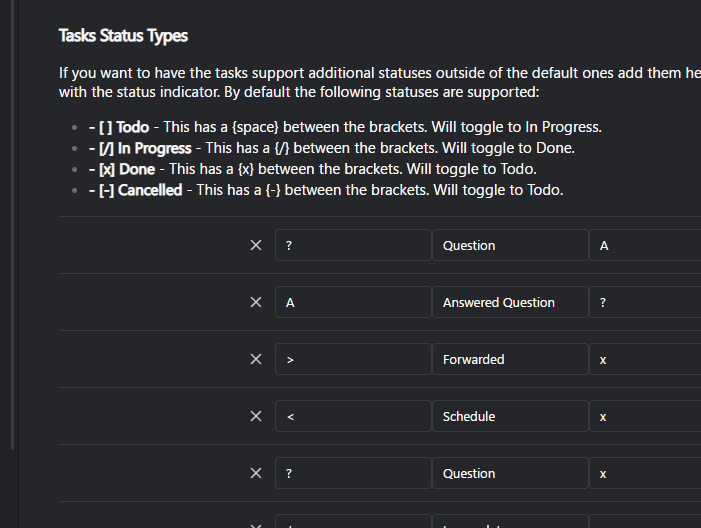
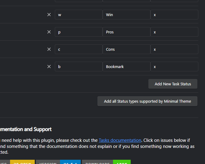
ok, have the draft PR in place and using it locally for my Vault. Working well and I will tweak as I go. The minimal theme already has styling in place so this should help support the blacksmithgu/obsidian-dataview#812 conversation. The settings will now take a set of custom status types with four defaults in place. When adding you can also specify the next status that should be selected when toggled. At the bottom you can add new ones in and also bulk add all the ones that the CSS in Minimal Theme supports.
@SimplGy & @claremacrae as a FYI. |
Beta Was this translation helpful? Give feedback.
-
|
that looks terrific. like the ability to define the characters. question is if the tasks queries can match the statuses so I can find (status is progress) and (status is question) |
Beta Was this translation helpful? Give feedback.
-
|
Very cool looking! |
Beta Was this translation helpful? Give feedback.
-
|
Yes. You can grab the plugin in the community soon or via BRAT. It is tasks sql powered. I am doing a update to bring in the recent tasks changes to keep it in sync for functionality that tasks has. |
Beta Was this translation helpful? Give feedback.
-
|
Query information can be found in the documentation. https://sytone.github.io/obsidian-tasks-x/5-queries-sql/columns/ Example. |
Beta Was this translation helpful? Give feedback.
-
|
A major new CSS styling capability for Tasks has now been released in Tasks 3.0.0. Huge thanks to There are examples in the documentation showing how to style checkboxes. Find out more in the comprehensive user docs. |
Beta Was this translation helpful? Give feedback.
Uh oh!
There was an error while loading. Please reload this page.
-
The checkbox of a task should have a prominent style in order to signify a task.
If possible, use existing css variables from the background/foreground to be in line with the current theme.
Beta Was this translation helpful? Give feedback.
All reactions