Handling Scrolls with CoordinatorLayout
[CoordinatorLayout] (https://developer.android.com/reference/android/support/design/widget/CoordinatorLayout.html) extends the ability to accomplish many of the Google's Material Design scrolling effects. Currently, there are several ways provided in this framework that allow it to work without needing to write your own custom animation code. These effects include:
-
Sliding the Floating Action Button up and down to make space for the Snackbar.
-
Expanding or contracting the Toolbar or header space to make room for the main content.
-
Controlling which views should expand or collapse and at what rate, including parallax scrolling effects animations.

Chris Banes from Google has put together a beautiful demo of the CoordinatorLayout and other design support library features.
The full source code can be found on github. This project is one of the easiest ways to understand CoordinatorLayout.
Make sure to follow the Design Support Library instructions first.
The CoordinatorLayout can be used to create floating effects using the layout_anchor and layout_gravity attributes. See the Floating Action Buttons guide for more information.
When a Snackbar is rendered, it normally appears at the bottom of the visible screen. To make room, the floating action button must be moved up to provide space.
So long as the CoordinatorLayout is used as the primary layout, this animation effect will occur for you automatically. The floating action button has a default behavior that detects Snackbar views being added and animates the button above the height of the Snackbar.
 <android.support.design.widget.CoordinatorLayout
        android:id="@+id/main_content"
        xmlns:android="http://schemas.android.com/apk/res/android"
        xmlns:app="http://schemas.android.com/apk/res-auto"
        android:layout_width="match_parent"
        android:layout_height="match_parent">

   <android.support.v7.widget.RecyclerView
         android:id="@+id/rvToDoList"
         android:layout_width="match_parent"
         android:layout_height="match_parent"></android.support.v7.widget.RecyclerView>

   <android.support.design.widget.FloatingActionButton
        android:layout_width="wrap_content"
        android:layout_height="wrap_content"
        android:layout_gravity="bottom|right"
        android:layout_margin="16dp"
        android:src="@mipmap/ic_launcher"
        app:layout_anchor="@id/rvToDoList"
        app:layout_anchorGravity="bottom|right|end"/>
 </android.support.design.widget.CoordinatorLayout>
The first step is to make sure you are not using the deprecated ActionBar. Make sure to follow the Using the ToolBar as ActionBar guide. Also make sure that the CoordinatorLayout is the main layout container.
<android.support.design.widget.CoordinatorLayout xmlns:android="http://schemas.android.com/apk/res/android"
 xmlns:app="http://schemas.android.com/apk/res-auto"
    android:id="@+id/main_content"
    android:layout_width="match_parent"
    android:layout_height="match_parent"
    android:fitsSystemWindows="true">

      <android.support.v7.widget.Toolbar
                android:id="@+id/toolbar"
                android:layout_width="match_parent"
                android:layout_height="?attr/actionBarSize"
                app:popupTheme="@style/ThemeOverlay.AppCompat.Light" />

</android.support.design.widget.CoordinatorLayout>Next, we must make the Toolbar responsive to scroll events using a container layout called AppBarLayout:
<android.support.design.widget.AppBarLayout
        android:id="@+id/appbar"
        android:layout_width="match_parent"
        android:layout_height="@dimen/detail_backdrop_height"
        android:theme="@style/ThemeOverlay.AppCompat.Dark.ActionBar"
        android:fitsSystemWindows="true">

  <android.support.v7.widget.Toolbar
                android:id="@+id/toolbar"
                android:layout_width="match_parent"
                android:layout_height="?attr/actionBarSize"
                app:popupTheme="@style/ThemeOverlay.AppCompat.Light" />

</android.support.design.widget.AppBarLayout>Note: AppBarLayout currently expects to be the first child nested within a CoordinatorLayout according to the official [Google docs] (http://developer.android.com/reference/android/support/design/widget/AppBarLayout.html).
Next, we need to define an association between the AppBarLayout and the View that will be scrolled. Add an app:layout_behavior to a RecyclerView or any other View capable of nested scrolling such as NestedScrollView. The support library contains a special string resource @string/appbar_scrolling_view_behavior that maps to AppBarLayout.ScrollingViewBehavior, which is used to notify the AppBarLayout when scroll events occur on this particular view. The behavior must be established on the view that triggers the event.
 <android.support.v7.widget.RecyclerView
        android:id="@+id/rvToDoList"
        android:layout_width="match_parent"
        android:layout_height="match_parent"
        app:layout_behavior="@string/appbar_scrolling_view_behavior">
When a CoordinatorLayout notices this attribute declared in the RecyclerView, it will search across the other views contained within it for any related views associated by the behavior. In this particular case, the AppBarLayout.ScrollingViewBehavior describes a dependency between the RecyclerView and AppBarLayout. Any scroll events to the RecyclerView should trigger changes to the AppBarLayout layout or any views contained within it.
Scroll events in the RecyclerView trigger changes inside views declared within AppBarLayout by using the app:layout_scrollFlags attribute:
    <android.support.design.widget.AppBarLayout
        android:layout_width="match_parent"
        android:layout_height="wrap_content"
        android:fitsSystemWindows="true"
        android:theme="@style/ThemeOverlay.AppCompat.Dark.ActionBar">

            <android.support.v7.widget.Toolbar
                android:id="@+id/toolbar"
                android:layout_width="match_parent"
                android:layout_height="?attr/actionBarSize"
                app:layout_scrollFlags="scroll|enterAlways"/>

 </android.support.design.widget.AppBarLayout>
The scroll flag used within the attribute app:layout_scrollFlags must be enabled for any scroll effects to take into effect. This flag must be enabled along with enterAlways, enterAlwaysCollapsed, exitUntilCollapsed, or snap:
-
enterAlways: The view will become visible when scrolling up. This flag is useful in cases when scrolling from the bottom of a list and wanting to expose theToolbaras soon as scrolling up takes place.Normally, the
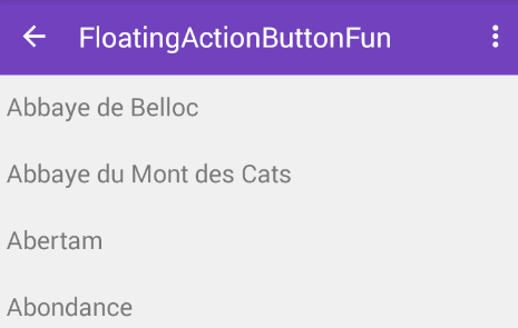
Toolbaronly appears when the list is scrolled to the top as shown below: -
enterAlwaysCollapsed: Normally, when onlyenterAlwaysis used, theToolbarwill continue to expand as you scroll up:Assuming
enterAlwaysis declared and you have specified aminHeight, you can also specifyenterAlwaysCollapsed. When this setting is used, your view will only appear at this minimum height. Only when scrolling reaches to the top will the view expand to its full height: -
exitUntilCollapsed: When thescrollflag is set, scrolling down will normally cause the entire content to move:By specifying a
minHeightandexitUntilCollapsed, the minimum height of theToolbarwill be reached before the rest of the content begins to scroll and exit from the screen: -
snap: Using this option will determine what to do when a view only has been partially reduced. If scrolling ends and the view size has been reduced to less than 50% of its original, then this view to return to its original size. If the size is greater than 50% of its sized, it will disappear completely.


Note: Keep in mind to order all your views with the scroll flag first. This way, the views that collapse will exit first while leaving the pinned elements at the top.
At this point, you should notice that the Toolbar responds to scroll events.
If we want to create the collapsing toolbar effect, we must wrap the Toolbar inside CollapsingToolbarLayout:
<android.support.design.widget.CollapsingToolbarLayout
            android:id="@+id/collapsing_toolbar"
            android:layout_width="match_parent"
            android:layout_height="match_parent"
            android:fitsSystemWindows="true"
            app:contentScrim="?attr/colorPrimary"
            app:expandedTitleMarginEnd="64dp"
            app:expandedTitleMarginStart="48dp"
            app:layout_scrollFlags="scroll|exitUntilCollapsed">

            <android.support.v7.widget.Toolbar
                android:id="@+id/toolbar"
                android:layout_width="match_parent"
                android:layout_height="?attr/actionBarSize"
                app:layout_scrollFlags="scroll|enterAlways"></android.support.v7.widget.Toolbar>
        </android.support.design.widget.CollapsingToolbarLayout>
Your result should now appears as:
Normally, we set the title of the Toolbar. Now, we need to set the title on the CollapsingToolBarLayout instead of the Toolbar.
   CollapsingToolbarLayout collapsingToolbar =
                (CollapsingToolbarLayout) findViewById(R.id.collapsing_toolbar);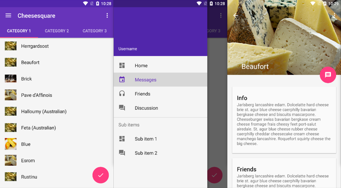
collapsingToolbar.setTitle("Title");The CollapsingToolbarLayout also enables us to do more advanced animations, such as using an ImageView that fades out as it collapses. The title can also change in height as the user scrolls.

To create this effect, we add an ImageView and declare an app:layout_collapseMode="parallax" attribute to the tag.
    <android.support.design.widget.CollapsingToolbarLayout
            android:id="@+id/collapsing_toolbar"
            android:layout_width="match_parent"
            android:layout_height="match_parent"
            android:fitsSystemWindows="true"
            app:contentScrim="?attr/colorPrimary"
            app:expandedTitleMarginEnd="64dp"
            app:expandedTitleMarginStart="48dp"
            app:layout_scrollFlags="scroll|exitUntilCollapsed">

            <android.support.v7.widget.Toolbar
                android:id="@+id/toolbar"
                android:layout_width="match_parent"
                android:layout_height="?attr/actionBarSize"
                app:layout_scrollFlags="scroll|enterAlways"></android.support.v7.widget.Toolbar>
            <ImageView
                android:src="@drawable/cheese_1"
                app:layout_scrollFlags="scroll|enterAlways|enterAlwaysCollapsed"
                android:layout_width="wrap_content"
                android:layout_height="wrap_content"
                android:scaleType="centerCrop"
                app:layout_collapseMode="parallax"
                android:minHeight="100dp"/>

</android.support.design.widget.CollapsingToolbarLayout>One example of a custom behavior is discussed in using CoordinatorLayout with Floating Action Buttons.
CoordinatorLayout works by searching through any child view that has a CoordinatorLayout Behavior defined either statically as XML with a app:layout_behavior tag or programmatically with the View class annotated with the @DefaultBehavior decorator. When a scroll event happens, CoordinatorLayout attempts to trigger other child views that are declared as dependencies.
To define your own a CoordinatorLayout Behavior, the layoutDependsOn() and onDependentViewChanged() should be implemented. For instance, AppBarLayout.Behavior has these two key methods defined. This behavior is used to trigger a change on the AppBarLayout when a scroll event happens.
  public boolean layoutDependsOn(CoordinatorLayout parent, View child, View dependency) {
            return dependency instanceof AppBarLayout;
        }

   public boolean onDependentViewChanged(CoordinatorLayout parent, View child, View dependency) {
            // check the behavior triggered
            android.support.design.widget.CoordinatorLayout.Behavior behavior = ((android.support.design.widget.CoordinatorLayout.LayoutParams)dependency.getLayoutParams()).getBehavior();
            if(behavior instanceof AppBarLayout.Behavior) {
            // do stuff here
            }
   }
The best way to understand how to implement these custom behaviors is by studying the AppBarLayout.Behavior and FloatingActionButtion.Behavior examples. Although the source code is not publicly available yet, you can use the decompiler integrated with Android Studio 1.2 to examine how they work by navigating up the source tree.
In addition to using the CoordinatorLayout as outlined above, be sure to check out these popular third-party libraries for scrolling and parallax effects across ScrollView, ListView, ViewPager and RecyclerView.
There is currently no way of supporting Google Maps fragment within an AppBarLayout as confirmed in this issue. Changes in the support design library v23.1.0 now provide a setOnDragListener() method, which is useful if drag and drop effects are needed within this layout. However, it does not appear to impact scrolling as stated in this blog article.