Introduction to Spatial Data Analysis using Kepler.gl Ai Assistant #2843
Replies: 17 comments 1 reply
-
Get StartedKepler.gl AI Assistant is a plugin for Kepler.gl that allows you to perform spatial data analysis and visualization using AI. Start AI AssistantTo use AI Assistant, you can click the "AI Assistant" button in the top right corner of the Kepler.gl UI. 
Configure AI AssistantYou will see the AI Assistant configuration panel on the right side of the Kepler.gl UI. You can adjust the width of the panel by dragging the border between the panel and the Kepler.gl UI. 
The configuration panel includes several important settings: AI ProviderSelect your preferred AI provider from the dropdown menu. Currently supports:
Select LLM ModelChoose the specific language model that supports tools to use for AI interactions. Available options vary by provider:
For more details, please visit the documentation https://ai-sdk.dev/providers/ai-sdk-providers#provider-support AuthenticationFor Cloud Providers (OpenAI, Google, Anthropic, Deepseek, XAI):
For example: visit https://platform.openai.com/docs/api-reference to get your OpenAI API key, or visit https://docs.anthropic.com/en/api/getting-started to get your Anthropic API key. For Ollama (Local):
See Ollama documentation for more details: https://ollama.com/docs TemperatureControl the creativity and randomness of AI responses using the temperature slider:
Top PFine-tune the diversity of AI responses with the Top P parameter:
Mapbox Token (Optional For Route/Isochrone)If you plan to use routing or isochrone analysis features, you can optionally provide your Mapbox access token. This enables advanced spatial analysis capabilities like:
Use AI AssistantIf the connection to the selected AI provider is successful, you will see the AI Assistant chat interface. Welcome Message: You'll be greeted with "Hi, I am Kepler.gl AI Assistant!" confirming that the assistant is ready to help with your spatial analysis tasks. Suggested Actions: The interface displays helpful suggestion buttons to get you started quickly based on the dataset loaded in Kepler.gl. For example, in the screenshot above:
Prompt Input: Use the "Enter a prompt here" field to type your questions, requests, or commands in natural language. :::tip Tips for Effective Prompting
Additional FeaturesThe AI Assistant includes several advanced features to enhance your interaction experience: Screenshot to AskClick the "Screenshot to Ask" button to capture specific areas of your map or interface and ask questions about them. How to use screenshot to ask?Taking Screenshots
Asking Questions
Managing Screenshots
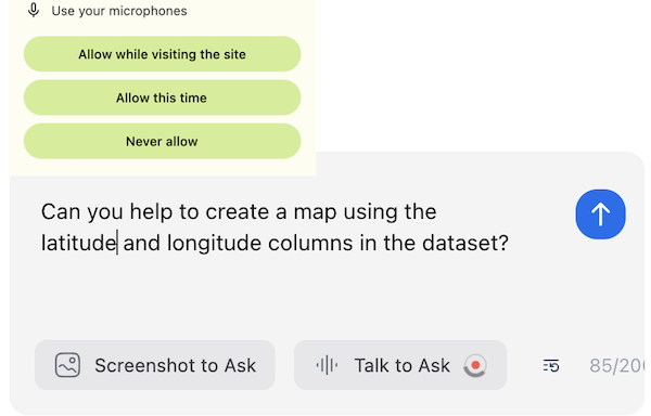
Talk to Ask (Voice-to-Text)The voice-to-text feature allows users to record their voice, which will be converted to text using the LLM. How to use voice-to-text?When using the voice-to-text feature for the first time, users will be prompted to grant microphone access. The browser will display a permission dialog that looks like this: Users can choose from three options:
Then, user can start recording their voice. User can stop recording by clicking the stop button or by clicking the microphone icon again. The text will be translated by LLM and displayed in the input box. This feature is only available with certain AI providers:
If using an unsupported provider, you'll receive a "Method not implemented" error. |

Beta Was this translation helpful? Give feedback.
-
Spatial Data WranglingOriginal GeoDa lab by Luc Anselin: https://geodacenter.github.io/workbook/01_datawrangling_1/lab1a.html IntroductionIn this chapter, we tackle the topic of data wrangling, i.e., the process of getting data from its raw input into a form that is amenable for analysis. This is often considered to be the most time consuming part of a data science project, taking as much as 80% of the effort (Dasu and Johnson 2003). However, with Kepler.gl AI Assistant, we can now achieve the same data manipulation goals with significantly less effort compared to traditional approaches using software like GeoDa. While data wrangling has increasingly evolved into a field of its own, with a growing number of operations turning into automatic procedures embedded into software (Rattenbury et al. 2017), the integration of AI assistance represents the next evolution in making these processes even more intuitive and efficient. A detailed discussion of the underlying technical implementations is beyond our scope, but we'll provide practical examples of how to harness this technology for your spatial analysis needs. Objectives
PreliminariesWe will illustrate the basic data input operations by means of a series of example data sets, all contained in the GeoDa Center data set collection. Specifically, we will use files from the following data sets:
You can download these data sets from the GeoDa Center data and lab. In this tutorial, we will use the following urls:
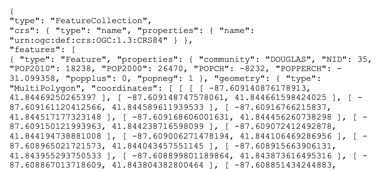
A GeoJSON file is simple text and can easily be read by humans. As shown in Figure below, we see how the locational information is combined with the attributes. After some header information follows a list of features. Each of these contains properties, of which the first set consists of the different variable names with the associated values, just as would be the case in any standard data table. However, the final item refers to the geometry. It includes the type, here a MultiPolygon, followed by a list of x-y coordinates. In this fashion, the spatial information is integrated with the attribute information. Spatial Data and GIS filesIf you are not familiar with spatial data and GIS files, you can refer to the Spatial Data and GIS files chapter. Polygon LayerMost of the analyses covered in these chapters will pertain to areal units, or polygon layers. In Kepler.gl, you can drag and drop the e.g. chicago_commonpop.geojson file to load the data and create a polygon layer automatically (see Add Data to your Map). Here we will use the AI Assistant to load the data and create a polygon layer. 
Point LayerPoint layer GIS files are loaded in the same fashion. For example, we can load the chicago_sup.geojson file to create a point layer. 
Tabular filesTabular files e.g. the comma separated value (csv) files are also supported. For example, we can load the commpopulation.csv file, which doesn't contain any geometric data. 
If the csv file contains coordinates, the AI Assistant will automatically create a point layer. Here we convert the chicago_sup.dbf, which is used in GeoDa workbook, to chicago_sup.csv file: 
As you can see in the screenshot above, the AI Assistant confirms with you what type of map layer you want to create. Then, it performs fetching the data from the URL. However, it is not sure about which columns should be used for latitude and longitude coordinates since the columns in the csv file are "XCoord" and "YCoord" not named as "latitude" and "longitude". Therefore, it asks you to specify the latitude and longitude columns or it can guess the columns based on the data. Once you confirm that you want to guess the columns, the AI Assistant successfully identifies the appropriate columns and creates the point layer, showing the grocery store locations as points on the map. GridGrid layers are useful to aggregate counts of point locations in order to calculate point pattern statistics, such as quadrat counts. In Kepler.gl, users can create a grid layer from a dataset easily. See Kepler.gl Grid Layer for more details. In this tutorial, we are using the Ai assistant to create a grid layer from either the current map view (the map bounds defind by northwest and southweast points), or use the bounding box of an available data source. 
Since there is a spatial join tool in the AI Assistant, we can also use it to filter the grids that intersect with chicago commpop polygons. The result will be more useful for a spatial data analysis: 
Table ManipulationsA range of variable transformations are supported through the query tool in the AI Assistant. To illustrate these, we will use the Natregimes sample data set. After loading the natregimes.shp file, we obtain the base map of 3085 U.S. counties, shown in the screenshot below. 
The table of the dataset can be opened by using the 'Show Data Table' button when mouse over the dataset name in Kepler.gl layer panel. 
This is a view only table. You can not e.g. edit the data, or add/remove a column in this table. The Foursqure Studio, which is developed based on Kepler.gl, has a more powerful table editor (see docs here). We hope these features will be upstream back to Kepler.gl in the future. However, using different AI Assistant tools, like query, standardizeVariable, etc., you can achieve the same goal of manipulating the data in the table. The limitation is that you can not directly edit the data in the table, but you can create a new dataset with the manipulated data. Variable propertiesChange variable propertiesOne of the most used initial transformations pertains to getting the data into the right format. Often, observation identifiers, such as the FIPS code used by the U.S. census, are recorded as character or string variables, not in a numeric format. In order to use these variables effectively, we need to convert them to a different format. 
:::info Other variable operationsThe other variable operations, like add a variable, delete a variable or rename a variable, should also be supported via the CalculatorThe
Spatial Lag and Rates are advanced functions that are discussed separately in later chapters. To illustrate the Calculator functionality, we return to the Chicago community area sample data and load the commpopulation.csv file. This file only contains the population totals. SpecialThe three Special functions are:
For example: 
:::note UnivariateIn GeoDa lab, there are six straightforward univariate transformations:
For example: 
Since the Variable StandardizationThe univariate operations also include five types of variable standardization:
The most commonly used is undoubtedly STANDARDIZED (Z). This converts the specified variable such that its mean is zero and variance one, i.e., it creates a z-value as where 
A subset of this standardization is DEVIATION FROM MEAN, which only computes the numerator of the z-transformation. An alternative standardization is STANDARDIZED (MAD), which uses the mean absolute deviation (MAD) as the denominator in the standardization. This is preferred in some of the clustering literature, since it diminishes the effect of outliers on the standard deviation (see, for example, the illustration in Kaufman and Rousseeuw 2005, 8–9). The mean absolute deviation for a variable i.e., the average of the absolute deviations between an observation and the mean for that variable. The estimate for mad takes the place of Two additional transformations that are based on the range of the observations, i.e., the difference between the maximum and minimum. These are the RANGE ADJUST and the RANGE STANDARDIZE. RANGE ADJUST divides each value by the range of observations: While RANGE ADJUST simply rescales observations in function of their range, RANGE STANDARDIZE turns them into a value between zero (for the minimum) and one (for the maximum): In GeoDa lab, the standardization is limited to one variable at a time, which is not very efficient. However, with the AI Assistant, you can apply the standardization to multiple variables at once. 
Bivariate or MultivariateThe bivariate functionality includes all classic algebraic operations. For example, to compute the population change for the Chicago community areas between 2010 and 2000, you can create a new variable 
:::tip Date and timeTo illustrate these operations, we will use the SanFran Crime data set from the sample collection, which is one of the few sample data sets that contains a date stamp. We load the sf_cartheft.shp shape file from the Crime Events subdirectory of the sample data set. This data set contains the locations of 3384 car thefts in San Francisco between July and December 2012. 
We bring up the data table and note the variable Date in the seventh column. We can ask the AI Assistant to create a new variable called "YEAR" and assign the year of the Date to it. 
:::note Merging tablesAn important operation on tables is the ability to Merge new variables into an existing data set. We illustrate this with the Chicago community area population data. First load the chicago_commpop.geojson file to create a polygon layer. A number of important parameters need to be selected. First is the datasource from which the data will be merged. In our example, we have chosen commpopulation.csv. Even though this contains the same information as we already have, we select it to illustrate the principles behind the merging operation. There are two ways to merge two datasets: horizontal merge and vertical merge. The default method is Merge horizontally, but Stack (vertically) is supported as well. The latter operation is used to add observations to an existing data set. Best practice to carry out a merging operation is to select a key, i.e., a variable that contains (numeric) values that match the observations in both data sets. 
Since we are using SQL to merge the two datasets, the key column is required to merge horizontally. If you want to specify which columns you want to merge, you can mention them in the prompt: QueriesWith the AI Assistant, you can easily query the dataset by just prompting. Load the sf_cartheft.geojson file to create a point layer. Then, you can query the dataset by just prompting. 
|
Beta Was this translation helpful? Give feedback.
-
Spatial Data Wrangling (2) – GIS OperationsOriginal GeoDa lab by Luc Anselin: https://geodacenter.github.io/workbook/01_datawrangling_2/lab1b.html IntroductionEven though Kepler.gl and GeoDa are not GIS by design, a range of spatial data manipulation functions are available that perform some specialized GIS operations. This includes Objectives
PreliminariesWe will continue to illustrate the various operations by means of a series of example data sets, all contained in the GeoDa Center data set collection. Some of these are the same files used in the previous chapter. For the sake of completeness, we list all the sample data sets used:
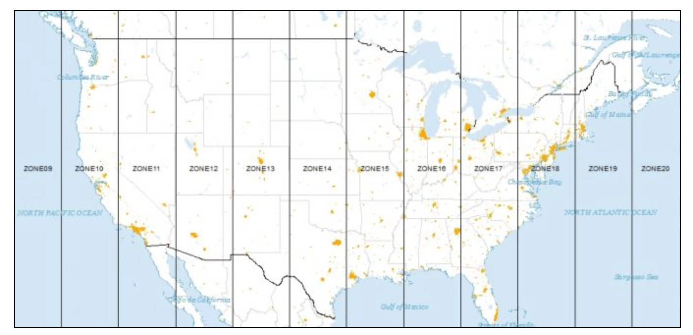
ProjectionsSpatial observations need to be georeferenced, i.e., associated with specific geometric objects for which the location is represented in a two-dimensional Cartesian coordinate system. Since all observations originate on the surface of the three-dimensional near-spherical earth, this requires a transformation. The transformation involves two steps that are often confused by non-geographers. The topic is complex and forms the basis for the discipline of geodesy. A detailed treatment is beyond our scope, but a good understanding of the fundamental concepts is important. The classic reference is Snyder (1993), and a recent overview of a range of technical issues is offered in Kessler and Battersby (2019). The basic building blocks are degrees latitude and longitude that situate each location with respect to the equator and the Greenwich Meridian (near London, England). Longitude is the horizontal dimension (x), and is measured in degrees East (positive) and West (negative) of Greenwich, ranging from 0 to 180 degrees. Since the U.S. is west of Greenwich, the longitude for U.S. locations is negative. Latitude is the vertical dimension (y), and is measured in degrees North (positive) and South (negative) of the equator, ranging from 0 to 90 degrees. Since the U.S. is in the northern hemisphere, its latitude values will be positive. In Kepler.gl, the WGS84 geographic coordinate system is used by default. All data is visualized using latitude and longitude in this system to represent geographic locations accurately. Note: the GeoJSON format uses the WGS84 geographic coordinate system by default. If you have datasets not in the WGS84 geographic coordinate system, you can convert them to WGS84 using GeoDa software (see Reprojection). However, when computing geometric measurements—such as distance, buffer, area, length, and perimeter—the AI assistant automatically uses GeoDa library to convert geographic coordinates (latitude and longitude) into projected coordinates (easting and northing) using the UTM projection with the WGS84 datum. This ensures accurate calculations in meters. For Universal Transverse Mercator or UTM, the global map is divided into parallel zones, as shown in Figure below. With each zone corresponds a specific projection that can be used to convert geographic coordinates (latitude and longitude) into projected coordinates (easting and northing). Converting Between Points and PolygonsSo far, we have represented the geography of the community areas by their actual boundaries. However, this is not the only possible way. We can equally well choose a representative point for each area, such as a mean center or a centroid. In addition, we can create new polygons to represent the community areas as tessellations around those central points, such as Thiessen polygons. The key factor is that all three representations are connected to the same cross-sectional data set. As we will see in later chapters, for some types of analyses it is advantageous to treat the areal units as points, whereas in other situations Thiessen polygons form a useful alternative to dealing with an actual point layer. The center point and Thiessen polygon functionality is brought up through the options menu associated with any map view (right click on the map to bring up the menu). We illustrate these features with the projected community area map we just created. Mean centers and centroidsThe mean centers is obtained as the simple average of the the X and Y coordinates that define the vertices of the polygon. The centroid is more complex, and is the actual center of mass of the polygon (image a cardboard cutout of the polygon, the centroid is the central point where a pin would hold up the cutout in a stable equilibrium). Both methods can yield strange results when the polygons are highly irregular or in a so-called multi-polygon situation (different polygons associated with the same ID, such as a mainland area and an island belonging to the same county). In those instances the centers can end up being located outside the polygon. Nevertheless, the shape centers are a handy way to convert a polygon layer to a corresponding point layer with the same underlying geography. For example, as we will see in a later chapter, they are used under the hood to calculate distance-based spatial weights for polygons. To add centroids of the map layer, you can use the following prompt to create a map layer first: After the map layer is created, you can add centroids by just prompting: 
Thiessen polygonsPoint layers can be turned into a so-called tessellation or regular tiling of polygons centered around the points. Thiessen polygons are those polygons that define an area that is closer to the central point than to any other point. In other words, the polygon contains all possible locations that are nearest neighbors to the central point, rather than to any other point in the data set. The polygons are constructed by considering a line perpendicular at the midpoint to a line connecting the central point to its neighbors. For example, we can prompt the AI assistant to create Thiessen polygons for the point layer: 
Minimum spanning treeA graph is a data structure that consists of nodes and vertices connecting these nodes. In our later discussions, we will often encounter a connectivity graph, which shows the observations that are connected for a given distance band. The connected points are separated by a distance that is smaller than the specified distance band. An important graph is the so-called max-min connectivity graph, which shows the connectedness structure among points for the smallest distance band that guarantees that each point has at least one other point it is connected to. A minimum spanning tree (MST) associated with a graph is a path through the graph that ensures that each node is visited once and which achieves a minimum cost objective. A typical application is to minimize the total distance traveled through the path. The MST is employed in a range of methods, particularly clustering algorithms. The Ai assistant uses GeoDa library to construct an MST based on the max-min connectivity graph for any point layer. The construction of the MST employs Prim’s algorithm, which is illustrated in more detail in the Appendix. To create a minimum spanning tree for the point layer, you can use the following prompt: 
AggregationSpatial data sets often contain identifiers of larger encompassing units, such as states for counties, or census tracts for individual household data. Spatial disolve is a function that allows us to aggregate the smaller units into the larger units. We illustrate this functionality with the natregimes dataset using spatial dissolve tool. First, load the dataset: While the observations are for counties, each county also includes a numeric code for the encompassing state in the variable STFIPS. We can use this variable to aggregate the counties into states. If you want to aggregate the properties values of the counties into the states, you can use the following prompt: 
Multi-Layer SupportKepler.gl supports multi-layer visualization by default. When you load more datasets, the map layers will be automatically added to current map. You can drag-n-drop the layers to reorder them. This multi-layer infrastructure allows for the calculation of variables for one layer, based on the observations in a different layer. 
Spatial JoinThis is an example of a point in polygon GIS operation. There are two applications of this process. In one, the ID variable (or any other variable) of a spatial area is assigned to each point that is within the area’s boundary. We refer to this as Spatial Assign. The reverse of this process is to count (or otherwise aggregate) the number of points that are within a given area. We refer to this as Spatial Count. Even though the default application is simply assigning an ID or counting the number of points, more complex assignments and aggregations are possible as well. For example, rather than just counting the point, an aggregate over the points can be computed for a given variable, such as the mean, median, standard deviation, or sum. This process is called Spatial Join. Spatial assignWe start the process illustrating the Spatial Assign operation by first loading the Chicago supermarkets point layer, chicago_sup.geojson, followed by the projected community area layer, chicago_commpop.geojson. The purpose of the Spatial Assign operation is to assign the community area ID to each supermarket. This is done by using the Spatial Join tool. 
Spatial countThe Spatial Count process works in the reverse order by counting the number of supermarkets in each community area. 
:::tip Spatial join with aggregationWe can also carry out an aggregation over the points in each area. For example, when joining the points to the community areas, we can aggregate the points by the mean of the variable 
The aggregation options that are supported now include: COUNT, SUM, MEAN, MIN, MAX, UNIQUE.
|
Beta Was this translation helpful? Give feedback.
-
Basic MappingOriginal GeoDa lab by Luc Anselin: https://geodacenter.github.io/workbook/3a_mapping/lab3a.html IntroductionIn this Chapter, we will explore a range of mapping and geovisualization options. We start with a review of common thematic map classifications. We next focus on different statistical maps, in particular maps that are designed to highight extreme values or outliers. We also illustrate maps for categorical variables (unique value maps), and their extension to multiple categories in the form of co-location maps. We close with a review of some special approaches to geovisualization, i.e., The main objective is to use the maps to interact with the data as part of the exploration process. PreliminariesWe will illustrate the various operations by means of the data set with demographic and socio-economic information for 55 New York City sub-boroughs.
Thematic Maps – OverviewWe start by loading the NYC sub-boroughs dataset: Common map classifications include the Quantile Map, Natural Breaks Map, and Equal Intervals Map. Specialized classifications that are designed to bring out extreme values include the Percentile Map, Box Map (with two options for the hinge), and the Standard Deviation Map. The Unique Values Map does not involve a classification algorithm, since it uses the integer/string values of a categorical variable itself as the map categories. The Co-location Map is an extension of this principle to multiple categorical variables. Finally, Custom Breaks allows for the use of customized classifications. Common map classificationsQuantile MapA quantile map is based on sorted values for a variable that are then grouped into bins that each have the same number of observations, the so-called quantiles. The number of bins corresponds to the particular quantile, e.g., five bins for a quintile map, or four bins for a quartile map, two of the most commonly used categories. For example, we can create a quantile map for the variable or 
:::tip The quantile map has been created with a default color scheme. If you want to replicate the same result in original GeoDa lab which use the colorbrewer2.org color scheme 'YlOrBr', you can use the following prompt: 
You can further explore the quantile results by querying the number of areas in each category: 
Upon closer examination from the screenshot, something doesn’t seem to be quite right. With 55 total observations, we should expect roughly 14 (55/4 = 13.75) observations in each group. But the first group only has 7, and the third group has 19! If we open up the Table and sort on the variable Ignoring the zero entries for now (those are a potential problem in their own right), we see that observations starting in row 8 up to row 21 all have a value of 1000. The cut-off for the first quartile is at 14, highlighted in yellow in the graph. In a non-spatial analysis, this is not an issue, the first quartile value is given as 1000. But in a map, the observations are locations that need to be assigned to a group (with a separate color). Other than an arbitrary assignment, there is no way to classify observations with a rent of 1000 in either category 1 or category 2. To deal with these ties, then quantile algorithm (implemented in geoda-lib) moves all the observations with a value of 1000 to the second category. As a result, even though the value of the first quartile is given as 1000 in the map legend, only those observations with rents less than 1000 are included in the first quartile category. As we see from the table, there are seven such observations. Any time there are ties in the ranking of observations that align with the values for the breakpoints, the classification in a quantile map will be problematic and result in categories with an unequal number of observations. A natural breaks map uses a nonlinear algorithm to group observations such that the within-group homogeneity is maximized, following the pathbreaking work of Fisher (1958) and Jenks (1977). In essence, this is a clustering algorithm in one dimension to determine the break points that yield groups with the largest internal similarity. To create such a map with four categories, you can use the following prompt: 
You will see there is a new map layer been created. But it has the same name as the previous one. You can click on the label of the map layer in the Layers panel to edit the name of the layer. If you want to compare the results of natural breaks map with the quartile map, you can click 'Switch to dual map view' button on the top right corner of the map to compare the two layers side by side. 
In comparison to the quartile map, the natural breaks criterion is better at grouping the extreme observations. The three observations with zero values make up the first category, whereas the five high rent areas in Manhattan make up the top category. Note also that in contrast to the quantile maps, the number of observations in each category can be highly unequal. Equal Intervals MapAn equal intervals map uses the same principle as a histogram to organize the observations into categories that divide the range of the variable into equal interval bins. This contrasts with the quantile map, where the number of observations in each bin is equal, but the range for each bin is not. For the equal interval classification, the value range between the lower and upper bound in each bin is constant across bins, but the number of observations in each bin is typically not equal. :::tip To create an equal intervals map for the variable 
As in the case of natural breaks, the equal interval approach can yield categories with highly unequal numbers of observations. In our example, the three zero observations again get grouped in the first category, but the second range (from 725 to 1450) contains the bulk of the spatial units (42). To illustrate the similarity with the histogram, you can use the following prompt: 
The resulting histogram has the exact same ranges for each interval as the equal intervals map. The number of observations in each category is the same as well. The values for the number of observations in the descriptive statistics below the graph match the values given in the map legend. Finally, we illustrate the equivalence between the two graphs by selecting a category in the map legend. To accomplish this, we select the highest category in the histogram. This selects will highlights the related observations in the map, through linking.
:::note Map optionsIn Kepler.gl, there are several options to customize the map. For saving and exporting the map, please refer to the following documentation:
Extreme Value MapsExtreme value maps are variations of common choropleth maps where the classification is designed to highlight extreme values at the lower and upper end of the scale, with the goal of identifying outliers. These maps were developed in the spirit of spatializing EDA, i.e., adding spatial features to commonly used approaches in non-spatial EDA (Anselin 1994). There are three types of extreme value maps:
These are briefly described below. Only their distinctive features are highlighted, since they share all the same options with the other choropleth map types. Percentile MapThe percentile map is a variant of a quantile map that would start off with 100 categories. However, rather than having these 100 categories, the map classification is reduced to six ranges, the lowest 1%, 1-10%, 10-50%, 50-90%, 90-99% and the top 1%. For example, you can create a percentile map for the variable 
:::tip Note how the extreme values are much better highlighted, especially at the upper end of the distribution. The classification also illustrates some common problems with this type of map. First of all, since there are fewer than 100 observations, in a strict sense there is no 1% of the distribution. This is handled (arbitrarily) by rounding, so that the highest category has one observation, but the lowest does not have any. In addition, since the values are sorted from low to high to determine the cut points, there can be an issue with ties. As we have seen, this is a generic problem for all quantile maps. As pointed out, the algorithm handles ties by moving observations to the next highest category. For example, when there are a lot of observations with zero values (e.g., in the crime rate map for the U.S. counties), the lowest percentile can easily end up without observations, since all the zeros will be moved to the next category. Box MapA box map (Anselin 1994) is the mapping counterpart of the idea behind a box plot. The point of departure is again a quantile map, more specifically, a quartile map. But the four categories are extended to six bins, to separately identify the lower and upper outliers. The definition of outliers is a function of a multiple of the inter-quartile range (IQR), the difference between the values for the 75 and 25 percentile. As we will see in a later chapter in our discussion of the box plot, we use two options for these cut-off values, or hinges, 1.5 and 3.0. The box map uses the same convention. To create a box map for the variable 
Compared to the quartile map, the box map separates the three lower outliers (the observations with zero values) from the other four observations in the first quartile. They are depicted in dark blue. Similarly, it separates the six outliers in Manhattan from the eight other observations in the upper quartile. The upper outliers are colored dark red. To illustrate the correspondence between the box plot and the box map, we create a box plot for the variable 
In the box plot, we select the upper outliers, the matching six outlier locations in the box map are highlighted. Note that the outliers in the box plot do not provide any information on the fact that these locations are also adjoining in space. This the spatial perspective that the box map adds to the data exploration.
The default box map uses the hinge criterion of 1.5. You can change the hinge criterion to 3.0 by using the following prompt: 
The resulting box map, shown in screenshot, no longer has lower outliers and has only five upper outliers (compared to six for the 1.5 hinge). The box map is the preferred method to quickly and efficiently identify outliers and broad spatial patterns in a data set. Standard Deviation MapThe third type of extreme values map is a standard deviation map. In some way, this is a parametric counterpart to the box map, in that the standard deviation is used as the criterion to identify outliers, instead of the inter-quartile range. In a standard deviation map, the variable under consideration is transformed to standard deviational units (with mean 0 and standard deviation 1). This is equivalent to the z-standardization we have seen before. The number of categories in the classification depends on the range of values, i.e., how many standard deviational units cover the range from lowest to highest. It is also quite common that some categories do not contain any observations (as in the example in the screenshot below). To create a standard deviation map for the variable 
In the screenshot above, there are five neighborhoods with median rent more than two standard deviations above the mean, and three with a median rent less than two standard deviations below the mean. Both sets would be labeled outliers in standard statistical practice. Also, note how the second lowest category does not contain any observations (so the corresponding color is not present in the map). Mapping Categorical VariablesSo far, our maps have pertained to continuous variables, with a clear order from low to high. GeoDa also contains some functionality to map categorical variables, for which the numerical values are distinct, but not necessarily meaningful in and of themselves. Most importantly, the numerical values typically do not imply any ordering of the categories. The two relevant functions are the unique value map, for a single variable, and the co-location map, where the categories for multiple variables are compared. Unique Value MapTo illustrate the categorical map, we first create a box map (with hinge 1.5) for each of the variables The category labels go from 1 to 6, but not all categories necessarily have observations. For example, the map for public assistance does not have either lower (label 1) or higher (label 6), outliers, only observations for 2–5. For the kids map, we have categories 1–5. 
Then, you can save the categories from the box map result into a new column. For example: 
:::tip SELECT ..., CASE To replicate the same result in the original GeoDa lab, you can use the following prompt: 
Then, you can do the same for the variable 

To replicate the same result in the original GeoDa lab, you can use the following prompt: 
Co-location MapThe co-location map is a map that shows the co-location of two categorical variables. It is a variant of the unique value map, where the categories for multiple variables are compared. To create a co-location map for the variables 
The above steps show how to create a co-location map of two variables step by step:
In Kepler.gl, we create a specific 'colocation' tool, so you can create a co-location map just with the following prompt: 
From the screenshot, you can see how AI Assistant plans the steps to create the co-location map:
Custom ClassificationIn addition to the range of pre-defined classifications available for choropleth maps, it is also possible to create a custom classification using AI Assistant. This is often useful when substantive concerns dictate the cut points, rather than data driven criteria. For example, this may be appropriate when specific income categories are specified for certain government programs. A custom classification may also be useful when comparing the spatial distribution of a variable over time. All included pre-defined classifications are relative and would be re-computed for each time period. For example, when mapping crime rates over time, in an era of declining rates, the observations in the upper quartile in a later period may have crime rates that correspond to a much lower category in an earlier period. This would not be apparent using the pre-defined approaches, but could be visualized by setting the same break points for each time period. For example, you can create a custom classification for the variable 
Tip: to create a custom classification, what you need to prompt includes:
The FSQ Studio (which is based on kepler.gl) has a custom classification tool that allows you to adjust the break points by simply dragging the break points. See Custom Breaks Editor. We hope this feature will be upstream back to kepler.gl in the future.
|


Beta Was this translation helpful? Give feedback.
-
Maps for Rates or ProportionsOriginal GeoDa lab by Luc Anselin: https://geodacenter.github.io/workbook/3b_ratemaps/lab3b.html IntroductionIn this chapter, we will explore some important concepts that are relevant when mapping rates or proportions. Such data are characterized by an intrinsic variance instability, in that the precision of the rate as an estimate for underlying risk is inversely proportional to the population at risk. Specifically, this implies that rates estimated from small populations (e.g., small rural counties) may have a large standard error. Furthermore, such rate estimates may potentially erroneously suggest the presence of outliers. In what follows, we will cover two basic methods to map rates. We will also consider the most commonly used rate smoothing technique, based on the Empirical Bayes approach. Spatially explicit smoothing techniques will be treated after we cover distance-based spatial weights. Objectives
Getting StartedIn this chapter, we will use a sample data set with lung cancer data for the 88 counties of the state of Ohio. This is a commonly used example in many texts that cover disease mapping and spatial statistics.2 The data set is also included as one of the Center for Spatial Data Science example data sets and can be downloaded from the Ohio Lung Cancer Mortality page. We can load the data by prompting: 
Choropleth Map for RatesSpatially extensive and spatially intensive variablesWe start our discussion of rate maps by illustrating something we should not be doing. This pertains to the important difference between a spatially extensive and a spatially intensive variable. In many applications that use public health data, we typically have access to a count of events, such as the number of cancer cases (a spatially extensive variable), as well as to the relevant population at risk, which allows for the calculation of a rate (a spatially intensive variable). In our example, we could consider the number (count) of lung cancer cases by county among white females in Ohio (say, in 1968). The corresponding variable in our data set is LFW68. We can create a box map (hinge 1.5) in the by now familar prompt: 
Anyone familiar with the geography of Ohio will recognize the outliers as the counties with the largest populations, i.e., the metropolitan areas of Cincinnati, Columbus, Cleveland, etc. The labels for these cities in the base layer make this clear. This highlights a major problem with spatially extensive variables like total counts, in that they tend to vary with the size (population) of the areal units. So, everything else being the same, we would expect to have more lung cancer cases in counties with larger populations. Instead, we opt for a spatially intensive variable, such as the ratio of the number of cases over the population. More formally, if Variance instabilityThe crude rate is an estimator for the unknown underlying risk. In our example, that would be the risk of a white woman to be exposed to lung cancer. The crude rate is an unbiased estimator for the risk, which is a desirable property. However, its variance has an undesirable property, namely where The flip side of this result is that for areas with sparse populations (small The AI assistant in kepler.gl provides a tool to calculate the different types of rates: Raw rate mapFirst, we consider the Raw Rate or crude rate (proportion), the simple ratio of the events (number of lung cancer cases) over the population at risk (the county population). For example, we can use the following prompt: We immediately notice that the counties identified as upper outliers in this screenshot are very different from what the map for the counts suggested in the previous box map. If we use split map to compare the two maps, we can see that none of the original count outliers remain as extreme values in the rate map. In fact, some counties are in the lower quartiles (blue color) for the rates. 
Raw rate values in tableFrom the response text, we can see that there is a new dataset 'rates_qxxx' has been created and added in Kepler.gl. If we click on the table icon, we can see the raw rates column: 
Excess risk mapRelative riskA commonly used notion in demography and public health analysis is the concept of a standardized mortality rate (SMR), sometimes also referred to as relative risk or excess risk. The idea is to compare the observed mortality rate to a national (or regional) standard. More specifically, the observed number of events is compared to the number of events that would be expected had a reference risk been applied. In most applications, the reference risk is estimated from the aggregate of all the observations under consideration. For example, if we considered all the counties in Ohio, the reference rate would be the sum of all the events over the sum of all the populations at risk. Note that this average is not the average of the county rates. Instead, it is calculated as the ratio of the total sum of all events over the total sum of all populations at risk (e.g., in our example, all the white female deaths in the state over the state white female population). Formally, this is expressed as: Excess risk mapWe can map the standardized rates directly using the following prompt: In the excess risk map, the legend categories are hard coded, with the blue tones representing counties where the risk is less than the state average (excess risk ratio < 1), and the brown tones corresponding to those counties where the risk is higher than the state average (excess risk ratio > 1). 
In the map above, we have six counties with an SMR greater than 2 (the brown colored counties), suggesting elevated rates relative to the state average. Empirical Bayes (EB) Smoothed Rate MapBorrowing strengthAs mentioned in the introduction, rates have an intrinsic variance instability, which may lead to the identification of spurious outliers. In order to correct for this, we can use smoothing approaches (also called shrinkage estimators), which improve on the precision of the crude rate by borrowing strength from the other observations. This idea goes back to the fundamental contributions of James and Stein (the so-called James-Stein paradox), who showed that in some instances biased estimators may have better precision in a mean squared error sense. The AI assistant in kepler.gl includes three methods to smooth the rates: an Empirical Bayes approach, a spatial averaging approach, and a combination between the two. We will consider the spatial approaches after we discuss distance-based spatial weights. Here, we focus on the Empirical Bayes (EB) method. First, we provide some formal background on the principles behind smoothing and shrinkage estimators. Bayes LawThe formal logic behind the idea of smoothing is situated in a Bayesian framework, in which the distribution of a random variable is updated after observing data. The principle behind this is the so-called Bayes Law, which follows from the decomposition of a joint probability (or density) into two conditional probabilities: where In most instances in practice, the denominator in this expression can be ignored, and the equality sign is replaced by a proportionality sign: In the context of estimation and inference, the The Poisson-Gamma modelFor each particular estimation problem, we need to specify distributions for the prior and the likelihood in such a way that a proper posterior distribution results. In the context of rate estimation, the standard approach is to specify a Poisson distribution for the observed count of events (conditional upon the risk parameter), and a Gamma distribution for the prior of the risk parameter In this model, the prior distribution for the (unknown) risk parameter and Using standard Bayesian principles, the combination of a Gamma prior for the risk parameter with a Poisson distribution for the count of events ( and Different values for the The Empirical Bayes approachIn the Empirical Bayes approach, values for In essence, the EB technique consists of computing a weighted average between the raw rate for each county and the state average, with weights proportional to the underlying population at risk. Simply put, small counties (i.e., with a small population at risk) will tend to have their rates adjusted considerably, whereas for larger counties the rates will barely change. More formally, the EB estimate for the risk in location In this expression, the weights are: with In the empirical Bayes approach, the mean For The estimate of the variance is a bit more complex: While easy to calculate, the estimate for the variance can yield negative values. In such instances, the conventional approach is to set EB rate mapYou can use the following prompt to create an EB smoothed rate map by using the dataset with raw rates, which we will compare to the EB rates in the next step: 
In comparison to the box map for the crude rates and the excess rate map, none of the original outliers remain identified as such in the smoothed map. Instead, a new outlier is shown in the very southwestern corner of the state (Hamilton county). Since many of the original outlier counties have small populations at risk (check in the data table), their EB smoothed rates are quite different (lower) from the original. In contrast, Hamilton county is one of the most populous counties (it contains the city of Cincinnati), so that its raw rate is barely adjusted. Because of that, it percolates to the top of the distribution and becomes an outlier. To illustrate this phenomenon, we can systematically select observations in the box plot for the raw rates and compare their position in the box plot for the smoothed rates. This will reveal which observations are affected most. We create the box plots in the usual way using the raw rates and the empirical bayes smoothed rates by prompting: 
Now, the AI assistant will create two box plots for the raw rates and the empirical bayes smoothed rates. We select the three outliers in the raw rates box plot. The corresponding observations are within the upper quartile for the EB smoothed rates, but well within the fence, and thus no longer outliers after smoothing. We can of course also locate these observations on the map, or any other open views. 
Next, we can carry out the reverse and select the outlier in the box plot for the EB smoothed rate. Its position is around the 75 percentile in the box plot for the crude rate. Also note how the range of the rates has shrunk. Many of the higher crude rates are well below 0.00012 for the EB rate, whereas the value for the EB outlier has barely changed. 
Here is a screen captured video of the above steps:
|

Beta Was this translation helpful? Give feedback.
-
|
This is a great new feature with a lot of potential. Question - how do you handle LLM hallucinations i.e errors ? And have you considered supporting Berkeley LLM, specifically designed for function calling, more accurate than LLama, and without the commercial restrictions ? |
Beta Was this translation helpful? Give feedback.
-
|
Thank you, @boxerab! To mitigate LLM hallucinations, the AI Assistant module integrates over 50+ geospatial tools that operate directly within the browser. These tools handle computations such as data standardization, querying, spatial joins, and more. The Kepler.gl will renders the computational result (-> to avoid hallucination), and the LLM just provides a summary of the results. For a comprehensive list of these computational tools, please refer to the GitHub repository: https://github.com/geodaai/openassistant. This module is part of the OpenJS project: https://geodaai.github.io/. We’ve evaluated various models, and currently, this AI Assistant module performs optimally with large models with > 100 billion parameters. For example, if you are interested in open models: qwen3 235b, gpt-oss 120b are capable. However, I haven’t had the opportunity to test the Berkeley LLM. Are you referring to the model available here: https://huggingface.co/gorilla-llm? One key aspect to highlight is that the design of this AI Assistant module ensures that your raw data remains within the browser. All computations are executed locally, and no data is transmitted to the LLM. Therefore, privacy concerns are mitigated, even when using commercial LLM models. |
Beta Was this translation helpful? Give feedback.
-
|
@lixun910 thank you for the explanation. So, the LLM converts natural language into choice of tools and how to call them. This is where the hallucinations could be a problem - wrong tool or it makes up a non-existent tool. How to mitigate this ? Yes, you're right, I meant Gorilla, developed at Berkeley. As you probably know they have a function-calling leaderboard. |
Beta Was this translation helpful? Give feedback.
-
|
@boxerab For most of the geospatial jobs, the large LLM models usually make very good plans calling different tools for a task. For wrong tool calling, you can mitigate this in the system level instruction. One good example is here: most LLM doesn't know how to create a co-location map, so we added specific instructions to mitigate this: kepler.gl/src/ai-assistant/src/constants.ts Lines 47 to 58 in dc8ba03 For now, we don't have a web search tool (which requires setting up a server), but another solution is to use the web search tool to get the latest information or knowledge (e.g. co-location map), before any other tool calls. Let me know if this makes sense. Thanks! :) |
Beta Was this translation helpful? Give feedback.
-
|
Thanks, it does make sense. However, you WILL encounter errors as no LLM is 100% accurate, and some user requests are sufficiently vague that it will need clarification. The saying is "the users ruin everything" :) .Web search and prompt engineering will help, but I think you will need a plan to recover from errors - maybe the user will catch the mistake, but maybe not. |
Beta Was this translation helpful? Give feedback.
-
|
Good point, @boxerab! Yes, that is 100% true that no LLM is 100% accurate : ) But it definitely provides a way to "assistant" users to do geospatial analysis more efficiently. In some cases, high school students (yes, high schoolers) are using this AI Assistant to learn spatial data analysis, and it is very important for them to know what tools have been called for what specific problem, and why is that. This is an "assistant" by the end, and you still need to take control and make the decision :) |
Beta Was this translation helpful? Give feedback.
-
|
fantastic! looking forward to trying this out. What I would find quite interesting is some benchmarks on: LLM used |
Beta Was this translation helpful? Give feedback.
-
|
@lixun910 do you have a roadmap or plan for what features you want to add in the next year or so ? |
Beta Was this translation helpful? Give feedback.
-
|
We have a list of tools/features for spatial data analysis including:
All of them are going to serve the workbook of spatial data analysis: https://geodacenter.github.io/documentation We will have biweekly open team meetings, you are welcome to join us :) cc @jkoschinsky |
Beta Was this translation helpful? Give feedback.
-
|
great! I will join the next call if the timing works |
Beta Was this translation helpful? Give feedback.
-
|
Welcome, Aaron! Here's the link for our biweekly GeoDa.AI community meeting
on Thursdays, 11-11:30am CT:
https://uchicagogroup.zoom.us/meeting/register/uDhL1VV-Rk-UTU9m-j8YkQ
Next one is Thursday, Aug 28. Let me know if that doesn't work.
Anyone interested in GeoDa.AI is welcome to join these meetings.
…On Fri, Aug 22, 2025 at 8:40 PM Aaron Boxer ***@***.***> wrote:
great! I will join the next call if the timing works
—
Reply to this email directly, view it on GitHub
<#2843 (comment)>,
or unsubscribe
<https://github.com/notifications/unsubscribe-auth/ADILY73XSZKLLOMMMERD7S33O5PZXAVCNFSM6AAAAABTZAY4DKVHI2DSMVQWIX3LMV43URDJONRXK43TNFXW4Q3PNVWWK3TUHMYTIMJZGI3DANY>
.
You are receiving this because you were mentioned.Message ID:
***@***.***>
|
Beta Was this translation helpful? Give feedback.
-
|
@jkoschinsky thanks! unfortunately won't be able to make that one, maybe near end of September. Will let you know. |
Beta Was this translation helpful? Give feedback.
-
|
@lixun910 This discussion is great. I think we can add all of this discussions to our documentation. |
Beta Was this translation helpful? Give feedback.
Uh oh!
There was an error while loading. Please reload this page.
Uh oh!
There was an error while loading. Please reload this page.
-
Introduction to Spatial Data Analysis using Kepler.gl Ai Assistant
Author: Xun Li Dec 17 2024
Contents
Architecture
The AI Assistant is a module that adds an AI chatbot to Kepler.gl. This module aims to integrates Kepler.gl with AI-powered capabilities, enabling it to interact with multiple AI models seamlessly.
Overview
The system is designed to enable Kepler.gl, a React-based single-page application, to integrate an AI Assistant Module for performing tasks with large language models (LLMs) like OpenAI GPT models, Google Gemini models, Ollama models, etc.
Below is a flow map that shows how a user can update a basemap in Kepler.gl through a simple AI-driven prompt, showcasing the integration of LLMs with application actions and rendering.
The AI Assistant Module also provides a set of tools to support data analysis and visualization. These AI Tools are designed to be used in conjunction with the Kepler.gl application and transform kepler.gl into a powerful spatial data analysis and visualization tool. For more details about the AI Assistant Module, please to https://github.com/geodacenter/openassistant.
Why LLM tools
LLMs are fundamentally statistical language models that predict the next tokens based on the context. While emergent behaviors such as learning, reasoning, and tool use enhance the model's capabilities, LLMs do not natively perform precise or complex computations and algorithms. For example, when asked to compute the square root of a random decimal number, ChatGPT typically provides an incorrect answer unless its Python tool is explicitly called to perform the calculation. This limitation becomes even more apparent with complex tasks in engineering and scientific domains. Providing computational tools for LLMs offers a solution for overcoming this problem and helps you successfully integrate LLMs with your applications.
AI Tools
LLMs use these AI Tools to perform spatial data analysis and visualization tasks to help users explore and understand their data.
For example, a user can ask the AI Assistant to simply change the basemap to a
voyagerbasemap, and the AI Assistant will call thebasemaptool to change the basemap.For complex tasks, the AI Assistant can use multiple tools to perform the task. For example, a user can ask the AI Assistant if the points dataset loaded in kepler.gl is clustering in zipcode areas. The AI Assistant could call the following tools to perform the task:
mapBoundaryto get the boundary of current map viewqueryUSZipcodeto get a list of zipcodes using the map boundaryusZipcodeto fetch the geometries of the zipcodes from Github sitesaveDatato save the zipcode areas as a new GeoJSON dataset in kepler.glspatialJointo count the number of points in each zipcode areasaveDatato save the spatialJoin result as a new dataset in kepler.glweightsCreationto create a e.g. queen contiguity weights using the spatialJoin resultlocal Moran's Ito apply local Moran's I using the counts and the queen contiguity weightssaveDatato save the local Moran's I result as a new dataset in kepler.gladdLayerto add the local Moran's I result as a new layer in kepler.glThese fine grained spatial tools are designed to transform the LLMs, which are fundarmentally statistical language models, into powerful spatial data analysis and visualization AI Agent.
As of May 2025, the AI Assistant Module supports the following AI Tools:
Kepler.gl Tools
Plot Tools
Query Tools
OSM Tools
Spatial Analysis Tools (powered by Geoda)
Beta Was this translation helpful? Give feedback.
All reactions