Replies: 1 comment 2 replies
-
|
This card is not redundant. It breaks out an important piece of information and makes it easy to interpreted without having to look at a single circle in another graph and do math. With that reasoning we might just throw everything in a table, drop all colors and just call anything else redundant 😉 I think adopting the colors for return to grid / consumption from grid is a good idea that we should explore (CC @matthiasdebaat) |
Beta Was this translation helpful? Give feedback.
-
|
I agree, especially as other changes seem in the works for the energy distribution card. With regards to colors, please feel free to leave comment on #10054! |
Beta Was this translation helpful? Give feedback.
-
|
Thanks for your suggestions! Just made a comment |
Beta Was this translation helpful? Give feedback.
Uh oh!
There was an error while loading. Please reload this page.
Uh oh!
There was an error while loading. Please reload this page.
-
Current look:
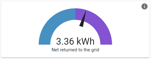
Current tooltip text:
This card represents your energy dependency. If it's green, it means you produced more energy than that you consumed from the grid. If it's in the red, it means that you relied on the grid for part of your home's energy consumption.In the context of the energy dashboard, this card is basically redundant with information presented directly above it in the energy distribution card, especially if suggestion #9975 is implemented. The gauge just does a few operations to tell you whether you returned more than you consumed, which you can tell by glancing at the "Grid" circle on the energy distribution card anyway. Second, it’s not immediately clear what the needle position represents. It’s relatively clear that the number displayed in the gauge is just
returned - consumed, but what does the needle position mean? What are the units/limits of the gauge? I’ve looked at the code, so I get what it’s doing (and it seems like a reasonable thing to do), but it's still not clear to the user. For these reasons, I would suggest removing this card from the energy dashboard. I could see leaving it around as an option for other Lovelace dashboards (especially for users not using the energy distribution card).But if this card is definitely sticking around in the energy dashboard, here are some changes I would suggest:
in the red, it means that you relied on the grid for part of your home's energy consumption.In fact, the needle represents net usage. It could be in the green even if you relied on the grid at night, which is, of course, typical. I would suggest changing the text to the following (coupled with the previous two changes):This card indicates your net energy usage. If the needle is in the purple, you returned more energy to the grid than you consumed from it. If it's in the blue, you consumed more energy than you returned.Beta Was this translation helpful? Give feedback.
All reactions