-
|
Hi there, is it currently possible to create a histogram plot, where a bar represents a range of values? For reference: https://plotly.com/python/histograms/ |
Beta Was this translation helpful? Give feedback.
Replies: 2 comments 6 replies
-
|
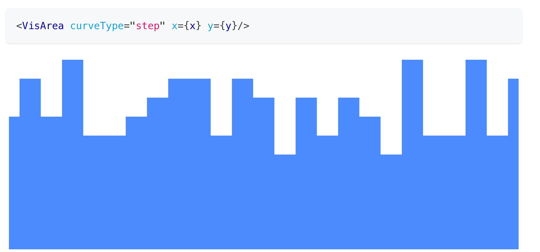
@pietz You can create histograms using the Stacked Bar component; or using Area with the You'll need to bin your data yourself though. |
Beta Was this translation helpful? Give feedback.
-
|
sorry to come back to this. i managed to do this with the area plot but would like to use the bar plot because i want there to be padding between the bars. how would you create a minimal example for plotting 3 values between 0 to 10 and 5 values between 11 and 20? basically i would want the ticks to be 0, 10 and 20 with 2 bars between the ticks. i can only manage to line up the ticks with the middle of the bars but not in between. |
Beta Was this translation helpful? Give feedback.
-
|
I think what I'm looking for is more like the stepAfter and stepBefore options but using a bar chart. |
Beta Was this translation helpful? Give feedback.
-
|
@pietz I see, there's no option like that unfortunately, the bars will always be centered. But you can try manually shifting them by the half of your step size. It can be achieved by modifying the |
Beta Was this translation helpful? Give feedback.
-
|
dont you think what I'm suggesting might be a good addition to unovis? |
Beta Was this translation helpful? Give feedback.
-
|
I think it can be a nice addition. We're open to contributions on that front if you want to help building it. |
Beta Was this translation helpful? Give feedback.
-
|
actually i took your advice and got everything working with the shifting method! it felt a bit hacky but it does exactly what i expect. very impressed with unovis! thanks for building such a great library :) |
Beta Was this translation helpful? Give feedback.
@pietz You can create histograms using the Stacked Bar component; or using Area with the
curveTypeproperty set to'step':You'll need to bin your data yourself though.