[Design System, ui] Vertical tabs or Menus? #194
Replies: 3 comments 6 replies
-
|
I will provide a more detailed answer later, but for now, I just wanted to point out that we briefly discussed this very use case when working on the menu, and this the reason we ended up with both a I need to think about this some more but I think in general terms we need to chose between two approaches: |
Beta Was this translation helpful? Give feedback.
-
|
Same here. I'll also need some time to really be able to say something sensible. One thing that immediately comes to mind is the intended usecases for both the tabs and the menu (and especially the vertically oriented variants). What are they supposed to be used for? For me that's where I'd start with figuring out whether the components are actually different, and if they are if the differences are cosmetic or functional. |
Beta Was this translation helpful? Give feedback.
-
|
Thanks for the initial thoughts, I can add some information regarding usecases:
The use cases for the components are:
Based on the use cases above, I think there is a reasonable argument for "all of the above" being available in |
Beta Was this translation helpful? Give feedback.
-
|
Oh by the way, we should keep the discussion threaded. Assuming that your reply here is to my question above @cooper-joe, you can reply under my initial question comment and it'll keep it contained in a single thread. |
Beta Was this translation helpful? Give feedback.
-
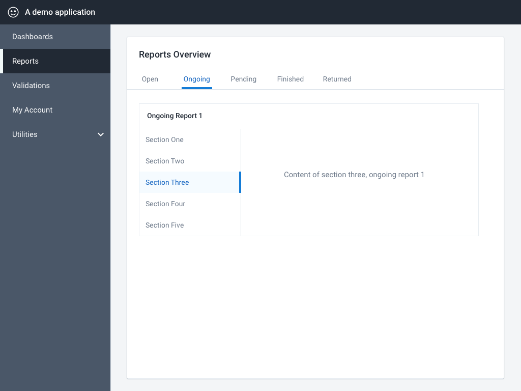
I think we can identify this, and potentially make the use cases less problematic, by emphasizing the differences. Focusing on the difference between vertical tabs and a vertical sidebar menu: The key difference is what navigation possibilities these components offer. Tabs are for related content, Sidebar is the "main" navigation that can link unrelated pages of an application. It may well be the case that a single component (tabs or menu) can fulfill both of those requirements. I'm still working through this myself, I'm unsure what I think at the moment. Here is a visual example of both of these components could exist on the same page, fulfilling different roles. I've given the sidebar a different (dark) style to emphasize the difference: Looking at the visual example, it's clear that both the sidebar and the vertical tabs are providing similar functionality: navigating between things. The question is: is there enough difference to warrant two components? As an aside, I think breaking these use cases into separate components also allows the components room to grow into the use case as those use cases develop. For example, a Sidebar Menu may one day need specific sidebar functionality like badge counts (for notifications), separate top/bottom sections, collapse/expand functionality, different color schemes like in the example above, and so on. Such functionality would likely not be needed in vertical tabs, so it seems at odds to combine them now. |
Beta Was this translation helpful? Give feedback.
-
|
Sorry for the late reply. I've thought about it a bit, hopefully I can clarify my thoughts on this a little.
That definition sounds good to me. Though to fit my idea of tabs and a menu more precisely, I would change it to:
My reasoning behind that change, is that from a technical perspective to me there's one important distinction between tabs and a menu:
Because tabs and menus look a bit similar. So what is the distinction between them? In my opinion it's that tabs exist to ease sectioning related content. By preloading content with the tabs, they can be switched to easily and quickly, and the transistion is not as jarring as routing. The downside being that you're preloading the content, so you can't use it to load a lot of content, because that'd slow down that section of the app. In that case a menu is more appropriate. This fits with the explanation here: https://ux.stackexchange.com/a/23528 (the way I read it), so hopefully my assumptions aren't too idiosyncratic. That means that these two pieces of functionality from the top comment conflict with my definition:
The reason that they conflict is that, if you accept my definition, you don't want to cater to the usecase of sectioning off a lot of content (because of the slowing down). I hope that helps. Note that I think that my idea of the difference between tabs and menu does not fit with the current reality of @dhis2/ui. I believe tabs don't currently work as I've defined above. But since we're hitting a problem where the distinction between both isn't clear, I'd tend towards the definitions above to solve that. |
Beta Was this translation helpful? Give feedback.
-
|
I agree @ismay, performance is an important part of user-experience and, as you said, loading a lot of content that is not visible is potentially problematic. I think we can move forward with the simple defenition you laid out:
After resolving these definitions, the next discussion from this point is the differences highlighted in the original post between |
Beta Was this translation helpful? Give feedback.
-
|
That sounds good to me 👍
I agree 👍. |
Beta Was this translation helpful? Give feedback.
Uh oh!
There was an error while loading. Please reload this page.
-
Background
There is a proposal to add a vertical variant to the
Tabuicomponent. A discussion opened up that suggested using existingMenuItem/Menucomponents to achieve the functionality that verticalTabs would provide.Providing a vertical tab/sidebar solution is currently blocking features that are planned for 2.36 release.
Why vertical tabs?
The proposal of vertical tabs was intended to provide the following functionality:
An example of vertical tab usage that led to this proposal:
Using
MenuItems insteadThis functionality could indeed be provided by the
MenuItemandMenucomponent, but with some adjustments to allow for sidebar functionality. These adjustments are outlined in this document.Currently, the
MenuItemandMenucomponent is designed specifically with aDropdownMenuin mind. The Menu component in the Design System only describes it's use as a dropdown menu. UsingMenuItems for a sidebar-type component is possible, but not fully supported.Dropdown
MenuItems and SidebarMenuItemsThe requirements of a
MenuItemare similar, but not identical, for a sidebar and a dropdown menu:Sidebar menu items
- Enabled
- Hover
- Focus
- Active (click)
- Disabled
- Selected
- Expanded/Collapsed
- Display icon
- Dense option
Dropdown menu items
- Enabled
- Hover
- Focus
- Active (click)
- Disabled
- Toggled
- Open (child menu open from this item)
- Display icon
- Dense option
A visual comparison of the states required by a
MenuItemin these two different use cases:(Styles are for illustration only and are not the final styles for sidebar menu items)
Requirements of a dual-usage
MenuItemTo support the dual-usage, a
MenuItemneeds to provide the following states, with clear differentiation between each:A
MenuItemthat satisfies the above requirements would then be composed for the different use cases, as follows:Component:
DropdownMenuDropdownContainerand multipleMenuItemsComponent:
SidebarMenuSidebarContainerand multipleMenuItemsWork required
To use a
MenuItemfor the dual-purpose of a dropdown and sidebar type menu, the following changes are needed:MenuItems with descendants in aSidebarMenuMenuItems (used only inSidebarMenu)SidebarMenucontainer componentDiscussion
toggledfor dropdown,selectedfor sidebar).Tabsonly? ASidebarMenumakes sense for the main page layout, but should it be used inside a page too?Beta Was this translation helpful? Give feedback.
All reactions