Is there an easy way to plot the colour difference between actual and target value in a chomaticity diagram? #1123
Unanswered
richardstardust
asked this question in
Q&A
Replies: 1 comment 1 reply
-
|
There's no one-liner to produce this type of plot but I've recently been working on something like this:
Which can roughly be described with this code (Sorry these variables are out of my current working space, but you can probably fill in something more appropriate) from colour.plotting import (
plot_ellipses_MacAdam1942_in_chromaticity_diagram_CIE1976UCS,
)
from sklearn.cluster import KMeans
fig, ax = plot_ellipses_MacAdam1942_in_chromaticity_diagram_CIE1976UCS(
standalone=False, diagram_opacity=0.4, title="CIE u'v' (1976) Average Error"
)
for meas_color in measured_color_uvp:
plt.arrow(
target_color_uvp[idx, 0],
target_color_uvp[idx, 1],
(meas_color - target_color)[0],
(meas_color - target_color)[1],
facecolor=[1, 0.25, 0.15],
edgecolor=[0, 0, 0],
width=0.003,
linewidth=0.5,
)
plt.ylim(-0.02, 0.64)
plt.xlim(-0.02, 0.65)
ax.set_aspect(1) |

Beta Was this translation helpful? Give feedback.
1 reply
-
|
@tjdcs - Thank you for sharing an example and pointing me in the right direction! |
Beta Was this translation helpful? Give feedback.
Sign up for free
to join this conversation on GitHub.
Already have an account?
Sign in to comment
Uh oh!
There was an error while loading. Please reload this page.
-
Hi,
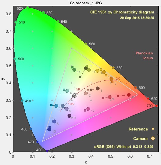
In Imatest it is easy to generate a colour difference plot for a colour calibration which is convenient.
The chromaticity diagram seems suitable but I am not sure how if there is built in functionality for this type of task in coulour-science or if it has to be done more manually?
Either way it would be great if somebody could explain how this is done in a good way or even share some example code.
Best regards,
Richard
Beta Was this translation helpful? Give feedback.
All reactions