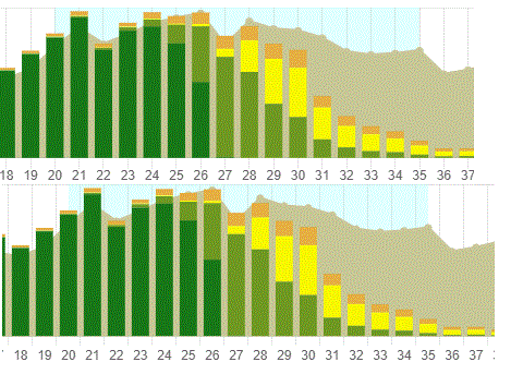
Alignment of line chart data points #10521
-
|
Hello, all. I'm in the process of upgrading ChartJS from v2.9.4 to v3.8.0, and a co-worker pointed out something that had slipped right past me. On one particular chart, the customer wants to highlight a range of weeks as Peak Season. We had originally tried to use a blank image that is the same size as the chart, but had a light blue section for those weeks. It worked, until the y axis max value went from 5,000 to 10,000 and the grid shifted. Next idea (the one that stuck) was to add Peak Season to the datasets, calculate what the max y axis value should be and set that, then set all the values to null, null, null, 100000, 100000, 100000, null, null, etc. to get the light blue for that range. Works like a charm! If the grid shifts, the blue range shifts with it. And the max data point will never get to 100000. One problem in the upgrade, tho. The v3 data points are in between the vertical grid lines; v2 didn't do that. I'm adding a picture comparing the two. Is there a way to shift the data points of the line chart to being on the vertical grid lines? V/r, |
Beta Was this translation helpful? Give feedback.
Replies: 1 comment 1 reply
-
Regarding the above topic, have you evaluated to use chartjs-plugin-annotation?
Can you try to set to scales: {
x: {
type: 'time',
...
grid: {
offset: false
}
}
} |
Beta Was this translation helpful? Give feedback.

Regarding the abo…