Possible to add buttons on x axis to cycle to next time interval? #10297
Replies: 2 comments 4 replies
-
|
I don't see any titles in your image. But the only way you can put the buttons on the canvas and use them to cycle through your data is by writing a custom plugin to draw them on the canvas and check for click actions and see if it is on your buttons |
Beta Was this translation helpful? Give feedback.
-
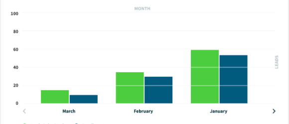
I may just have the wording wrong. I edited my original post to have a better picture of the wireframe I'm working off of. The X axis labels are the months on the bottom, and the "MONTH" title is on the top. Same setup for the Y axis, but split on left and right. |
Beta Was this translation helpful? Give feedback.
-
|
I think you should be able to use extra scales for the scale labels (month), by hiding everything else from the scale. scales: {
x:..
y:..
xTitle:..
yTitle..
} |
Beta Was this translation helpful? Give feedback.
-
|
If the buttons allow you to scroll left and right. You will need to add buttons directly in the canvas. |
Beta Was this translation helpful? Give feedback.
-
|
Whoa thanks for the link! The functionality isn't exactly what I'm looking for, but it's very close. The data I'm working with will have intervals like Hitting the buttons would just replace the data in the canvas with the next set of data instead of scrolling through the entire thing. I have the functionality in place for the buttons, I just don't have them where I want them. The video you linked seems like a great place to start though! |
Beta Was this translation helpful? Give feedback.
-
|
If you have the functionality already but need to place them below. You will need to use the chartArea to place them correctly. That is this related to chartArea: https://youtu.be/NgCHY3RVhEY I have tried to figure out your yscale title on the right side. Somehow rotating a 90 degrees on the label title is just not working. It makes the entire chart spin instead of that specific title. |
Beta Was this translation helpful? Give feedback.
Uh oh!
There was an error while loading. Please reload this page.
Uh oh!
There was an error while loading. Please reload this page.
-
I'm trying to get my chart to look like this wireframe (specifically the left and right chevrons) but not sure if this is possible. I have the functionality in place to cycle to the next group of data. It shows 3 months at a time, and the right chevron goes to the next 3 months, and left goes to previous. Is there a way to put them on the actual chart, aligned with the X axis labels like the picture?
Another less important detail is the wireframe has the Y axis title on the right, but the labels on the left, and the X axis title on the top, but the labels on the bottom. Is this possible? I've messed with so many settings but no luck. It seems like the title and labels have to be in the same area.
Beta Was this translation helpful? Give feedback.
All reactions