Create interactive maps with Datawrapper
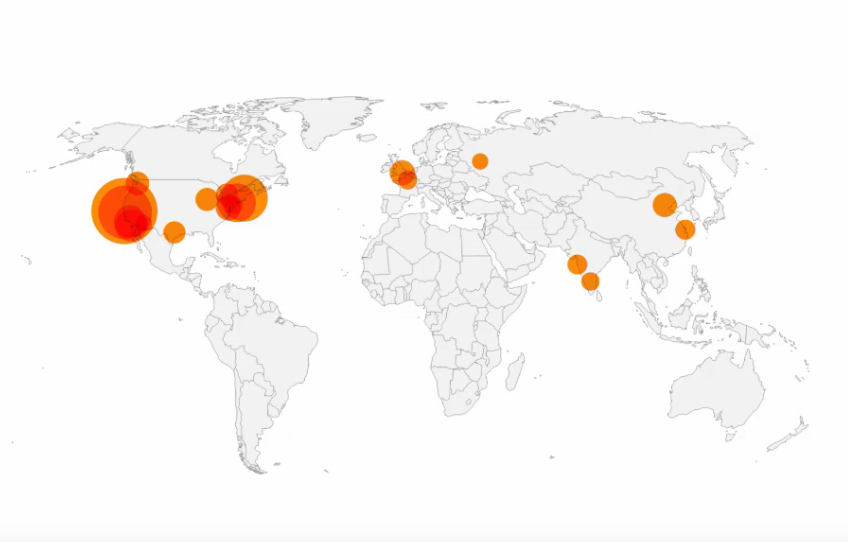
Symbol maps show symbols sized and colored according to your data. They work great for data for specific locations (like cities).
https://www.youtube.com/watch?v=4Ewat7ojICk
The first question that Datawrapper will ask you after you've decided to use a symbol map, is: "What type of map do you want to create?" Even if you know that you want a US map, you can still decide between different levels, e.g. states, counties, district courts or congressional districts. We want a US state map as a background for our population circles to give the reader some orientation. So we'll search for "USA", click on "USA » States" and then click "Next" (You can also upload your own map, with instructions on how to do so in the article How to upload your own map).

Before we can visualize the unemployment rates, we need to bring it in the right format. Datawrapper will need addresses or latitudes/longitudes to know where you want your points to be. For our map of US cities, the city names will serve as addresses. Datawrapper will map them automatically (that's called "geocoding"). For more information on geocoding using place names, see this article.
If you want to represent data with the size or color of circles (or other geometric shapes), you also need to prepare a column with data values. On our map, the size of the circles is determined by population numbers, and the color of the circles represents the change since 2010. So we need at least two more columns for population and change. Our table looks like this now:
| city | population 2016 | change to 2010 | tooltip |
|---|---|---|---|
| New York | 8537673 | 4.43 | 8.5m |
| Detroit | 672795 | -5.74 | 0.7m |
| Chicago | 2704958 | 0.35 | 2.7m |
As you can see, we added a fourth column: "population 2016 for tooltip". We will use that information for the tooltip, so that we don't need to take the long number chains from the "population 2016" column.
You can also import latitudes and longitudes. Datawrapper accepts decimal coordinates (e.g. 40.6635, -73.9387 instead of 40° 39′ 48.6″ N, 73° 56′ 19.32″ W for New York City). You will need one column for latitudes and one column for longitudes. That's how our data looks like when we add the two columns:
| lat | long | city | population 2016 | change to 2010 | tooltip |
|---|---|---|---|---|---|
| 40.6635 | -73.9387 | New York | 8537673 | 4.43 | 8.5m |
| 42.383 | -83.1022 | Detroit | 672795 | -5.74 | 0.7m |
| 41.8376 | -87.6818 | Chicago | 2704958 | 0.35 | 2.7m |
Why should you upload latitudes and longitudes when Datawrapper can just transform our city names into points on the map? Because the names of cities (or any other places) might exist more than once or might be written differently in different languages. For example, there are multiple Vancouver's around the globe. If you give a geocoder (like Google Maps or Datawrapper) "Vancouver" as an address, it will assume that you mean the biggest Vancouver, which happens to be in Canada. But the "Vancouver" in our table actually refers to the Vancouver in Washington state. When using city names as addresses, Datawrapper will map Vancouver in Canada. When using latitudes and longitudes, our Vancouver appears (correctly) in Washington. With latitudes and longitudes, you can be sure that Datawrapper maps the exact points you want to appear on your map.
Importing the data
You've prepared your data? Great! Now there are three ways to import your table with names/ID and values:
Write your values directly into the "Add a new point" field. This takes a long time, so we don't recommend it for maps with lots of points (like our US cities map):

Click on "Import Data", then choose if you want to import addresses or latitudes/longitudes, then copy & paste your data into the table that appears.
Click on "Import Data", then "Click here to upload a CSV file" and upload a CSV. If you're a fan of CSVs (e.g. because you export them out of R or Python), this will be your preferred option.
If something's wrong with your data, our map feature will tell you immediately and lets you correct it on the spot. If you want to delete or edit a point on the map, you can do so directly in the table with a click on the pen or the trash symbol. If your table has many columns, you might need to scroll a bit to the right to see these symbols:

https://academy.datawrapper.de/article/114-how-to-create-a-symbol-map-in-datawrapper
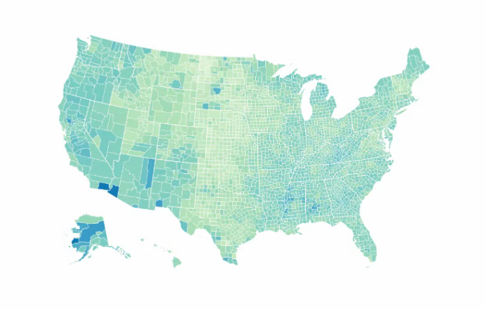
Choropleth maps color regions according to values in your dataset. They're great to show clear regional patterns.
https://www.youtube.com/watch?v=kw_mfPtCDtI https://academy.datawrapper.de/article/115-how-to-import-data-choropleth-map
Locator maps are great to show where something is located or happened, e.g. events within a city. These responsive maps are perfect for putting the places you mention in a story in context. Simply set markers, style them and define a text.
https://academy.datawrapper.de/article/161-how-to-create-a-locator-map