r figure for capstone project - Delaney #1198
-
|
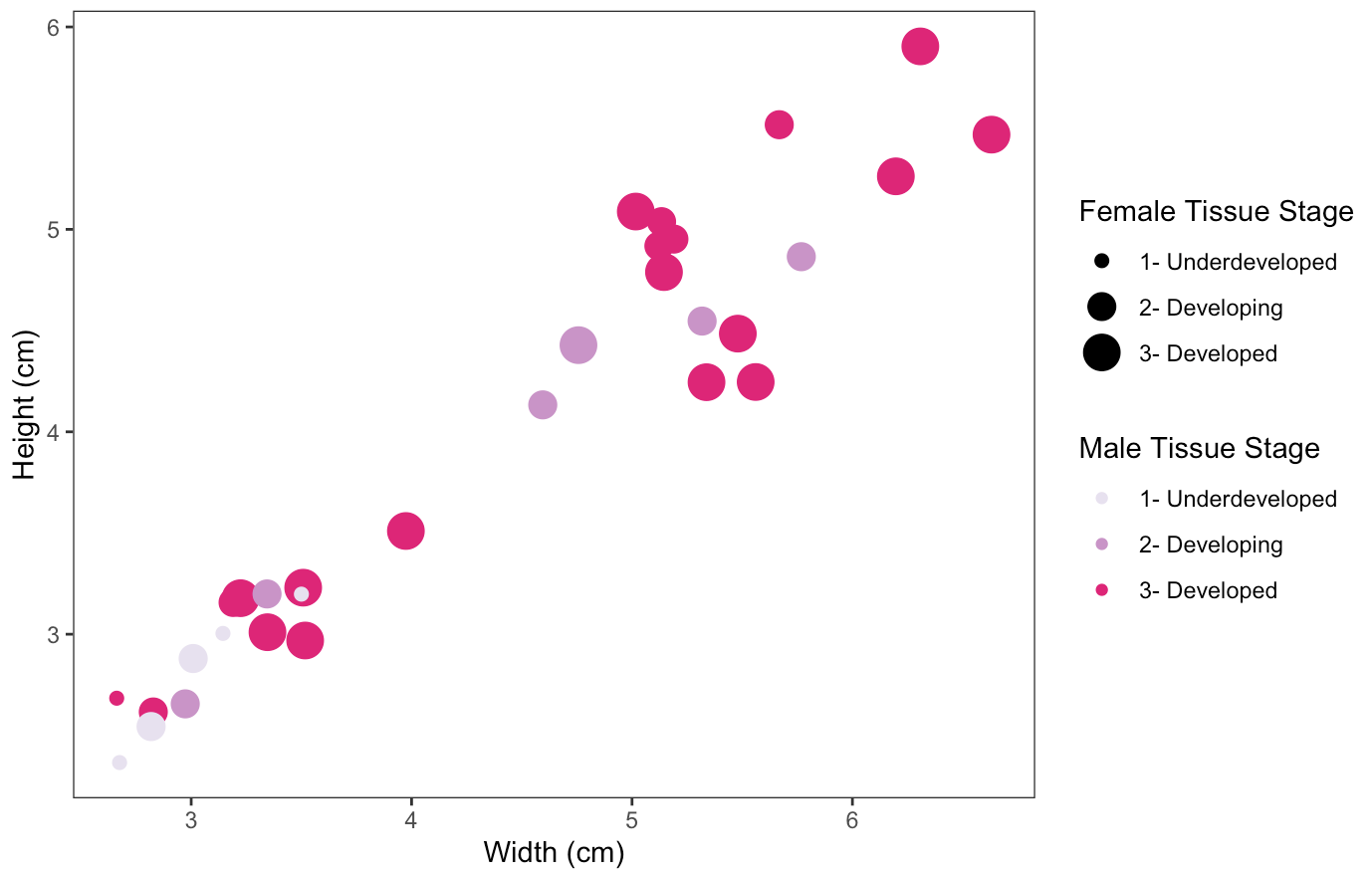
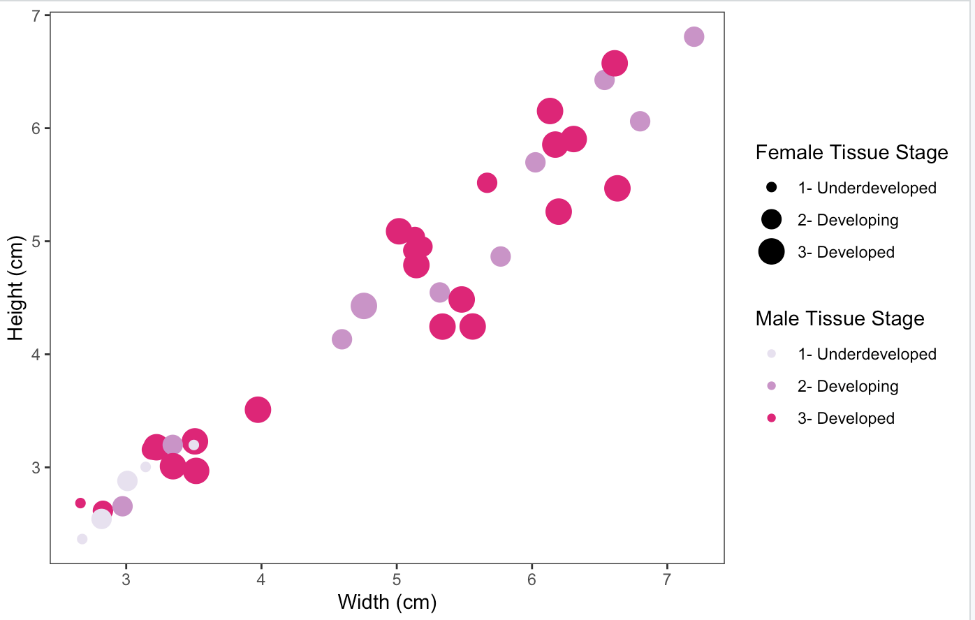
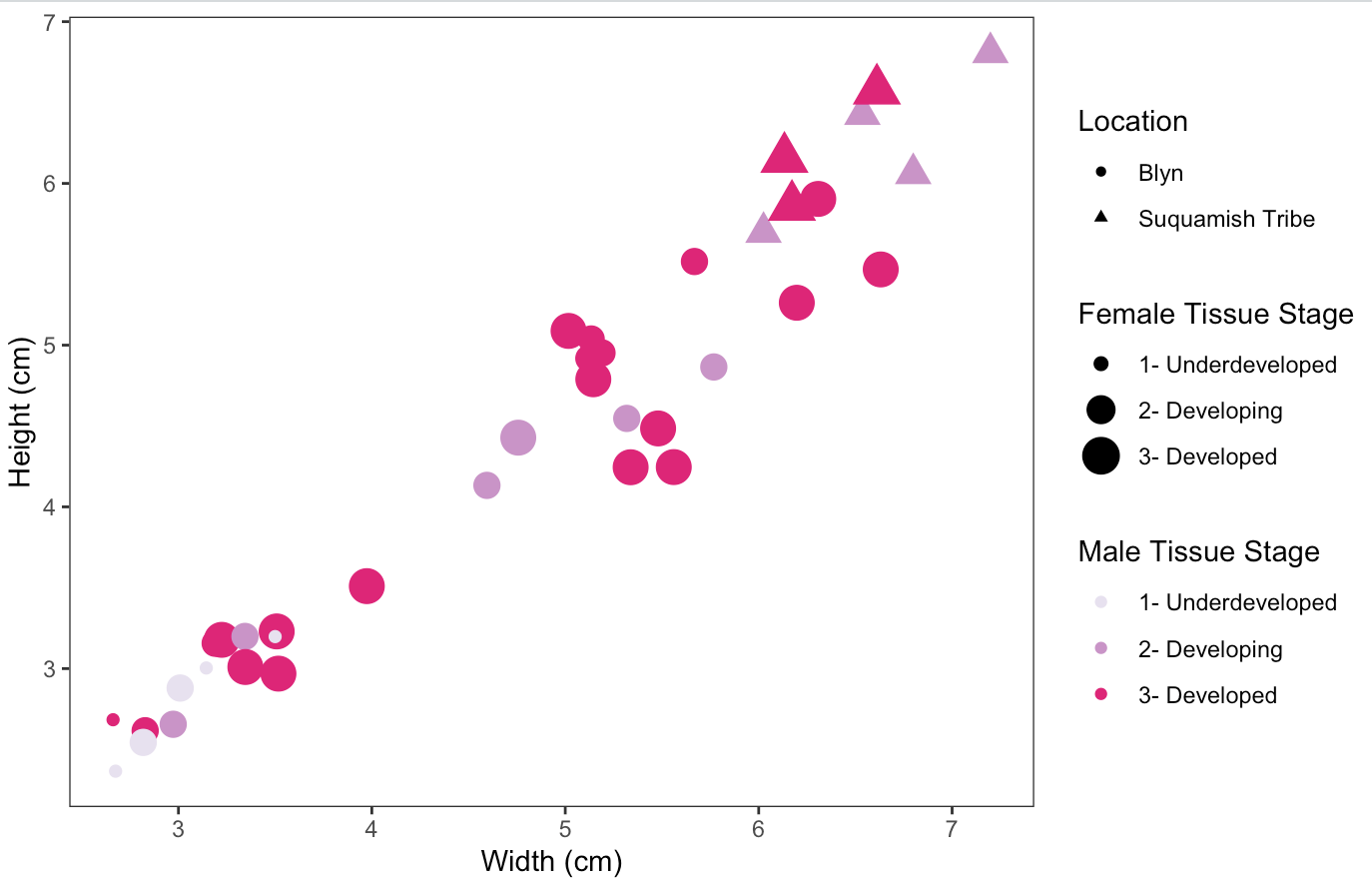
Hi all, Steven and I were brainstorming figure ideas to combine as much information from my capstone as I can into one (easy to understand) figure. However, I am not super well versed in R so I did what I could but I'm looking for suggestions and help! I can't really put female/male gonadal stage on the x or y axis because it is ordinal data not continuous so the graph ends up looking really weird. Also, I would like to have something show the difference between the 2 populations based on location in the figure that includes both, but having 2 shapes looks weird. Maybe another color palette for that population? How would I do something like that/what else could I do? (The image with width and heights up to 7 cm includes both populations, and the one with widths and heights up to 6 cm includes only one) Thanks all, looking forward to your help!! - sincerely, an R amateur (lol!)[
ggplot capstone farm population only.TXT ](url) |
Beta Was this translation helpful? Give feedback.
Replies: 8 comments 20 replies
-
|
Can you do one where you have Female stage on the y axis and width on x? And maybe one where Female stage on y axis, male stage on x axis and symbol size be height? |
Beta Was this translation helpful? Give feedback.
-
|
both of these include both populations, but I can redo with just one population if needed :) |
Beta Was this translation helpful? Give feedback.
-
|
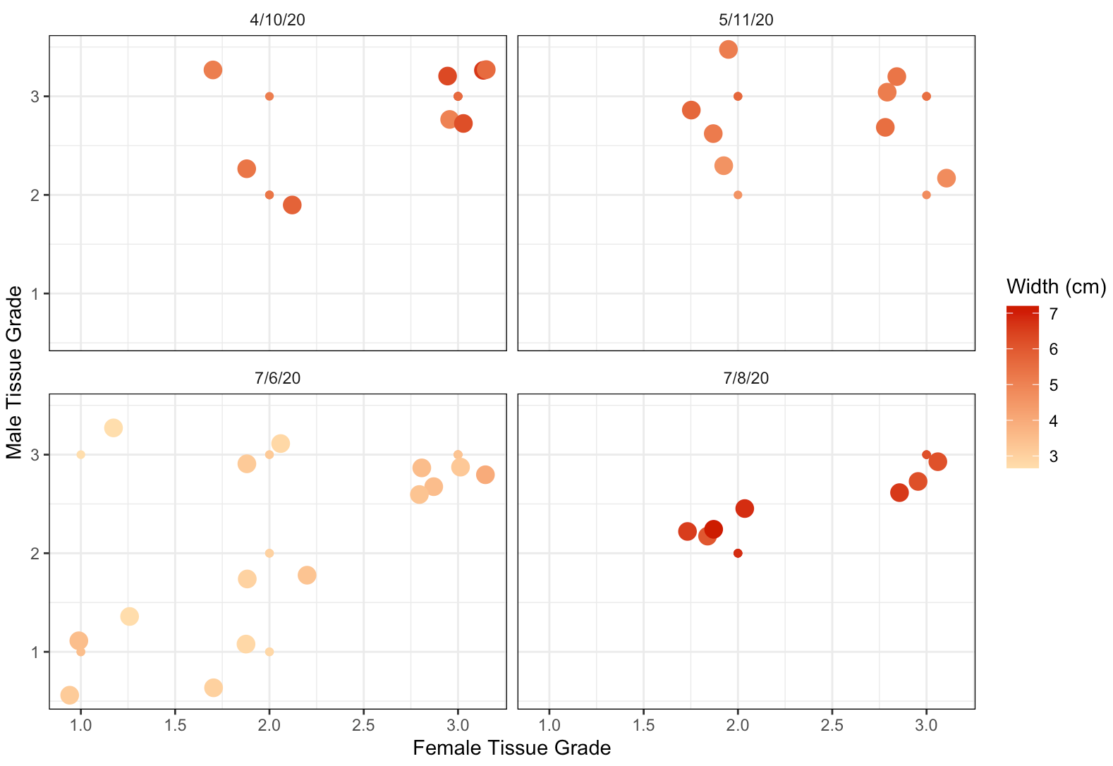
For the second one, these are likely means? can you plot all data, possibly using |
Beta Was this translation helpful? Give feedback.
-
|
Would that be for height? And do I add that inside the aes()? If so, doesn't change anything (maybe they are hiding behind larger dots since there are only 9 possible combinations of male and female stage due to it being an ordinal scale)... |
Beta Was this translation helpful? Give feedback.
-
|
not height, the female / male plot you have. Yes you are probably correct they are simply hiding now. |
Beta Was this translation helpful? Give feedback.
-
|
would jitter help in that case? not sure how to use it to make the other points visible. Let me know, thanks for the help :) |
Beta Was this translation helpful? Give feedback.
-
|
Also can you post the data? |
Beta Was this translation helpful? Give feedback.
-
|
https://docs.google.com/spreadsheets/d/1yEDEfA5WaUk4pF2ZteG3aAZf_pfOcyxzU849nq4mfmE/edit?usp=sharing this should work. included just the data needed for this figure to make it easy :) |
Beta Was this translation helpful? Give feedback.
-
|
What other data is there? |
Beta Was this translation helpful? Give feedback.
-
|
Have a look at this for working with GitHub https://washington.zoom.us/rec/play/HoYr33lGLfwGRFNkf-rJI4Pw6TDbUtyPK-EhgOhRR3-V_lZTBBhAQoi4B5N5Jp9OVVCiIPkt3OWu6e_D.wUiaKzo8GfzbbvrN?continueMode=true |
Beta Was this translation helpful? Give feedback.
-
Beta Was this translation helpful? Give feedback.
-
|
how about |

Beta Was this translation helpful? Give feedback.
-
|
I like this figure :) However, I don't understand why there are some points higher than 3 or 2.75, etc. Could you help me understand this? |
Beta Was this translation helpful? Give feedback.
-
|
that is just the |
Beta Was this translation helpful? Give feedback.
-
|
|
Beta Was this translation helpful? Give feedback.
-
|
Used that code to make this one, should be the same just changed the theme around. See you Thursday! |
Beta Was this translation helpful? Give feedback.
-
|
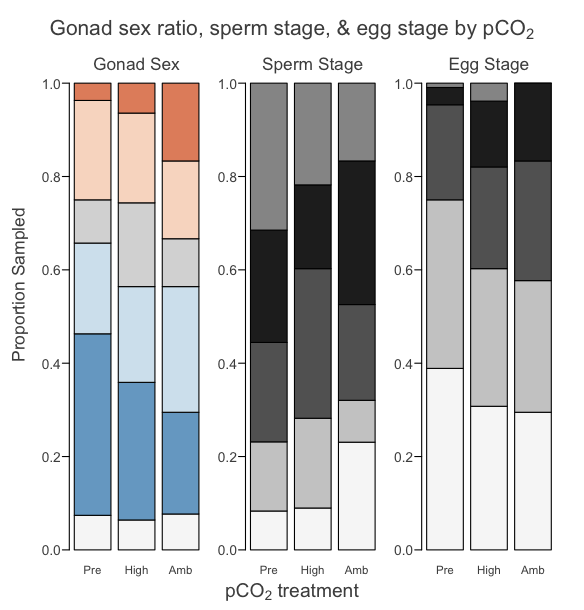
at Lab Meeting it was suggest stacked bar plots might also have value |
Beta Was this translation helpful? Give feedback.
-
|
ok I will try to make one of those. should i be trying to have male and female grades on the x and y? |
Beta Was this translation helpful? Give feedback.
-
|
or something involving height? sorry, I'm having trouble visualizing that plot |
Beta Was this translation helpful? Give feedback.
-
|
Here's an example: Here's my R code to make these stacked barplots - hope that helps, let me know if you have any questions! |
Beta Was this translation helpful? Give feedback.
-
|
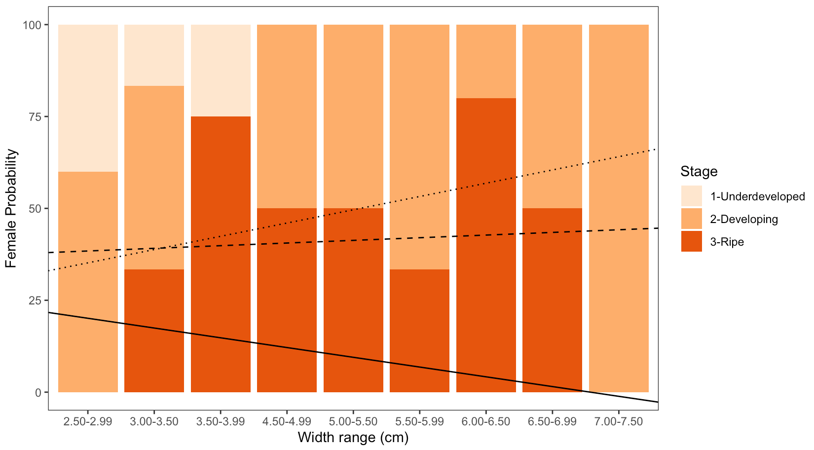
WOW that is gorgeous! Do you think I'm on the right track with this one? I remember Steven mentioning a while back not to do proportions so I tried to do the values. I will need to add male as well of course
|
Beta Was this translation helpful? Give feedback.
-
|
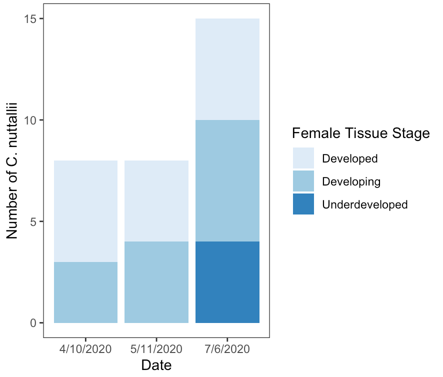
I think this shows differences between the spring dates and the summer date - you might want to make the sex ratio + male gamete stage figures too, to see if anything jumps out. But- for what it's worth I did still like the 4 scatter plots that steven made, since they show the relationship between sperm + egg stage for the same individual. |
Beta Was this translation helpful? Give feedback.
-
|
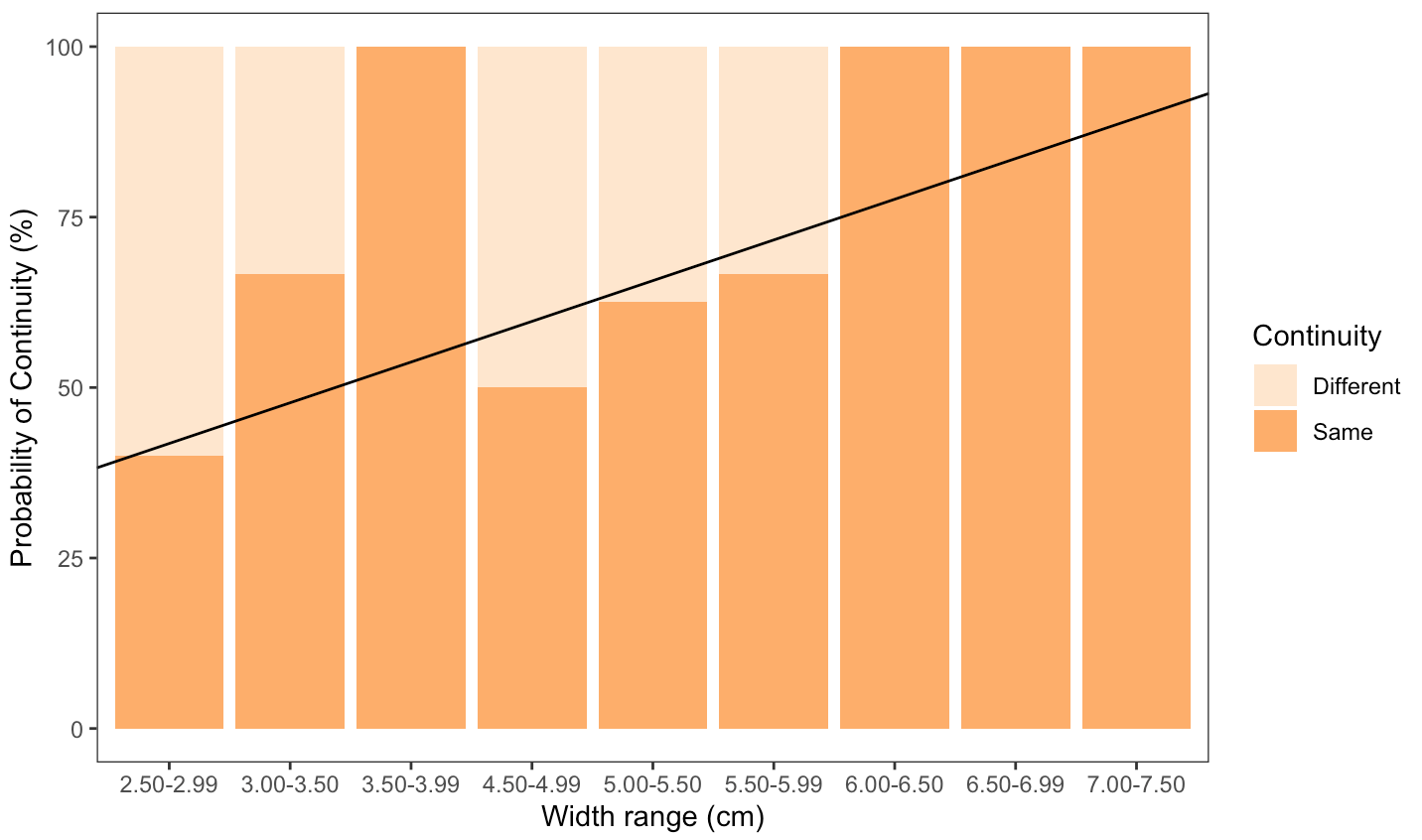
How does this look for the size by continuity graph Steven? I will of course explain what continuity means in the figure description. It skips 4.00-4.50 because there was no data there, is that ok? R^2 = 0.298 (also should the y axis be in percent or out of 1? I have both versions because I wasn't sure) |
Beta Was this translation helpful? Give feedback.
-
|
whoops I forgot to switch the ranges from 3.00-3.49 instead of 3.00-3.50. quick and easy fix :) |
Beta Was this translation helpful? Give feedback.
-
|
|
Beta Was this translation helpful? Give feedback.
-
|
Can you add the number of samples for each size class (n)? |
Beta Was this translation helpful? Give feedback.
-
|
Better yet just have axis not be percentage. |
Beta Was this translation helpful? Give feedback.
Here's an example:
Here's my R code to make these stacked barplots - hope that helps, let me know if you have any questions!
Histology-barplots.zip