Issue with add_at_risk_counts, lifelines 0.25.9 #1229
Replies: 5 comments 14 replies
-
|
I second @claudiocc1 suggestion. it'd be great to have the "at risk" information more compact. Thanks! |
Beta Was this translation helpful? Give feedback.
-
|
Hi @claudiocc1 and @andradekc - these are good points, and will try to address them shortly! Thanks for the comments |
Beta Was this translation helpful? Give feedback.
-
|
Thanks @CamDavidsonPilon. I'm afraid it still did not work. I've installed it using pip as you described above and rerun the code, exactly as it was before. Am I doing something wrong? My Lifelines version is 0.25.9. Thanks again. |
Beta Was this translation helpful? Give feedback.
-
|
Hm, my only guess is that it's not installing correctly. Can you provide first dozen lines from the output of: |
Beta Was this translation helpful? Give feedback.
-
|
Here you go: add_at_risk_counts(*fitters, labels: Union[Iterable, bool, NoneType] = None, rows_to_show=None, ypos=-0.6, ax=None, **kwargs) |
Beta Was this translation helpful? Give feedback.
-
|
right, so it looks like the branch wasn't installed (I've update the docs on that function, which aren't present in your output). Try: and if that doesn't work: |
Beta Was this translation helpful? Give feedback.
-
|
Great, it worked after trying the second option! Thanks a lot once again |
Beta Was this translation helpful? Give feedback.
-
|
@claudiocc1 for 2), try adding a Still looking into 1) |
Beta Was this translation helpful? Give feedback.
-
|
@claudiocc1 - are you able to provide me with your data (over email is fine too)? I'm not able to repro the problem you are seeing. |
Beta Was this translation helpful? Give feedback.
-
|
Alternative potential solution for anyone else, who are here to figure out how to save figures with risk counts: I managed to solve it by calling savefig() with bbox_inches='tight'. |
Beta Was this translation helpful? Give feedback.
-
|
Yes. Let me clean up the code to make it easy
for you. I assume that you are ok with a jupyter notebook?
On Thu, Feb 18, 2021 at 19:36 Cameron Davidson-Pilon < ***@***.***> wrote:
@claudiocc1 <https://github.com/claudiocc1> - are you able to provide me
with your data (over email is fine too)? I'm not able to repro the problem
you are seeing.
—
You are receiving this because you were mentioned.
Reply to this email directly, view it on GitHub
<#1229 (reply in thread)>,
or unsubscribe
<https://github.com/notifications/unsubscribe-auth/ABD7FG67X2M5PKVDBTK4XXTS7XMFNANCNFSM4XVYPLPA>
.
--
Sent from phone
|
Beta Was this translation helpful? Give feedback.
-
|
Jupyter nb is fine, yup! |
Beta Was this translation helpful? Give feedback.
-
|
how do I send it to you by email ? |
Beta Was this translation helpful? Give feedback.
-
Beta Was this translation helpful? Give feedback.
-
|
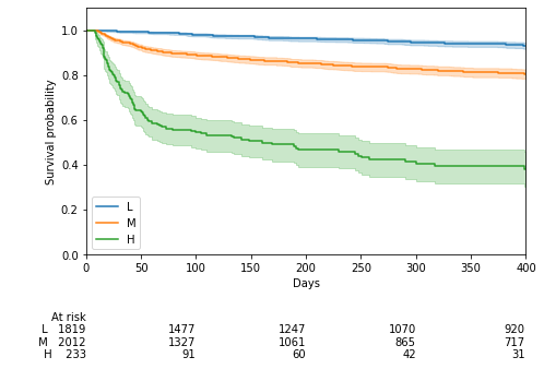
The problem was "at-risk" counts are calculated at end-of-time-period, and in this dataset, everyone was censored at day 400. Thus, at the end-of-day-400, no one was at risk (which is correct). However, the xticks happened to land on 400 as well, so there was a column of zeros. An easy fix was to set the
|
Beta Was this translation helpful? Give feedback.
Uh oh!
There was an error while loading. Please reload this page.
Uh oh!
There was an error while loading. Please reload this page.
-
I went back to an old lifelines project to "prettify" some
plots for a publication.
I am now having problems with add_at_risk_counts.
Unfortunately I do not remember what version of lifelines I
used to run at the earlier time.
I am now running 0.25.9 which I believe is the latest.
There are two problems
(1) The at-risk counts at the end of the plot are set to zero (*)
(2) The at-risk counts are outputted in jupyter notebook but
do not show up when I try to save the plot + the counts
in a figure.pdf file
(*) In my project the "duration" is capped at less than or equal to 400
days. The last "tick" on the x-axis when the curve is plotted is at
400. Since it appears that the counts are given in correspondence
to the tickmarks (right?), the last displayed counts are at 400 and are set
to zero. This seems like a "greater than" vs "greater than or equal to"
bug (or feature?) that was introduced at some point (?).
You can see the outputs here:
https://www.dropbox.com/s/ctowotae1jjcpbs/at_risk.pdf?dl=0
The old code looked like this
The new code is identical to the old code except for these three lines
Any help would be appreciated.
Thanks, and thank you for making this great code available!
C.
PS another different "feature" is that the "at risk" information
is much less compact that it used to be (blank lines, etc).
I wonder if there is a way to go back to make it compact.
(Yes, I understand that before it was only showing the "at risk"
counts and now it can optionally also show "censored" and "events"
counts).
Beta Was this translation helpful? Give feedback.
All reactions